Different menu on landing page VS. other pages / combining mobile burger vs. non-burger menu
-
Hi there,
two questions, is it possible to configure Laytheme as follows:
- different menu on landing page vs. other pages
- combining mobile burger vs. non-burger menu
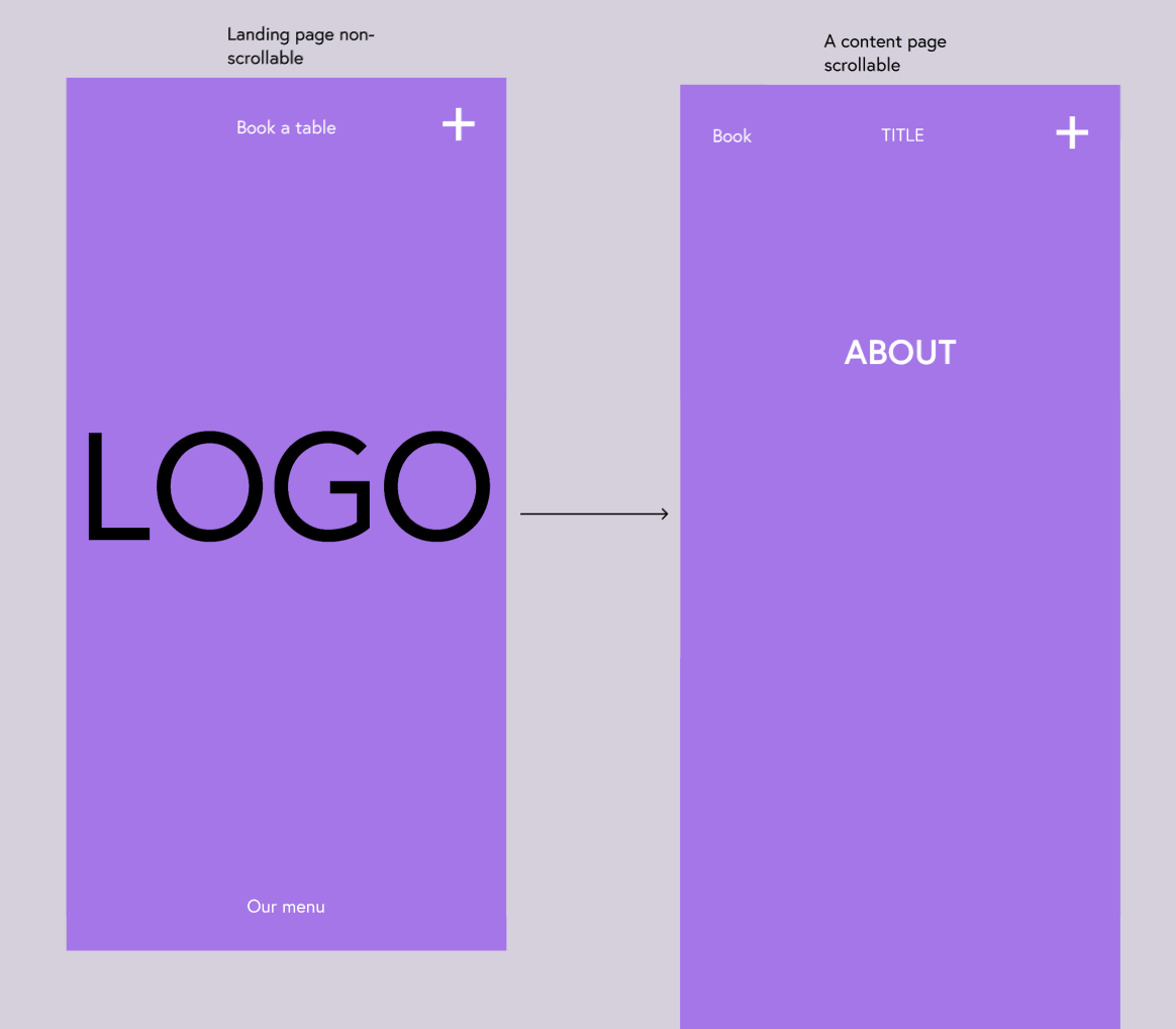
See screenshot of the wanted outcome. Basically it's a combination of an Overlay menu and normal menu, which I see is possible on Desktop layout but couldn't find the options on Mobile layout.
Also, mobile landing page should have a different menu structure from other pages.
Landing page has Book a table on top and Our menu on the bottom and the PLUS as an overlay menu. All other pages would have Book (menu link), TITLE (menu link to home) and PLUS overlay menu on top.
Thank you for any hints how to achieve this.

-
hey!
so if i was you i would try and create both types of menus.
then i would use custom css to hide and show the menus based on which page you're on
https://laytheme.com/documentation/custom-css-styling.html#css-based-on-current-pageso lets assume your homepage has the slug home. and you have two menus:
.menu-1
and
.menu-2
then you'd do
//by default, menu1 is always shown, and menu2 is always hidden
.menu-1{
display: block!important;
}
.menu-2{
display: none!important;
}

// but on homepage, hide menu1 and show menu2 instead
.slug-home .menu-1{
display: none!important;
}
.slug-home .menu-2{
display: block!important;
}
this css is the basic logic behind how you show one menu on the homepage and hide the other. and on all other pages its the other way around.
but your classes you use will be different because you will need to hide/show a menu, a mobile menu or a button that opens an overlay. so you'll need to get comfortable with the "chrome inspector" for example to find the correct css selectors and write the css yourself.
also you're right you can't create multiple menus for mobile. for desktop you can have up to 4.
one way to get around this is to use "custom css & html" → "custom html at top/bottom"
in here you can hard-code some anchor tags and use custom css to style them. this could act as an additional menu on mobile.all of this needs quite some knowledge in html and css but with some patience and learning you will be able to do it
I also code custom websites or custom Lay features.
💿 Email me here: 💿
info@laytheme.com
Before you post:
- When using a WordPress Cache plugin, disable it or clear your cache.
- Update Lay Theme and all Lay Theme Addons
- Disable all Plugins
- Go to Lay Options → Custom CSS & HTML, click "Turn Off All Custom Code", click "Save Changes"
This often solves issues you might run into
When you post:
- Post a link to where the problem is
- Does the problem happen on Chrome, Firefox, Safari or iPhone or Android?
- If the problem is difficult to explain, post screenshots / link to a video to explain it