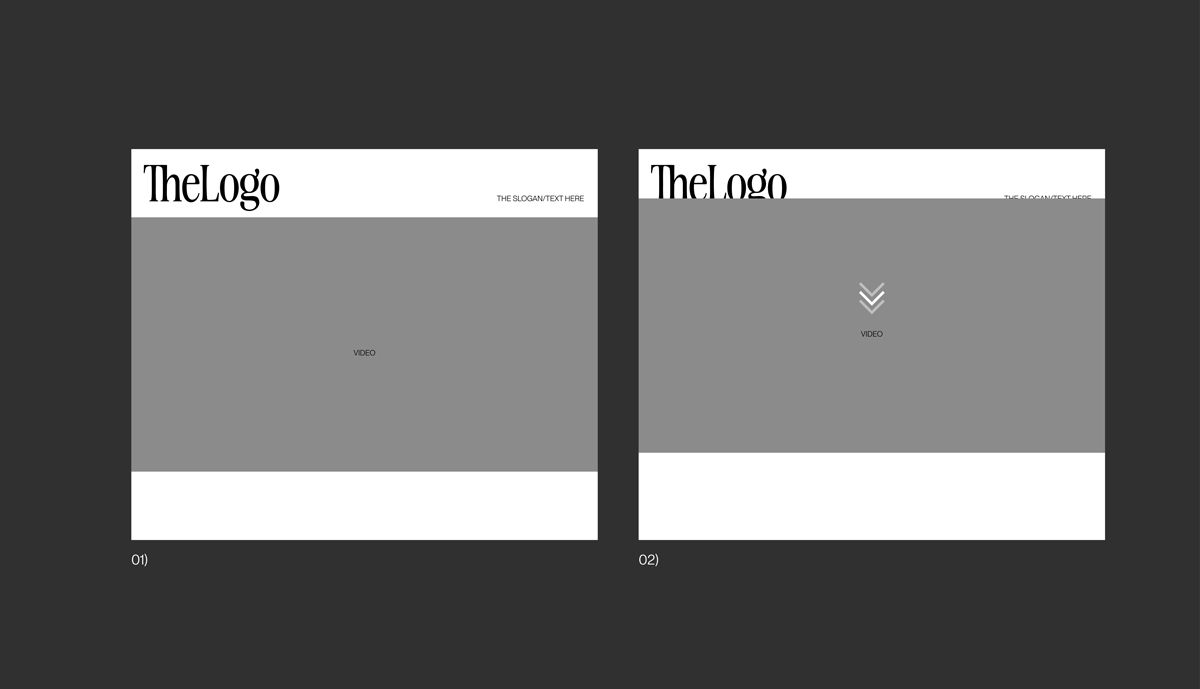
Fixed content on 1st row / short cover
-
Hey there,
I'm gonna ask a specific thing, which i believe may be hard to find a solution but still I will try if somebody can help.
What I would love to archive is something like this: Example
So the idea is I like to have a Logo in the first section, which more or less will behave like a parallax cover, but shorter in height.
I'm using a CSS i found in the forum:
.cover-region, .cover-region-placeholder, .cover-inner {
    min-height: 34vh !important;
    height: 34vh !important;
}
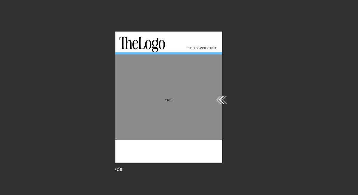
What I don't like from this, is the fact that this way I cannot manage the space between the 1st section[cover] and the second one. Because on resizing the window, the space changes.
Here is an illustration of what I'm trying to do:

On scroll, the 1st section stays fixed, while the second one cover it.
////////

On resizing the browser, the space between 1st and 2nd section to stay the same. [the area in blue]
Looking forward to any help,
Cheers, -
sure!
you use vh. which is viewportheight. when resizing (making the width of the browser smaller) the viewportheight stays the same.
instead of vh use vw as the measuring unit.
.cover-region, .cover-region-placeholder, .cover-inner {
    min-height: 34vw !important;
    height: 34vw !important;
}
you will need to use a different value than 34 for it to fit well i think
-
sure!
you use vh. which is viewportheight. when resizing (making the width of the browser smaller) the viewportheight stays the same.
instead of vh use vw as the measuring unit.
.cover-region, .cover-region-placeholder, .cover-inner {
    min-height: 34vw !important;
    height: 34vw !important;
}
you will need to use a different value than 34 for it to fit well i think
I also code custom websites or custom Lay features.
💿 Email me here: 💿
info@laytheme.com
Before you post:
- When using a WordPress Cache plugin, disable it or clear your cache.
- Update Lay Theme and all Lay Theme Addons
- Disable all Plugins
- Go to Lay Options → Custom CSS & HTML, click "Turn Off All Custom Code", click "Save Changes"
This often solves issues you might run into
When you post:
- Post a link to where the problem is
- Does the problem happen on Chrome, Firefox, Safari or iPhone or Android?
- If the problem is difficult to explain, post screenshots / link to a video to explain it
