text content to be have fixed width after a certain size
-
Hi,
Was wondering, is there any way to make this text in the first section, not to adapt to grid 'so to say' after a certain width.

What I mean, is the text box above not to extend more than how it looks in the image.
For reference, see this text box here:

It responds when the browser is decrasing, but this form/view won't be deformed doesn't matter how big the screen is,
🤔
-
Hi,
Was wondering, is there any way to make this text in the first section, not to adapt to grid 'so to say' after a certain width.
What I mean, is the text box above not to extend more than how it looks in the image.
For reference, see this text box here:
It responds when the browser is decrasing, but this form/view won't be deformed doesn't matter how big the screen is,
🤔
I think I did it through some CSS,
.main-text-cover {
	width: 70%!important;
  align-items: center!important;
  justify-content: center!important;
}
Just now I have to find how to center it, :D
-
can you right click the text, and then click:
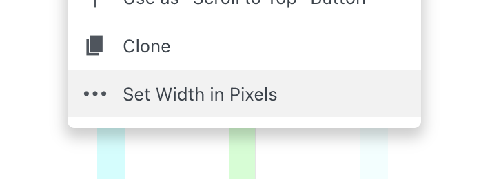
here you have settings for this i think this fixes it
pls remove or comment out your css before using this -
you could also think about using a textformat with fontsize in %. this way the text scales
-
@arminunruh Is there any way I can center the text block? 🤔 It's all I need now

-
Thank you man, it works almost perfectly. If I can only get rid of that fraction of a second when you load the page and the text box moves from right to center.
-
@panteley try this:
transform: translateX(-50%)!important;maybe this forces your style to be applied at page load.
I also code custom websites or custom Lay features.
💿 Email me here: 💿
info@laytheme.com
Before you post:
- When using a WordPress Cache plugin, disable it or clear your cache.
- Update Lay Theme and all Lay Theme Addons
- Disable all Plugins
- Go to Lay Options → Custom CSS & HTML, click "Turn Off All Custom Code", click "Save Changes"
This often solves issues you might run into
When you post:
- Post a link to where the problem is
- Does the problem happen on Chrome, Firefox, Safari or iPhone or Android?
- If the problem is difficult to explain, post screenshots / link to a video to explain it