Skip to content
  • Recent
  • Tags
  • Popular
  • Users
  • Search
Skins
  • Light
  • Cerulean
  • Cosmo
  • Flatly
  • Journal
  • Litera
  • Lumen
  • Lux
  • Materia
  • Minty
  • Morph
  • Pulse
  • Sandstone
  • Simplex
  • Sketchy
  • Spacelab
  • United
  • Yeti
  • Zephyr
  • Dark
  • Cyborg
  • Darkly
  • Quartz
  • Slate
  • Solar
  • Superhero
  • Vapor

  • Default (No Skin)
  • No Skin
Collapse

Lay Theme Forum

  1. Home
  2. General Discussion
  3. Gridder: Column width

Gridder: Column width

Scheduled Pinned Locked Moved General Discussion
8 Posts 3 Posters 118 Views
  • Oldest to Newest
  • Newest to Oldest
  • Most Votes
Reply
  • Reply as topic
Log in to reply
This topic has been deleted. Only users with topic management privileges can see it.
  • S Offline
    S Offline
    Sebaster
    wrote on last edited by
    #1

    Hello Laythemer,
    is it correct that the Gridder columns only have 2 widths: up to the phone breakpoint the column width is the window width divided by the specified number of columns and below the phone breakpoint the column width is 100%? And if that's correct: are there simple ways to adjust this behavior?

    Thanks for your feedback!

    1 Reply Last reply
    0
    • F Offline
      F Offline
      felix_rabe
      wrote on last edited by felix_rabe
      #2

      the columns get stacked under each other on mobile by default, because desktop layouts can be too sophisticated for a small mobile display. you can create a custom phone layout etc, depending on what you want to achieve.

      1 Reply Last reply
      0
      • arminunruhA Offline
        arminunruhA Offline
        arminunruh
        Global Moderator
        wrote on last edited by
        #3

        yes very good answer  @felix_rabe
        you can create a custom phone layout:
        https://laytheme.com/documentation/custom-phone-layouts.html

        if you want more layout capabilities for phone

        1 Reply Last reply
        0
        • S Offline
          S Offline
          Sebaster
          wrote on last edited by
          #4

          I know that I can create my own phone layout manually. I had hoped that there would be a more granular adjustability analogous to the Bootstrap column classes (e.g. .col-sm-6 or .col-lg-3 etc.), which allow a very flexible breakpoint-specific setting of the column widths.
          If I understand correctly, in Laytheme there is unfortunately only the preset number of columns and after the phone breakpoint the reduction to one column or an alternative phone layout to be created. Intermediate steps cannot be set. In my opinion, this is somewhat inconvenient.

          1 Reply Last reply
          0
          • F Offline
            F Offline
            felix_rabe
            wrote on last edited by felix_rabe
            #5

            @Sebaster if you have that extensive skills in CSS and coding (which I just assume from your post) maybe a WordPress + Theme is not appropriate at all for your project? LayTheme is focused on bringing rich layout possibilities to people with less or no coding experience, while also offer a broad space for customization.

            But what you want to achieve is something like a Tablet-Layout in between, right?

            1 Reply Last reply
            0
            • arminunruhA Offline
              arminunruhA Offline
              arminunruh
              Global Moderator
              wrote on last edited by arminunruh
              #6

              @Sebaster whats the use case?
              i understand your concerns!

              i too think that tablet settings are important, so i added them for:
              the elementgrid, thumbnailgrid elements. they have the "tablet" button:
              Screenshot 2024-12-20 at 17.45.20.png

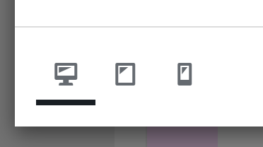
              in here, you can change the amount of columns that a layout has for this element.
              also, textformats can have a tablet fontsettings

              i wasnt sure if we'd need more than that mh

              do you think using the elementgrid element could help?

              1 Reply Last reply
              0
              • S Offline
                S Offline
                Sebaster
                wrote on last edited by
                #7

                Hello Armin,
                thank you for your feedback.
                The use case is a free poster-like layout of text blocks and images that all have different column widths. It looks good on a desktop monitor, but not on a tablet because the desktop content is only scaled down 1:1 and all the blocks are actually too narrow.
                As I understand the element grid feature, all elements inserted there have the same width - resulting from the number of columns. This means that layouts with different image and textblock widths are not possible there. In short: I would very much like to see a custom tablet option for the Gridder in addition to the custom phone layout option.

                1 Reply Last reply
                0
                • arminunruhA Offline
                  arminunruhA Offline
                  arminunruh
                  Global Moderator
                  wrote on last edited by
                  #8

                  oh i understand.

                  are you using the "place freely" method of placing elements?
                  https://laytheme.com/documentation/place-freely.html

                  1 Reply Last reply
                  0
                  Reply
                  • Reply as topic
                  Log in to reply
                  • Oldest to Newest
                  • Newest to Oldest
                  • Most Votes


                  I also code custom websites or custom Lay features.
                  💿 Email me here: 💿
                  info@laytheme.com

                  Before you post:
                  1. When using a WordPress Cache plugin, disable it or clear your cache.
                  2. Update Lay Theme and all Lay Theme Addons
                  3. Disable all Plugins
                  4. Go to Lay Options → Custom CSS & HTML, click "Turn Off All Custom Code", click "Save Changes"

                  This often solves issues you might run into

                  When you post:
                  1. Post a link to where the problem is
                  2. Does the problem happen on Chrome, Firefox, Safari or iPhone or Android?
                  3. If the problem is difficult to explain, post screenshots / link to a video to explain it
                  Online Users
                  S
                  svinder
                  Forgot your key, lost your files, need a previous Lay Theme or Addon version? Go to www.laykeymanager.com
                  laytheme.com
                  • Login

                  • Don't have an account? Register

                  • Login or register to search.
                  • First post
                    Last post
                  0
                  • Recent
                  • Tags
                  • Popular
                  • Users
                  • Search