fixed sized square video
-
hello all - total beginner in css, so excuse my cluelesness.
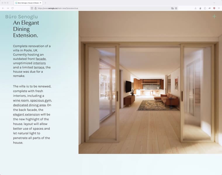
i'm trying to make a video stick to the right side of the page, and to have it dictate the rest of the elements on the page without changing aspect ratio or cropping. meaning that i don't want to see any padding beneath the video when the page is resized, or have the video cut. ideally the aspect ratio would always stay 1:1 and the video would get smaller if the page is of an odd shape. is this possible?
-
what would happen if your browser window is also square? there would be no space left for the text, right?
-
Either that or the text could overlap the video.
-
you could try "set browser height for row height" for this row in the gridder and then give the video a class and make it "height: 100vh" with custom css for starters.
-
thanks felix, i will try this.
-
i've done as you said i believe, however it doesn't work as intended. can you spot what i'm not doing correct? here's a screen capture:
-
@emresenoglu try to use that for your custom video class:
position: absolute;
top: 0;
right: 0;
width: auto;
height: 100vh;
aspect-ratio: 1;But you have to reflect if this is the best approach webdesign-wise, also considering mobile and tablet layouts.
-
do you have a link please?
-
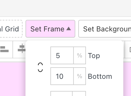
right click your row, choose "use browser height for row height"

for top frame and bottom frame use: 0
now select your video in your grid, make sure it is aligned

to middle
and make sure to use a square video.
this way you dont need to use css.
I also code custom websites or custom Lay features.
💿 Email me here: 💿
info@laytheme.com
Before you post:
- When using a WordPress Cache plugin, disable it or clear your cache.
- Update Lay Theme and all Lay Theme Addons
- Disable all Plugins
- Go to Lay Options → Custom CSS & HTML, click "Turn Off All Custom Code", click "Save Changes"
This often solves issues you might run into
When you post:
- Post a link to where the problem is
- Does the problem happen on Chrome, Firefox, Safari or iPhone or Android?
- If the problem is difficult to explain, post screenshots / link to a video to explain it