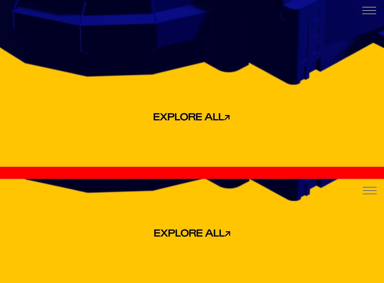
burger/menu dynamic color adaptation
-
Hello everyone,
I recently came across a website built with LayTheme (https://prideof.london) that has an interesting feature: the burger menu icon automatically adjusts its color based on the background - appearing light on dark backgrounds and dark on light backgrounds when viewed on mobile.
I assume this effect is achieved through custom CSS. How? Would it also be possible to implement the same dynamic color adaptation for desktop menu items as well?
Thank you for your help, and happy new year to all!
mr.do
-
@mr-do this effect is called "mix-blend-mode" with the setting "difference" and a white color for the icon that you can apply with custom css.
-
yes very good @felix_rabe !
for page overlay burger:
.standard-overlay-burger{
   mix-blend-mode: difference !important;
   /*if your icon is black, use this:*/
   filter: invert(100%);
}
for desktop nav:
.desktop-nav{
   mix-blend-mode: difference !important;
   /*if your icon is black, use this:*/
   filter: invert(100%);
}
for desktop site title:
.sitetitle{ mix-blend-mode: difference !important; /*if your icon is black, use this:*/ filter: invert(100%); } -
yes very good @felix_rabe !
for page overlay burger:
.standard-overlay-burger{
   mix-blend-mode: difference !important;
   /*if your icon is black, use this:*/
   filter: invert(100%);
}
for desktop nav:
.desktop-nav{
   mix-blend-mode: difference !important;
   /*if your icon is black, use this:*/
   filter: invert(100%);
}
for desktop site title:
.sitetitle{ mix-blend-mode: difference !important; /*if your icon is black, use this:*/ filter: invert(100%); }I'm trying to apply a "difference" blending mode for the mobile version of my site, specifically to a custom SVG burger icon. However, I can't get it to work. I'm also unsure how to properly target the site title on mobile to apply the same effect.
The "difference" blending mode works perfectly on the desktop version, but not on mobile so far.
-
I'm trying to apply a "difference" blending mode for the mobile version of my site, specifically to a custom SVG burger icon. However, I can't get it to work. I'm also unsure how to properly target the site title on mobile to apply the same effect.
The "difference" blending mode works perfectly on the desktop version, but not on mobile so far.
@OLVVDB for mobile its .mobile-title{ ... } etc. use the inspection tool of your browser to find the classes. and I would dramatically decrease the size and quality of the thumbnail videos. the frontage has a load of over 100 MB. https://handbrake.fr is a good app for that.
-
@OLVVDB for mobile its .mobile-title{ ... } etc. use the inspection tool of your browser to find the classes. and I would dramatically decrease the size and quality of the thumbnail videos. the frontage has a load of over 100 MB. https://handbrake.fr is a good app for that.
@felix_rabe allright thanks for informing me about the heavy page load. need to take care of that. as for the custom burger Icon I was able to find the class but the blending mode does not seem to work on the SVG files i uploaded in the custom icons. I exported the SVGs as styling = presentation attributes and its object IDs as minimal and decimals: 2, responsive from illustrator. Is there something I am doing wrong here or is this a knows issue that blending modes might not work on custom SVG files?
this is the CSS i used:
/* Mobile burger menu icon blend */
.mobile-menu-icon {
mix-blend-mode: exclusion;
filter: invert(100%);
} -
@felix_rabe allright thanks for informing me about the heavy page load. need to take care of that. as for the custom burger Icon I was able to find the class but the blending mode does not seem to work on the SVG files i uploaded in the custom icons. I exported the SVGs as styling = presentation attributes and its object IDs as minimal and decimals: 2, responsive from illustrator. Is there something I am doing wrong here or is this a knows issue that blending modes might not work on custom SVG files?
this is the CSS i used:
/* Mobile burger menu icon blend */
.mobile-menu-icon {
mix-blend-mode: exclusion;
filter: invert(100%);
}I would make the svg white by file, not by filter.
-
Oh, thanks for the great answers Felix. Yeah, I too think the SVG needs to be white. And then remove the filter invert.
I also code custom websites or custom Lay features.
💿 Email me here: 💿
info@laytheme.com
Before you post:
- When using a WordPress Cache plugin, disable it or clear your cache.
- Update Lay Theme and all Lay Theme Addons
- Disable all Plugins
- Go to Lay Options → Custom CSS & HTML, click "Turn Off All Custom Code", click "Save Changes"
This often solves issues you might run into
When you post:
- Post a link to where the problem is
- Does the problem happen on Chrome, Firefox, Safari or iPhone or Android?
- If the problem is difficult to explain, post screenshots / link to a video to explain it