Mobile Website Display – LAYOUT error
-
Hello,
Our mobile website has an issue. When opening the webpage on a mobile device, the cover is supposed to be displayed at the very top. However, there is now a set of disorganized information appearing in front of the cover.
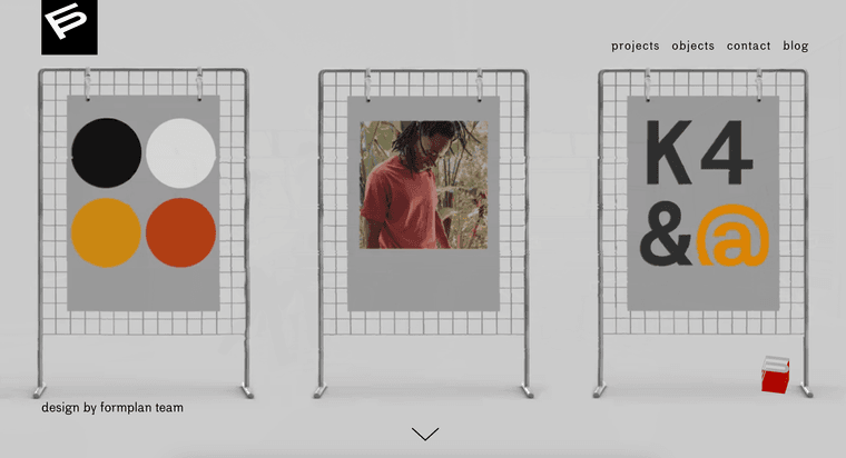
website desktop layout:
phone layout:
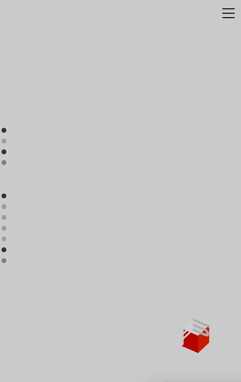
This issue occurs on all pages. Could you help us resolve it?
website link: formplan.design
-
@KA that seems to be your desktop-layout that is "stuck" on top. while investigating the error, you can try to fix this provisionally by adding this to custom mobile css:
cover-content-desktop{
display: none;
} -
hey, I just tried felix's code and if you take out 'desktop' it should work as I just tried it in inspector. Try this:
.cover-content {
display: none !important
} -
yes! if you update lay theme it should work again, sorry for this!
-
hey i think if you enable the cover feature it should also work now with the update
I also code custom websites or custom Lay features.
💿 Email me here: 💿
info@laytheme.com
Before you post:
- When using a WordPress Cache plugin, disable it or clear your cache.
- Update Lay Theme and all Lay Theme Addons
- Disable all Plugins
- Go to Lay Options → Custom CSS & HTML, click "Turn Off All Custom Code", click "Save Changes"
This often solves issues you might run into
When you post:
- Post a link to where the problem is
- Does the problem happen on Chrome, Firefox, Safari or iPhone or Android?
- If the problem is difficult to explain, post screenshots / link to a video to explain it