How to set Row Image Background to 100% width on mobile?
-
I’m trying to set a row image background to 100% width on mobile (excluding the default padding).
Specifically, this is for the white transparent image in the footer of the following website.
The red area is also a square image, but it’s not displaying as a square on mobile either. I’ve tried various solutions using CSS and even JavaScript, but I’m still struggling to get it right. I might be doing something wrong, so any help or guidance would be greatly appreciated.
Thanks in advance!
-
@MWPA not quite sure I am understanding your problem, because I think you mean 100% height? you could make a custom phone layout for your footer to get rid of the default padding above and below the footer area.
for the red square: you could give the area a red background color instead of an image and give it a custom mobile css class that has an aspect-ratio of 1/1.
-
@felix_rabe: Thanks for your quick reply. I fixed what I needed, but now there seems to be a bug with the two-column layout. See attachments.
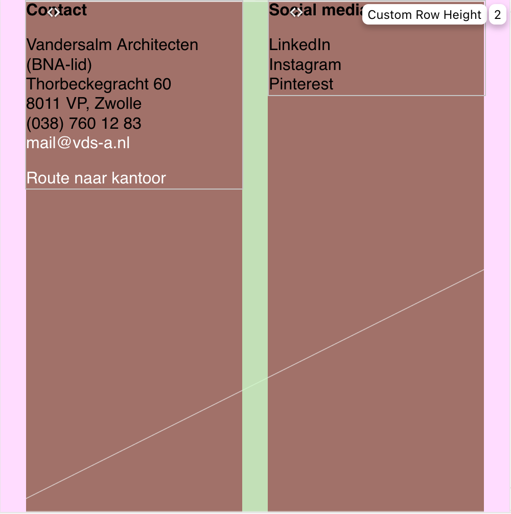
Screenshot backend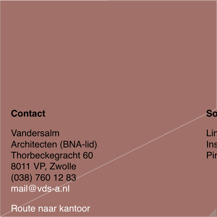
Screenshot frontendIf I only use the second column, then there is no problem. See the additional text below (on mobile):
Social media
LinkedIn
Instagram
PinterestI don't understand this.
URL website:
https://dev.rickangenent.nl/ -
oh
sorry about the late response!
i found out why it doesnt work! im releasing the fix now, if u update it should work
-
actually give me a few minutes, i will release the update later today
I also code custom websites or custom Lay features.
💿 Email me here: 💿
info@laytheme.com
Before you post:
- When using a WordPress Cache plugin, disable it or clear your cache.
- Update Lay Theme and all Lay Theme Addons
- Disable all Plugins
- Go to Lay Options → Custom CSS & HTML, click "Turn Off All Custom Code", click "Save Changes"
This often solves issues you might run into
When you post:
- Post a link to where the problem is
- Does the problem happen on Chrome, Firefox, Safari or iPhone or Android?
- If the problem is difficult to explain, post screenshots / link to a video to explain it