reduce number of columns only in project overlay at defined extra breakpoint
-
Hallo!
Everything works fine in my project, I have just one only layout-related issue. In the project overlays i use a 2 column layout with image/carusel on the left and text on the right column, this works fine on desktop and mobile (where everything gets stacked on top of each other). Only on very small desktops and tablets, the layout becomes a bit ugly as it remains with 2 very narrow columns and the text column is much longer than the one with the image.
Is there a simple way to avoid this by somehow switching to mobile layout at tablet breakpoint or at a self-defined breakpoint, but only for projects/project overlays and not for header, nav and pages?
A workaraound might be to work with extra rows with own classes and show/hide them via css accordingly, this works, but as far as i have seen, this would have to be done for each project manually and creates a lot of double content...
Any hints on how to do that easier very welcome!
Mike -
use an elementgrid element
-
use an elementgrid element
@arminunruh Hi Armin, thank you for the hint, sounds good and basically works for what i am aiming at. there is only one more question: when i tested it, i could splitt the grid in the desktop version only into two columns of the same width - i need one textblock and one carousel, can i somehow easily make the split like 65% carousel 30% text and 5% gutter by adding css? Or did i miss some option in the elementgrid settings?
best
Mike -
use an elementgrid element
@arminunruh this seems to do it, is there anything generally wrong with using that:
@media (min-width: 1024px) {
.elementgrid-row .element-wrap:first-of-type {
width:62%!important;
}
.elementgrid-row .element-wrap:nth-of-type(2) {
width:35%!important;
}
}thank you!
-
you can use masonry type elementgrid
use a couple more columns.
then you'll see + and - buttons to change sizes: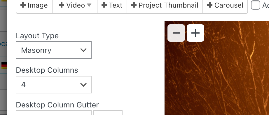
like this, you can make some elements span one column, others can span all columns or like 4 out of 5 or sth like that :DD
I also code custom websites or custom Lay features.
💿 Email me here: 💿
info@laytheme.com
Before you post:
- When using a WordPress Cache plugin, disable it or clear your cache.
- Update Lay Theme and all Lay Theme Addons
- Disable all Plugins
- Go to Lay Options → Custom CSS & HTML, click "Turn Off All Custom Code", click "Save Changes"
This often solves issues you might run into
When you post:
- Post a link to where the problem is
- Does the problem happen on Chrome, Firefox, Safari or iPhone or Android?
- If the problem is difficult to explain, post screenshots / link to a video to explain it