help with mobile menu styling needed
-
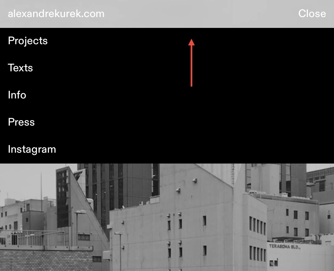
How can I fill the space between the open mobile menu and where the menu bar is with black? I‘m using a transparent menu bar with mobile menu style 1 and lowered the position of the open menu using this code (which doesn’t work properly):
@media (max-width: 768px) {
.mobile-nav-wrap {
background-color: black !important;
}
.laynav.mobile-nav.mobile-menu-style-style_1.active {
top: 36px !important;
background-color: black !important;
}
}Essentially what I want is the black space to reach up and fill the site title and menu button space only when the mobile menu is open. Any ideas really appreciated!
-
instead of top: 36px, do padding-top: 36px;
.laynav.mobile-nav.mobile-menu-style-style_1.active { padding-top: 36px !important; background-color: #000 !important; } -
im happy it works for you! no problem! sorry for the wait
I also code custom websites or custom Lay features.
💿 Email me here: 💿
info@laytheme.com
Before you post:
- When using a WordPress Cache plugin, disable it or clear your cache.
- Update Lay Theme and all Lay Theme Addons
- Disable all Plugins
- Go to Lay Options → Custom CSS & HTML, click "Turn Off All Custom Code", click "Save Changes"
This often solves issues you might run into
When you post:
- Post a link to where the problem is
- Does the problem happen on Chrome, Firefox, Safari or iPhone or Android?
- If the problem is difficult to explain, post screenshots / link to a video to explain it