Fullscreen carousel doubt
-
Hello Guys,
maybe this is a stupid answer, but i try :)
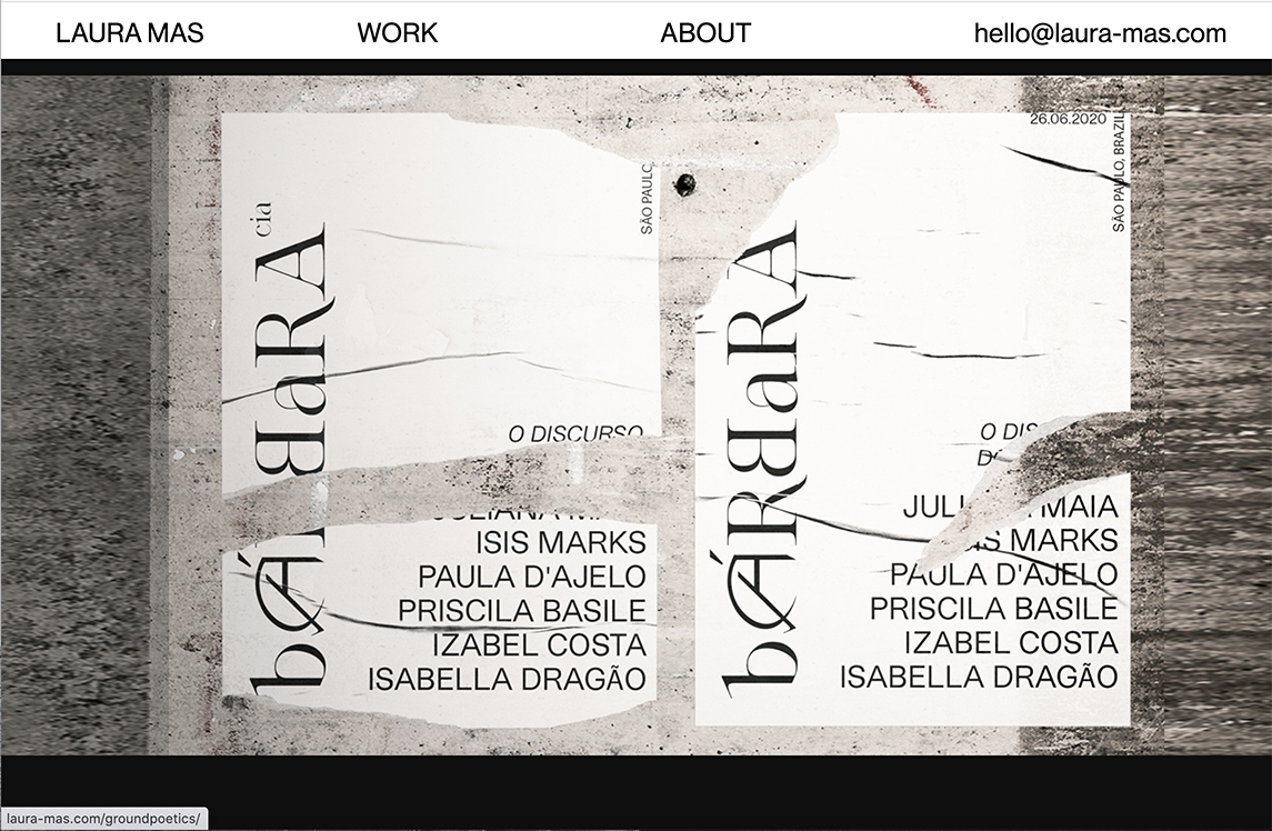
My website (www.lorenzoperrotta.org.uk) use a full screen carousel, but i don't like that when i resizing or visualize on tablet, the result is the resize image with a black part down, so I would in any case the site is fullscreen, maybe by cutting like this ivypark.com.
Does anyone know how to do it?
I hope I have explained it well, thank you and have a great week end!
:)L
-
Hi Elle!
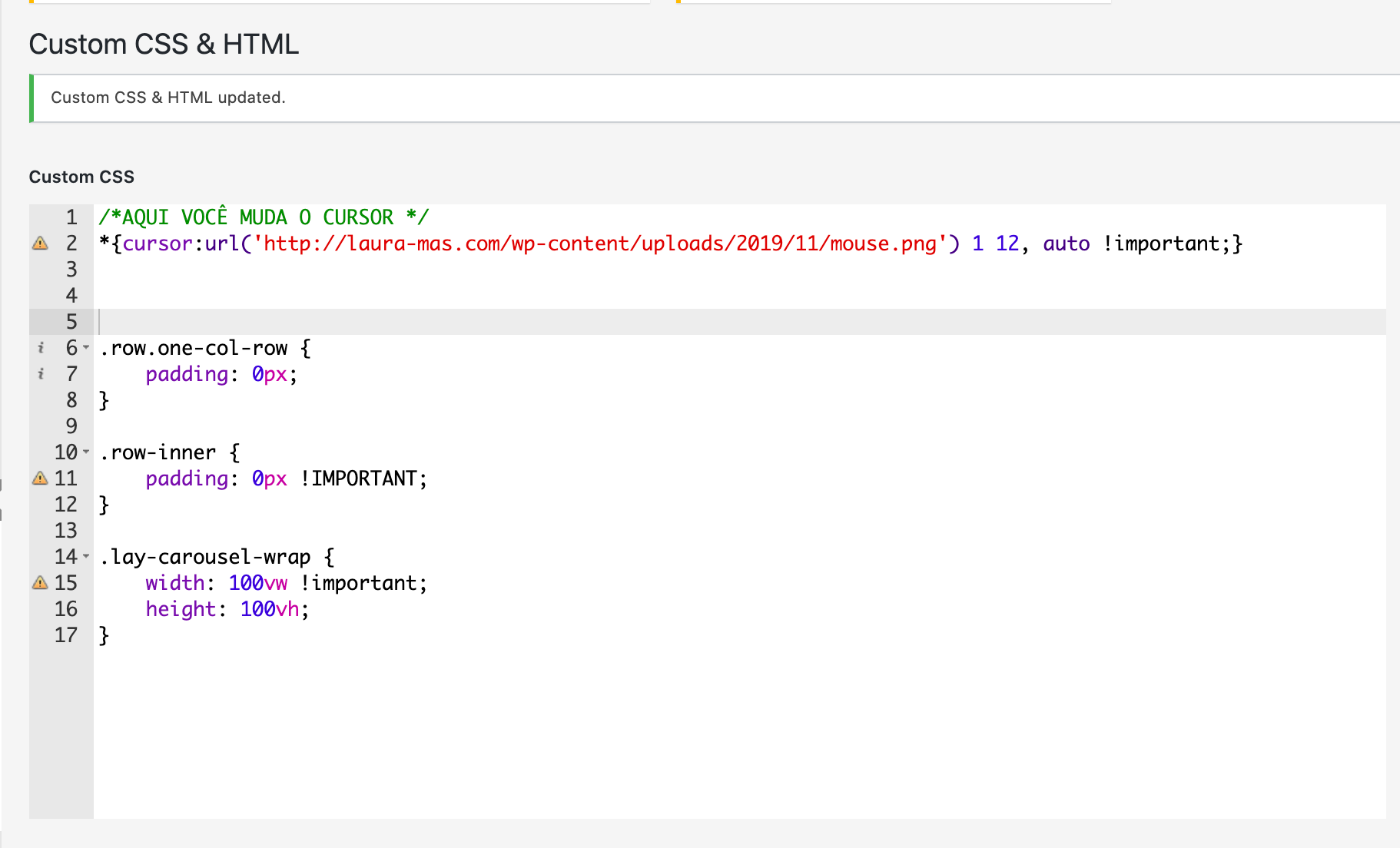
I would play around with this:
.row.one-col-row {
    padding: 0px;
}

.row-inner {
    padding: 0px !IMPORTANT;
}

.lay-carousel-wrap {
    width: 100vw !important;
    height: 100vh;
}
The solution is not 100% but you can get the idea.
I hope that helps. Let me know if you face trouble!
Best!
Marius
-
Hello!
I would like to know where i need to copy+ paste this code for it to work?I used it here, does that make sense? I tried pasting it everywhere else but it isn't working for some reason, not sure if i need to add anything else to the code?
Thank you! :)

-
Dear Laura
@lauramas
Yes this is correct :)
If you want to see the CSS being applied to your site - you can also add the code via:Customize > CSS
(note: they are the same input field, but one allows you to see the changes live - remember to click 'publish' when done )
Best wishes Laura 🌸
Richard
I also code custom websites or custom Lay features.
💿 Email me here: 💿
info@laytheme.com
Before you post:
- When using a WordPress Cache plugin, disable it or clear your cache.
- Update Lay Theme and all Lay Theme Addons
- Disable all Plugins
- Go to Lay Options → Custom CSS & HTML, click "Turn Off All Custom Code", click "Save Changes"
This often solves issues you might run into
When you post:
- Post a link to where the problem is
- Does the problem happen on Chrome, Firefox, Safari or iPhone or Android?
- If the problem is difficult to explain, post screenshots / link to a video to explain it
