Image layout on iPad
-
Hey guys,
I'm having a lot of trouble when looking at my website on an iPad.
www.petermarshall-photography.com
password: Jol1956p@When you click on the images on an iPad they have very little space at the top, and are not arranged on the page the way they appear on a laptop. It looks quite strange.
I though about using code to create some sort of top margin that specifically targets the ratio of an iPad screen like this:
@media all and (device-width: 768px) and (device-height: 1024px) and (orientation:portrait) {
.ipad-portrait { margin-top: 2cm; }
}
@media all and (device-width: 768px) and (device-height: 1024px) and (orientation:landscape) {
.ipad-landscape { margin-top: 2cm; }
}but I am not having any luck!
Any help would be really appreciated :))
-
-
Hey @mariusjopen
Sorry, I'm juggling so many passwords right now! The one you need is Fre1960a@
Thanks for looking into this for me!
-
Hey @mariusjopen , do you have any advice?
-
Hi @marshall
ok. I had a look also on an iPad.I cannot really see what you mean.
Can you provide us with screenshots and show what exactly you mean?
Thank you!
Marius
-
Hey @mariusjopen ,
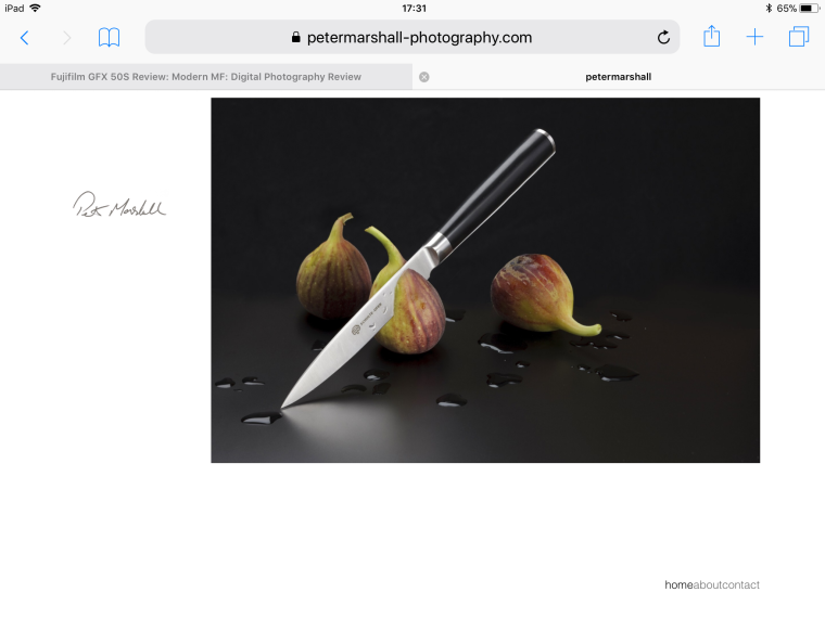
Here you go - this is how it is displayed on an iPad. As you can see, the image is very close to the top, with white space underneath. I like how the image is positioned on a computer/laptop screen (it has more space at the top), but really would like to shift it down when it is viewed on an iPad.
Thanks so much for your help!
-
Hi @marshall
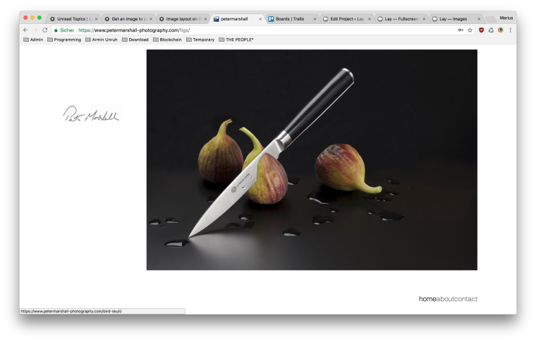
on my macbook the image is like in your iPad. On the very top of the screen.
Have a look:
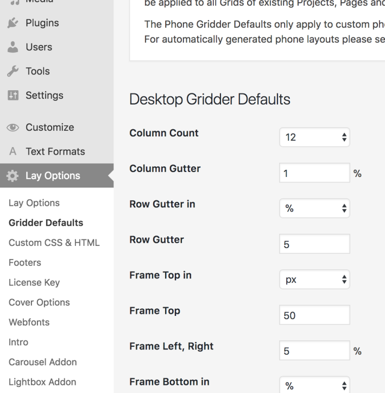
Here you can change the distance from the Gridder to the top:
TO only move it on the iPad you might need to use special mediaqueries. I cannot tell you now which ones you will need. But you can easily find out and test them.
You can just add them into the custom CSS.
Google: CSS media queries iPad sizeThen you can make specific CSS changes only for the iPad
All the best!
And good luck!Marius
-
Wonderful!
I also code custom websites or custom Lay features.
💿 Email me here: 💿
info@laytheme.com
Before you post:
- When using a WordPress Cache plugin, disable it or clear your cache.
- Update Lay Theme and all Lay Theme Addons
- Disable all Plugins
- Go to Lay Options → Custom CSS & HTML, click "Turn Off All Custom Code", click "Save Changes"
This often solves issues you might run into
When you post:
- Post a link to where the problem is
- Does the problem happen on Chrome, Firefox, Safari or iPhone or Android?
- If the problem is difficult to explain, post screenshots / link to a video to explain it