Space between elements off in Mobile
-
Hey there,
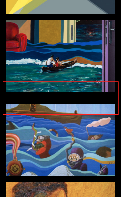
I'm having a problem with spacing between elements in mobile. On the main page I've set the spacing at 5% everywhere (top, bottom, in between etc) and for some reason the space between two specific thumbnails is off - it's larger than it should be (area in red square below). The thumbnails/images are exactly the same size, so I'm not sure why it's doing this. Has anyone experienced this or know if I'm going anything wrong?

Here is the site: www.perezconcepcion.com
I've updated everything and it's happening across multiple browsers, laptops and phones.
Thanks!
J. -
Hi @davidj
it looks like you gave each row also a margin bottom.
Can you check on your mobile-layout if there is a double margin somewhere?Let me know if that helped. Othwise I can have a look myself!
Best!
Marius
-
Hi @mariusjopen
thanks for your message! I don't think I've given individual margins (correct me if I'm wrong tho!).
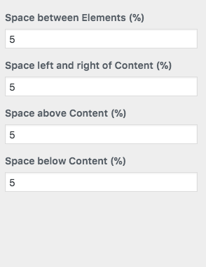
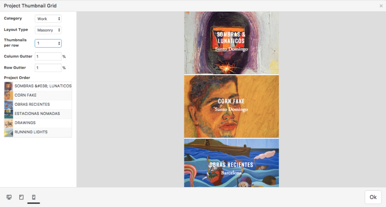
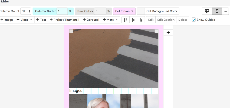
Here is what the mobile space percentage looks like in the customization tool, along with the "Work" category thumbnail grid and Gridder. It seems like the row gutter and spacing % is the same everywhere, so that's why I'm a bit confused as to why there's that random space between the second and third thumbnail. If you could have a look at it, that would be really helpful!
Thank you!


-
Hi @davidj
do you use a special mobile layout?

It looks like it starts a new row in the mobile version…
All the best!
Marius
I also code custom websites or custom Lay features.
💿 Email me here: 💿
info@laytheme.com
Before you post:
- When using a WordPress Cache plugin, disable it or clear your cache.
- Update Lay Theme and all Lay Theme Addons
- Disable all Plugins
- Go to Lay Options → Custom CSS & HTML, click "Turn Off All Custom Code", click "Save Changes"
This often solves issues you might run into
When you post:
- Post a link to where the problem is
- Does the problem happen on Chrome, Firefox, Safari or iPhone or Android?
- If the problem is difficult to explain, post screenshots / link to a video to explain it