fluid font size / fixed text format by changing browser size
-
Hi,
Im new into Lay theme and try my first steps.
I want to to do an basicly 2 column layout, one column the caroussel with slideshow, next to it in same row the description text.Now, when I change the browser size, the caroussel is fluidly changing its size, but the text remains in its given font size. This is leading to an unproportinal layout by having a mini-slideshow and a 2 or 3 words a line broken text next to it.
how is the way to have a fluid textsize. or a fixed textformat, which relativly changing its size by changing the browser size?
i hope it is understandable.
thank you in advance.robert
-
Hi @ontherun
yes. The text does not change its size proportionally.
Sometimes that is a good setup. But mostly it is not the desired effect.Anyway. You can achieve that by adding some CUSTOM CSS.
._Default {
    font-size: 2vw;
}
This is making the default text format always in 2% size of the window width.
You can play around with that.
Hope I could help!
Best!
Marius
-
I also code custom websites or custom Lay features.
💿 Email me here: 💿
info@laytheme.com
Before you post:
- When using a WordPress Cache plugin, disable it or clear your cache.
- Update Lay Theme and all Lay Theme Addons
- Disable all Plugins
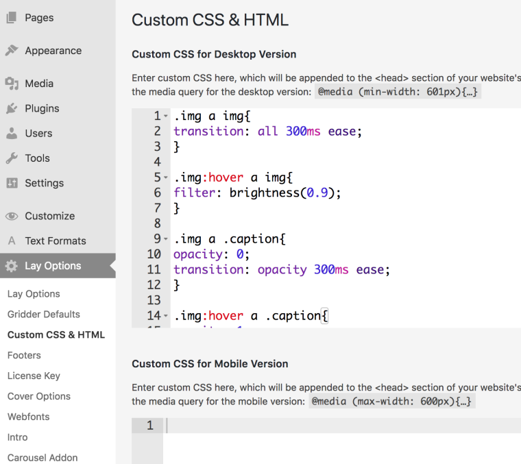
- Go to Lay Options → Custom CSS & HTML, click "Turn Off All Custom Code", click "Save Changes"
This often solves issues you might run into
When you post:
- Post a link to where the problem is
- Does the problem happen on Chrome, Firefox, Safari or iPhone or Android?
- If the problem is difficult to explain, post screenshots / link to a video to explain it