Mobile (smartphone) "use desktop menu for mobile" changes the orientation of my menu
-
Hi,
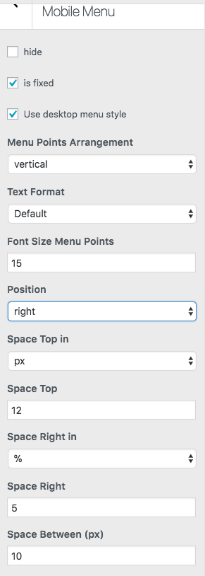
I'm excited to have the option to use my desktop menu navigation for my mobile site, however when I apply the feature, it seems to change the orientation of my menu... for example, it puts my 'about' menu on the right and 'index' on the left... Also, I'm wondering if there is a way to adjust the space between the menus on mobile? Any help would be great. Thank you!
-
Oh, can you send the URL please?
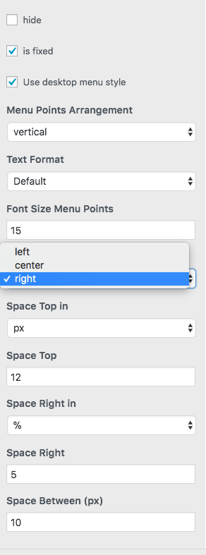
Afaik you can only set the menu position to "left" "center" or "right"
I also code custom websites or custom Lay features.
💿 Email me here: 💿
info@laytheme.com
Before you post:
- When using a WordPress Cache plugin, disable it or clear your cache.
- Update Lay Theme and all Lay Theme Addons
- Disable all Plugins
- Go to Lay Options → Custom CSS & HTML, click "Turn Off All Custom Code", click "Save Changes"
This often solves issues you might run into
When you post:
- Post a link to where the problem is
- Does the problem happen on Chrome, Firefox, Safari or iPhone or Android?
- If the problem is difficult to explain, post screenshots / link to a video to explain it
Online Users
Forgot your key, lost your files, need a previous Lay Theme or Addon version?
Go to www.laykeymanager.com