blurry lightbox images that flicker when they load + layout issue
-
Hi Armin, couple of unrelated issues I hope you can help me with:
-
there seems to be a problem with the Lightbox function on my website -
Some images look fuzzy/ blurry when they load, with some of those flickering and then turning sharp, after a few seconds, while others just stay fuzzy.
I'm using Chrome, but the problem looked worse on my friend's computer (she has a desktop with a larger screen, not sure if that's relevant) and using Firefox. -
on my smaller laptop screen, i m pretty happy with the layout - the size of the menu in comparison to the logo on the left. But wasn't aware that the menu doesn't scale up at all on larger screens - it just stays the same size (then looking tiny) while the logo scales up waaaaay large, which doesn't look too good by itself and even worse with the menu now looking really tiny :(
those two are the main BUG points, plus I just noticed
3. something which doesn't bother me as much - is menu point mouseover meant to make the point in the side menu light up as the mouse hovers over the corresponding image? because it doesn't seem to be doing that.thanks for your help and happy easter!
My website is on: emccollard.com (already sent you login details in the chat)
.......
(I also have another question of something I'd like to do and am not sure if it is possible with the theme - should i be posting this somewhere else?
here goes:::
i'd like to uncouple the menu on the left from the images and have a menu that shows categories instead - i.e. painting, work on paper, performance ... and when one of these menu points is clicked while the viewer is on the front / 'work' page for only those projects to be shown that belong to this category.
ideally, i'd like to be able to have only my new projects on the front/ work page all the time, and when the individual category is clicked for additional (older) projects to also show up on the front page (with those from other categories disappearing, if you see what I mean?)
Plus, I don't want to see the menu (just the home button) when I'm on the about page.
(maybe even not when I'm in the individual projects). Possible?
:) -
-
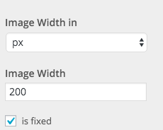
You can make your logo have a px size instead of a percentage based size. In "Customize" -> "Site Title" -> "Site Title":

Some images look fuzzy/ blurry when they load, with some of those flickering and then turning sharp, after a few seconds, while others just stay fuzzy.
When you open an image in the lightbox it first shows a lowres image and then loads the highres version. That's how I coded it. If your image doesn't turn sharp it probably means that you need to upload a larger version of that image.
Your third question, I don't understand what you mean, can u give me a screenshot?
Your other questions:
Atm it's only possible to have one menu.
What you mean is you want some kind of filter functionality. Right now theres no filter functionality, but for each category you'd need to create a page that contains all the project thumbnails of that category.On the about page you could hide your menu points by using custom css. Please take a look here at "Menu Color based on current page": http://laytheme.com/documentation.html#custom-css-styling
Just instead of changing your menu color on a specific page, you would hide menupoints on that page. You'd need to know some basic css to do that.
I also code custom websites or custom Lay features.
💿 Email me here: 💿
info@laytheme.com
Our Web Development company: 100k.studio
Want to tip me? https://www.paypal.com/paypalme/arminunruh
Before you post:
- When using a WordPress Cache plugin, disable it or clear your cache.
- Update Lay Theme and all Lay Theme Addons
- Disable all Plugins
- Go to Lay Options → Custom CSS & HTML, click "Turn Off All Custom Code", click "Save Changes"
This often solves issues you might run into
When you post:
- Post a link to where the problem is
- Does the problem happen on Chrome, Firefox, Safari or iPhone or Android?
- If the problem is difficult to explain, post screenshots / link to a video to explain it