link with fullscreen background image on hover
-
Hello,
I would like to have a landing page with a bit of type that links to the different categories of my photography portfolio.
And I would live if those links would have a fullscreen image connected to them that shows up on mouse over (behind the type). To if the user hovers on les say "people" he gets a people image as a fullscreen background behind the type layer.
Is that somehow possible? Would I need javascript or should css work?If so would it be possible to hide the primary menu on that one specific page?
Im not good in coding so any help is appreciated.
Thanks
Leo -
Dear @leo01
with CUSTOM CSS you can do it. No jQuery needed I assume.Also you can hide specific parts like the navigation on specific pages.
Have a look here:
http://laytheme.com/documentation.html#custom-css-stylingHope I could help a bit!
Best!
Marius
-
Hello, I was actually trying to do the same, but could you give me some hints on the css? I have the laytheme addon hover, and I have set my hover images over the content on purpose. Also sizes regarding width and height are 130%, although it seems it's not fullscreen. They are still adjusting based on the width. how could it be?
-
Dear @giselach
Unsure about your setup and any custom css you have currently.
Can you post a link to your website if able? 🔍The Goal is to have the images fullscreen yes?
Best wishes 🌝
Richard
@Richard the website is https://groups.uni-paderborn.de/digitale-ausstellung-bildhauerei/
and tha idea is that whenever you go over the menu categories and an image pops up, all the background is white (so you can't see what's behind).
so I guess would mean either applying a white overlay behind the hover images (so you don't see the background) or keeping the image full screen.
-
Dear @giselach
I see your content exists as a footer, therefore you would like some code saying, when we hover over an link or when the class
.showis added to the imagehover region then set the footer to haveopacity:0
Best
Richard
-
@mariusjopen said in link with fullscreen background image on hover:
Hello Richard! thanks for the answer, but I am not sure I am getting what you mean.
I want my hover images to be fullscreen with white background. I thought about uploading hover images with no background and then manually add a white background. In that. sense, the hover images won't be cut (if scaled) and will be fullscreen.
Also, as my footer is set as the menu, I am having some trouble on different screen sizes there are times where I can't see the full menu (it is cut) is there any way to make it fit the screen?
Thanks!!
-
Dear @giselach
Sorry if my reply was short, i can explain more 🌝
The Imagehover Addon images are all stacked within an "Imagehover region" they are already present on the page, but are hidden from us "invisible" . When a user hovers over a link, the "Class"
showis added to the Imagehover region. Theshowclass adds some CSS to the Image saying " Dont be invisible anymore, make yourself visible! " and so we see the image. When the user moves off the link, the classshowis removed from the Imagehover region and so too is the CSS that was telling the image to be visible.It would be best to make use of this action occurring. This
showclass being added and then removed. You can take advantage of this for what you are trying to achieve.If you want there to be a white background with the Images, you don't necessarily have to removed all the text, or make each image have its own fullscreen background container that is white.
Your text with links exists within the "footer-region"
You could say; " When the class
showis added to the Imagehover region -- then make the "footer-region" invisible""when the class
showis added to theimagehover-regionthen set thefooter-regionopacityto0"By setting your footer (your main content) to an opacity of 0 then to the user it would seem white anyway because your background is white and the text would become completely transparent.
Hope that better explains the process 🌻
Also, as my footer is set as the menu, I am having some trouble on different screen sizes there are times where I can't see the full menu (it is cut) is there any way to make it fit the screen?
The following Custom CSS for your footer region is causing the issue:
max-height: 100vh !important;
    max-width: 100vw !important;
    position: fixed;
If the text is set in "pixels" (px) which is a fixed unit then it will likely go over on smaller screens. If the text all added up equals over 700px in height then on screen less that 700px height, it will go over.
You should use a responsive unit so that it resizes based on the screen size. If the text when all added together equals 80% of the screen size in height, then even on a smaller screen it would still try to fit into 80% of the screen height.You can see how different "Units" apply and their behaviour here:
best wishes
Richard
-
Dear @Richard Thanks for the answers and the time you've given me
regarding the hover image: I would still to keep the footer-region visible (and over the image.
regarding the "responsive" footer height I've changed the
max-height: 100vh !important;
max-width: 100vw !important;
position: fixed;to:
max-height: 100% !important;
max-width: 100% !important;
position: fixed;but it still doesn't work... specially on Firefox and Safari. When I resize the tab and make it shorter the footer is not acting as responsive so it gets "cut".
However If I say:
max-height: 90% !important;
max-width: 90% !important;
position: fixed;the footer-region gets even bigger... shouldn't it be the opposite?
I'm quite desperate!!
Looking forward to your reply,
-
Dear @Richard,
Gisela and me work on this together. Would be amazing if you got back to us about the footer. The footer (=menu) is to small in Chrome but cut in Firefox and Safari. The footer should be completely visible in any desktop screen.
https://groups.uni-paderborn.de/digitale-ausstellung-bildhauerei/
Thanks a lot. Appreciate your help!
Best wishes
Daniel
-
Dear Daniel
@danny @giselach
The font-size being set to
pxmay be a reason. This is a fixed unit:If the screen is only a certain dimension of pixels then the content may well be too big. If you want the text to always remain visible even when the browser is resized you would want to look into Responsive text
https://www.w3schools.com/howto/howto_css_responsive_text.asp
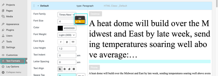
You could use % font sizes, setting this in Text Formats:
Hope this helps you and Gisela 🖼
Richard
-
Dear @giselach
I see 🤔
In text Formats each format has it's on HTML Class that your can see in the title area of the format, e.g HTML Class:_DefaultYou may want to use the unit
vhwhich is based on viewport height as apposed tovwwhich is veiwport width:You could apply this
vhunit to your Text format e.g (here targeting the default text format)._Default{ font-size:5vh; }
Best wishes
Richard
-
@Richard regarding the hovered image, how can I make it appear fullscreen? I know I should go for the same method you've just told me, 100vh and 100vw, but then I guess the image has it's own dimensions so either would appear as "cut" or incomplete. Also every hover image has its own id, is there a way to set a white background for all hovered images ?
so every time I hover an element that has a hover image set, it's background is white.
-
Dear @giselach
css selectors:
The container that holds the image-hover images:.lay-imagehover-regionThe images inside the Image hover container:
.lay-imagehover-region imgExample:
.lay-imagehover-region {
     background-color:white;
}
"how can I make it appear fullscreen?"
https://www.w3schools.com/howto/howto_css_full_page.asp
"is there a way to set a white background for all hovered images ?"
If it was fullscreen would you need the background to be white?
You could target either the container or the images themselves to add background colours:
Best wishes
Richard
-
Dear @giselach
css selectors:
The container that holds the image-hover images:.lay-imagehover-regionThe images inside the Image hover container:
.lay-imagehover-region imgExample:
.lay-imagehover-region {
     background-color:white;
}
"how can I make it appear fullscreen?"
https://www.w3schools.com/howto/howto_css_full_page.asp
"is there a way to set a white background for all hovered images ?"
If it was fullscreen would you need the background to be white?
You could target either the container or the images themselves to add background colours:
Best wishes
Richard
@Richard Hello Richard ! thanks for the answer,
but actually that's what I did long ago and seems not to affect the hover image, so, i'm quite stuck there.
Ideally we should just make the .lay-imagehover-region to scale and adapt to the screen size. But it's just not happening. When I tagged .lay-imagehover-region img it just changed it's position, got smaller and couldn't control it anyway ...
-
Dear @giselach
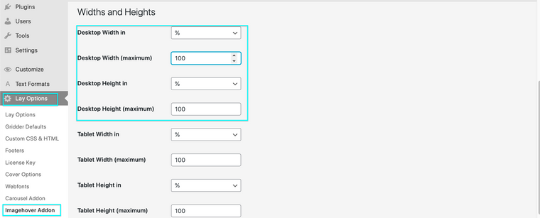
You can change the dimensions of your Imagehover region within > Lay Options > Imagehover Addon > Widths & Heights :
Settings for a 'row' within the Gridder may also be of interest:
Best wishes 🌝
Richard
-
Hello Richard, thanks again for your patience. Tough nut to crack… this i know, I actually have it in 100%fand 120% from the beginning, but as it stays for “maximum” it can still go smaller! Any other ideas?
I also code custom websites or custom Lay features.
💿 Email me here: 💿
info@laytheme.com
Before you post:
- When using a WordPress Cache plugin, disable it or clear your cache.
- Update Lay Theme and all Lay Theme Addons
- Disable all Plugins
- Go to Lay Options → Custom CSS & HTML, click "Turn Off All Custom Code", click "Save Changes"
This often solves issues you might run into
When you post:
- Post a link to where the problem is
- Does the problem happen on Chrome, Firefox, Safari or iPhone or Android?
- If the problem is difficult to explain, post screenshots / link to a video to explain it