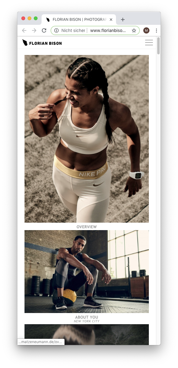
Phone only displays desktop version
-
Dear @flob13
it helps to send us a link to your website.You can activate an alternative mobile layout, though.

Hope that helps!
Best!
Marius
-
Hi Marius,
thanks for getting back so quickly!
My website is www.florianbison.com. Propblem is not only that the desktop version is displayed, when clicking on an image inside a project (such as the first one OVERVIEW) it won't enlarge it as it does when using a desktop computer!? Are these issues connected?
I know about the alternative mobile layout, but I want to avoid to layout every project individually for mobile since I'm happy with how it looks in the preview in wordpress.
I have turned everything upside down and hope you can help with this!
Thanks so much!
Flo -
Dear @flob13
it is not possible yet to enlarge images onClick on mobile like on the desktop.On the mobile it displays the content underneath each other.
That is not what you have in mind?Best!
Marius
-
Hi Maruis,
the problem is, that the phone does not show a mobile version. It shows the exact same that I see when I use my MacBook. Meaning that images are not displayed underneath each other but in the same layout that I built for larger screens. You can check it for yourself when visiting www.florianbison.com.
Thank you
Flo -
Dear @flob13
here the images are different on the mobile page:

Do I misunderstand something here?
Best!
Marius
I also code custom websites or custom Lay features.
💿 Email me here: 💿
info@laytheme.com
Before you post:
- When using a WordPress Cache plugin, disable it or clear your cache.
- Update Lay Theme and all Lay Theme Addons
- Disable all Plugins
- Go to Lay Options → Custom CSS & HTML, click "Turn Off All Custom Code", click "Save Changes"
This often solves issues you might run into
When you post:
- Post a link to where the problem is
- Does the problem happen on Chrome, Firefox, Safari or iPhone or Android?
- If the problem is difficult to explain, post screenshots / link to a video to explain it