mobile site crashes
-
Hi
I've recently tweaked my website and now when i'm viewing it on my mobile I get this message -
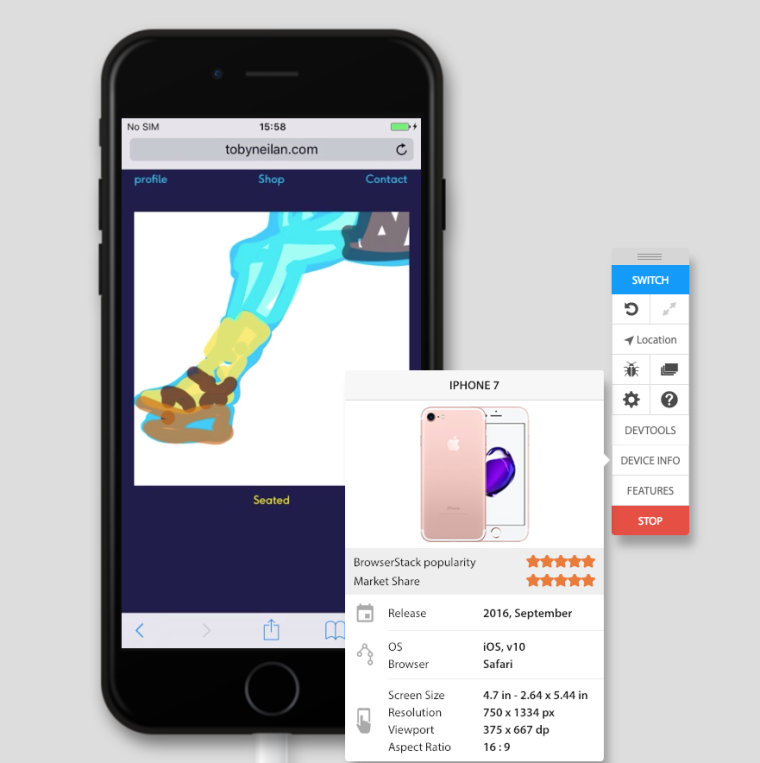
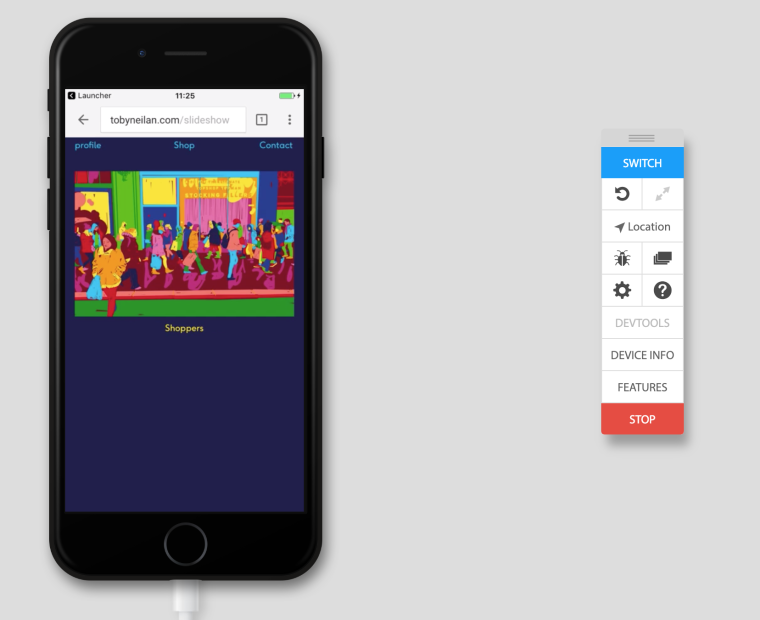
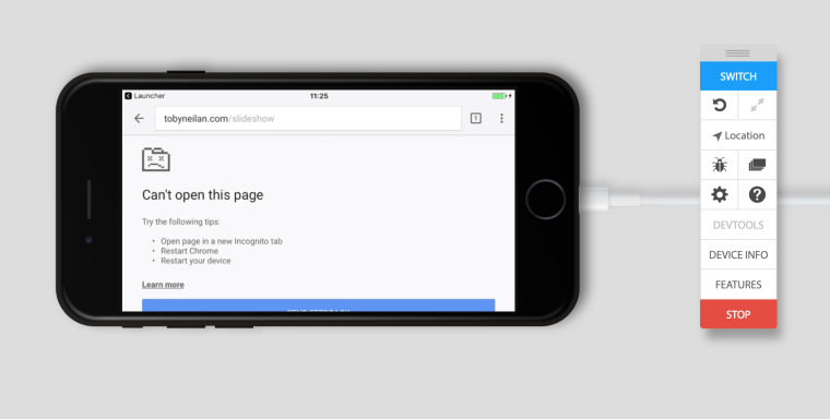
A problem repeatedly occurred on "http:tobyneilan.com/slideshow".
It also crashes when phone is turned from portrait to landscape.
I have an iPhone 7 plus
Cheers
Toby
-
Dear @Toby
oh wow! Looks like a bug!We will look into this!
Which plugins do you have activated?Best!
Marius
-
-
Did you add any custom code?
-
Hi Armin
Here's my custom code for for desktop and mobile - I have built separate layouts for the slideshow, shop and profile pages for the mobile
and this source code is written within project description of my shop images (desktop)
<p><img class="aligncenter" src="http://tobyneilan.com/wp-content/uploads/2019/01/BUY.png" /></p>Desktop css
.type-project .sitetitle{
display: none;
}
.hide-info {
    display: none;
}

.show-infos {
    display: block !important;
}

.type-category .descr{
display: none !important;
}
#lightbox-region #lightbox-inner.cursor-left img,
#lightbox-region #lightbox-inner.cursor-right img,
.cursor-left,
.cursor-right,
body,
a,
.lightbox-css-on #lightbox-region .close-lightbox,
.lightbox-css-on #main-region .col[data-type="img"] img,
.scrolltotop,
a{
cursor: url(http://tobyneilan.com/wp-content/uploads/2019/01/dot_arrow_pink.png) 17 17, auto !important;
}
body {
cursor: url(http://tobyneilan.com/wp-content/uploads/2019/01/dot_arrow_pink.png) 17 17, auto !important;
}

.col.above{
	transform: translateY(-90px);
	opacity: 0;
}

.col.below{
	transform: translateY(90px);
	opacity: 0;
}

.col.transition-in{
	transform: translateY(0);
	opacity: 1;
}

.col{
	transition: transform 0.5s cubic-bezier(0.165, .84, .44, 1), opacity 0.5s cubic-bezier(0.165, .84, .44, 1);
}
Mobile css
.burger{
display:none;
}

.hide-info {
    display: none;
}

.show-infos {
    display: block !important;
}
.col.above{
	transform: translateY(-90px);
	opacity: 0;
}

.col.below{
	transform: translateY(90px);
	opacity: 0;
}

.col.transition-in{
	transform: translateY(0);
	opacity: 1;
}

.col{
	transition: transform 0.5s cubic-bezier(0.165, .84, .44, 1), opacity 0.5s cubic-bezier(0.165, .84, .44, 1);
}
jQuery
<script>
jQuery(document).on("hover", ".info", function(event) {
	 jQuery(".hide-info").toggleClass("show-infos");
});
</script>

<style>
    .scrollto{
        cursor: pointer;
    }
</style>
Thanks
Toby -
Hey
So that page does not crash for me on an iphone 7, neither does it on an iphone 6.
You could try to remove your custom javascript and see if that changes anything.
-
This post is deleted!
-
Dear @Toby
Best is if you write me a PM and include your username, password and a link to this conversation.Marius
-
Dear @Toby
Best is if you write me a PM and include your username, password and a link to this conversation.Marius
@mariusjopen - email has been sent
Thanks in advance
Toby -
-
-
hey again, so i managed to reproduce this on phone rotation and it's rlly unclear to me why this would happen.
i will need to look at this more closely, however, this week we have an important launch for another project so i don't have time to look into this more right now. -
-
Nope sorry
-
-
-
-
No. I have too many other things to do at the moment and also this bug is rlly hard to fix. I've written it down and will try to fix it one day.
I also code custom websites or custom Lay features.
💿 Email me here: 💿
info@laytheme.com
Before you post:
- When using a WordPress Cache plugin, disable it or clear your cache.
- Update Lay Theme and all Lay Theme Addons
- Disable all Plugins
- Go to Lay Options → Custom CSS & HTML, click "Turn Off All Custom Code", click "Save Changes"
This often solves issues you might run into
When you post:
- Post a link to where the problem is
- Does the problem happen on Chrome, Firefox, Safari or iPhone or Android?
- If the problem is difficult to explain, post screenshots / link to a video to explain it