"Justified" option for element grid.
-
Some feedback: I think having a "justified" option would be a wonderful addition for layout for the element grid.
In other words, the option for the grid to be displayed in rows rather than columns.
For those of us with lots of horizontal images, it would be an extremely welcome option.
-
-
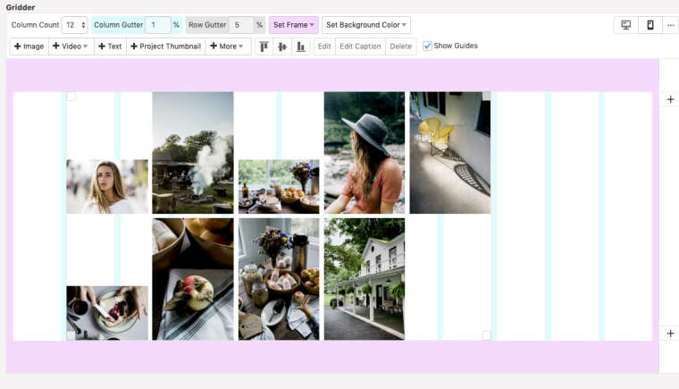
For reference, what I think would be useful is a grid like this
The difference is that the height of every image is adjusted so that it takes the entire height of the row.
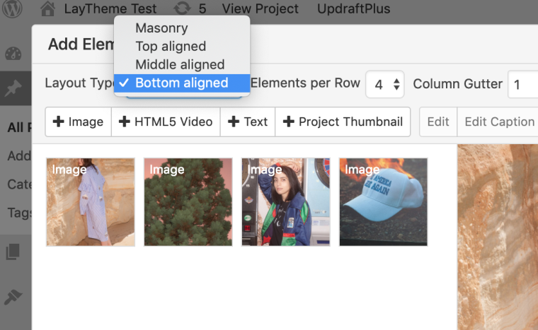
Here's how it looks with "bottom aligned" for me

Or am I missing something/is there some way to prevent these blank spaces?
-
Dear @jakobox
ok. I see.I will write that down for the future.
With a bit of CSS magic you can achieve that I think.Best!
Marius
-
Glad to hear it!
When you say "with a little CSS magic" do you mean that it's something that may be achievable by writing custom CSS and nothing more?
It's not something I could do, but if it's not a super complicated thing to do with just CSS, I might see about hiring someone to do it (so I can get it on my site sooner 😄)
-
Dear @jakobox
I don't know your skills.Best is to ask coder friends before and get an opinion.
There is a Facebook group: Crazy Cool Websites and Crazy Cool Developers.Best!
Marius
I also code custom websites or custom Lay features.
💿 Email me here: 💿
info@laytheme.com
Before you post:
- When using a WordPress Cache plugin, disable it or clear your cache.
- Update Lay Theme and all Lay Theme Addons
- Disable all Plugins
- Go to Lay Options → Custom CSS & HTML, click "Turn Off All Custom Code", click "Save Changes"
This often solves issues you might run into
When you post:
- Post a link to where the problem is
- Does the problem happen on Chrome, Firefox, Safari or iPhone or Android?
- If the problem is difficult to explain, post screenshots / link to a video to explain it
