Skip to content
  • Recent
  • Tags
  • Popular
  • Users
  • Search
Skins
  • Light
  • Cerulean
  • Cosmo
  • Flatly
  • Journal
  • Litera
  • Lumen
  • Lux
  • Materia
  • Minty
  • Morph
  • Pulse
  • Sandstone
  • Simplex
  • Sketchy
  • Spacelab
  • United
  • Yeti
  • Zephyr
  • Dark
  • Cyborg
  • Darkly
  • Quartz
  • Slate
  • Solar
  • Superhero
  • Vapor

  • Default (No Skin)
  • No Skin
Collapse

Lay Theme Forum

  1. Home
  2. Addons
  3. Padding / Aligning full screen slider

Padding / Aligning full screen slider

Scheduled Pinned Locked Moved Addons
7 Posts 2 Posters 568 Views
  • Oldest to Newest
  • Newest to Oldest
  • Most Votes
Reply
  • Reply as topic
Log in to reply
This topic has been deleted. Only users with topic management privileges can see it.
  • J Offline
    J Offline
    joeclarkx
    wrote on last edited by
    #1

    Hello I am using full screen slider with "Give elements a max-width and max-height and center them"

    I would love to be able to centre the content in the space to the left of the menu:
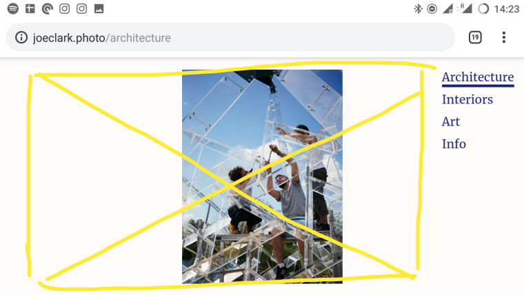
    http://joeclark.photo/architecture

    I tried this:

    .fp-section.fp-table {
    padding-right: 150px;

    It kind of worked, but pushed some content off the left edge.

    I guess I need something a bit fancier than just padding.

    Any tips?

    Thanks
    Joe

    1 Reply Last reply
    0
    • mariusjopenM Offline
      mariusjopenM Offline
      mariusjopen
      Global Moderator
      wrote on last edited by
      #2

      Dear @joeclarkx
      can you make a quick sketch of how you imagine it to look like?

      Best!

      Marius

      www.mariusjopen.world

      1 Reply Last reply
      0
      • J Offline
        J Offline
        joeclarkx
        wrote on last edited by
        #3

        Thanks Marius,

        I'm hoping to have the slider content scale to and centre in, the space to the left of the menu as in this marked up screenshot.

        0_1556195241996_Screenshot_20190425-142347__01.png

        1 Reply Last reply
        0
        • mariusjopenM Offline
          mariusjopenM Offline
          mariusjopen
          Global Moderator
          wrote on last edited by
          #4

          Dear @joeclarkx
          well, you just need to change the width of the slider module.
          You can do this with CUSTOM CSS or just by resizing the module in the gridder.

          Best!

          Marius

          www.mariusjopen.world

          J 1 Reply Last reply
          0
          • mariusjopenM mariusjopen

            Dear @joeclarkx
            well, you just need to change the width of the slider module.
            You can do this with CUSTOM CSS or just by resizing the module in the gridder.

            Best!

            Marius

            J Offline
            J Offline
            joeclarkx
            wrote on last edited by
            #5

            Thanks @mariusjopen

            I didn't think resizing in the gridder would be an option as I wanted to take advantage of "Give elements a max-width and max-height and center them" rather than having to lay out each image individually...

            As I wrote, I already did something with Custom CSS which kind of worked, but the value I edited ended up pushing some content off the screen to the left in the case of a 3:2 landscape image.

            If I try to rephrase my question to be more precise, I think it should be:

            "When using "Give elements a max-width and max-height and center them" in the slider module what value should I attempt to a hack in order to have the slider module work with only a portion of the viewport horizontally, rather than the whole thing?

            1 Reply Last reply
            0
            • J Offline
              J Offline
              joeclarkx
              wrote on last edited by
              #6

              For example, I have been playing around with this:

              .fp-section.fp-table{
              margin-left: 15vw!important;
              margin-right: calc(15vw - 200px)!important;

              }

              .fp-section.fp-table, .fp-tableCell{
              width: calc(70vw - 200px)!important;

              }

              but I have been struggling.

              The behaviour when resizing the window seems a bit unpredictable and I have been unable to dial in the values to get the content centred exactly in the space between the menu and the left of the viewport.

              It would be really useful to know if I am at least on the right track or if I am always going to fail because I'm missing a variable, or something about the Slider plugin is overwriting what I'm doing for example...

              1 Reply Last reply
              0
              • mariusjopenM Offline
                mariusjopenM Offline
                mariusjopen
                Global Moderator
                wrote on last edited by mariusjopen
                #7

                Dear @joeclarkx
                does it help to play around with this?

                .row.one-col-row.dofit.fp-section.fp-table {
                    width: 78%;
                    padding-left: 10%;
                }
                

                About the different sizes of the browser – probably many different values are calculated together, this is why it is different for each width.

                To make things easy, I would use media-queries to make a new value for every 100px or so.
                I know that this is not a clean solution. But since it is a small website – it is possible.

                Best!

                Marius

                www.mariusjopen.world

                1 Reply Last reply
                0
                Reply
                • Reply as topic
                Log in to reply
                • Oldest to Newest
                • Newest to Oldest
                • Most Votes


                I also code custom websites or custom Lay features.
                💿 Email me here: 💿
                info@laytheme.com

                Before you post:
                1. When using a WordPress Cache plugin, disable it or clear your cache.
                2. Update Lay Theme and all Lay Theme Addons
                3. Disable all Plugins
                4. Go to Lay Options → Custom CSS & HTML, click "Turn Off All Custom Code", click "Save Changes"

                This often solves issues you might run into

                When you post:
                1. Post a link to where the problem is
                2. Does the problem happen on Chrome, Firefox, Safari or iPhone or Android?
                3. If the problem is difficult to explain, post screenshots / link to a video to explain it
                Online Users
                _
                _flx
                Forgot your key, lost your files, need a previous Lay Theme or Addon version? Go to www.laykeymanager.com
                laytheme.com
                • Login

                • Don't have an account? Register

                • Login or register to search.
                • First post
                  Last post
                0
                • Recent
                • Tags
                • Popular
                • Users
                • Search