Background image in gridder / text overlay
-
Hello Armin & Marius,
would it be possible to consider, for future features, having the possibility to integrate background images in the gridder instead of having it filling the entire row (+ using browser height for row height)? The aim would be to have more flexibility to place it in the layout.
It would also be fantastic to have more flexibility when placing an overlay text onto the background image. I might have missed something but, for the moment, I can only put the text on the top, middle and lower part of a background image which fills a row which is browser height.
Thank you & have a great day! -
Dear @naperonable
you can always set a background as an image. Even though the height is not set to full.What do you imagine which positioning the text? You can make a right click on the element and also give it an offset.
Best!
Marius
-
absolutely, sorry I didn't integrate the link to the message!
-
Dear @naperonable
can you show us a quick sketch in Photoshop of how you imagine it to look like?
Thank you!Marius
-
Here we go with some quick sketches @mariusjopen
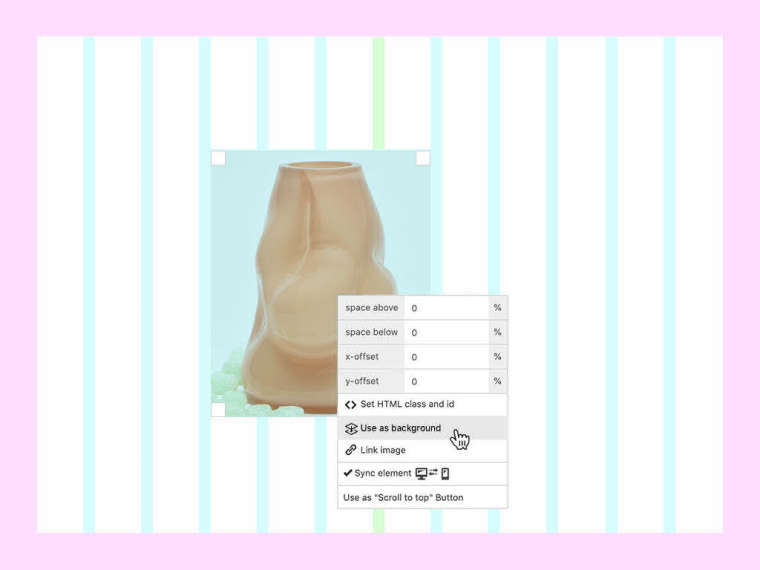
I’m aware that it’s possible to use any image or video as a background. With the method I illustrated below there would be the possibility to freely place more images (or even text) in the gridder, resize, offset and align them as desired and use that layout as a background (aka. move it behind the main content via z-index).
I guess that’s what @naperonable was trying to describe – I imagine something like this could be a pretty cool solution:
#1
Place an image or content in the gridder and be able to right-click it to put it in the background.

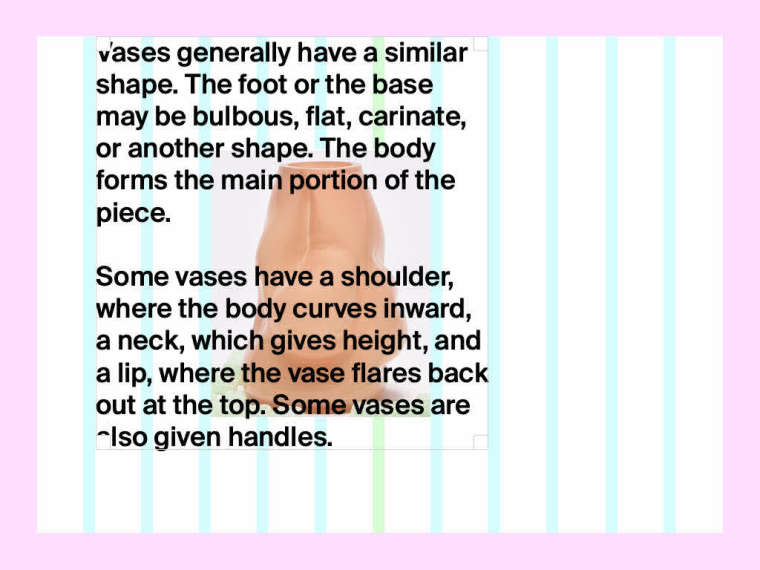
#2
Be able to place any content freely above the element(s) in the background.

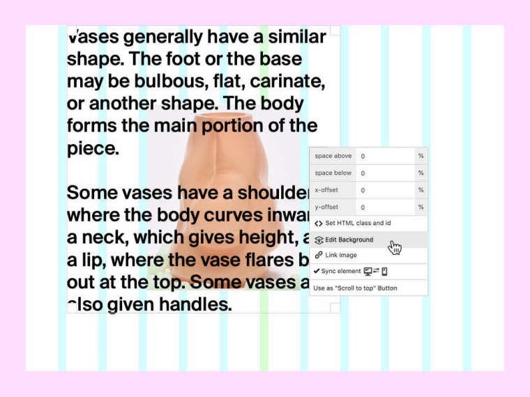
#3
If one wants to edit the background again → right-click in the row → Edit Background. The content in the front should be hidden and the background can be edited (looks like #1)

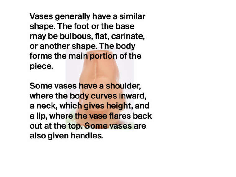
#4
The frontend might look like this or similar after the editing is done and published:

-
Dear @edgrbnz
oh wow! This is good input!We love it!!!
Nice new avatar, by the way!
This will be considered :-D
Best!!!
Marius
-
Coool! Glad this somehow makes sense 😎
After looking at it again:
It’s not perfekt in terms of usability. There may be the need of an indicator / flag per row to show if the user is currently editing the fore- or the background.Looking forward to the implementation 🤩
-
Wow that's cool!
I also code custom websites or custom Lay features.
💿 Email me here: 💿
info@laytheme.com
Before you post:
- When using a WordPress Cache plugin, disable it or clear your cache.
- Update Lay Theme and all Lay Theme Addons
- Disable all Plugins
- Go to Lay Options → Custom CSS & HTML, click "Turn Off All Custom Code", click "Save Changes"
This often solves issues you might run into
When you post:
- Post a link to where the problem is
- Does the problem happen on Chrome, Firefox, Safari or iPhone or Android?
- If the problem is difficult to explain, post screenshots / link to a video to explain it