Carousel 100vh on mobile not working
-
Hello everybody,
I did this single row page where inside there is only the fantastic LT Carousel in 100vh height. Everything works perfectly on Desktop, no extra top or bottom padding. No overflow. Cool! But when you switch to Mobile there this annoying scroll due to I dont know what.
You can see it here, please use the mobile to check it because from the desktop browser inspector seems fine.
I have already set Use Browser Height for Row Height and the Top and Bottom margin to zero.By doing various tests I tried to enable the Fullscreen Slider and set its direction to Horizontal. For making it working I had to add another Row, but in this way the Carousel height was perfectly stuck, zero overflow! But this system was not working for me because I just need one Row for one Carousel.
So, is there a way to have the Carousel perfectly stuck at 100vh as it works in the Fullscreen Slider?
Hope you understand my point :)
Thank guys,
melo -
Dear @melo_lenosier
the carousel works fine on mobile with 100vh.Can you show a screenshot?
Best!
Marius
-
It works, ok, but it's not properly fixed as when you active the Fullscreen slider with the direction set to Horizontal. Indeed now you can scroll up and down a little bit, but that should not happen. The hoverflow should be completely hidden. You know what I mean?
Here you can see it in a video.
Thanks
-
-
Ok, please let me know!
Meanwhile I wanted to know if at the moment there are any alternative solutions.
For example, if I use the Carousel while enabling the Fullscreen Slider it work perfectly, it doesn't overflow vertically (here). The only problem is that, in order to make the Fullscreen slider working, I have to insert 2 Rows and in this way there are problems when swiping from left to right because one Row has the Carousel with all the images inside and the other Row has just one image inside another Carousel.
I wonder if there is a way to make the Fullscreen slider working with just one Row. That would solve the problem. Or maybe having 2 Rows but one should be set in display:none (but probably is not that easy).Hope you understand what I meant.
Thanks again!melo
-
Nothing of that kind. Everything is set the same: 0 margin or padding.
It's a Carousel problem.
But thanks for checking! :) -
-
Yea, will try to fix this soon!
-
Danke schön!
-
@melo_lenosier Was this issue ever resolved? I am running into the same problem myself.
-
-
links guys?
you might need to do
body {
    padding-top: 0!important;
}
in lay options → custom html & css → custom css for mobile
usually there will be a space at the top so the content does not start underneath the mobile menu bar. this could be the issue.
if that doesn't fix it for you, post your website link here
-
ok so on an iphone, 100vh is actually the height of the browser + the top and bottom browser bars.
so the issue is not that the row/carousel is not set to browser-height, the issue is that on an iphone safari, browserheight is interpreted differently.
also it is interpreted differently for an iphone with a home-button and one without a homebutton.
you can try and create a custom phone layout and then use: "100vh - 110px" as your carousel fixed height. also make sure in that row, don't have your row be "browser height"
-
Hi @arminunruh thanks, I try it, but also this doesn't work. The final target is to create a carousel that can swipe horizontal, with show multiple slides, like in the desktop view (where is perfect) but in the mobile view. Have you other ideas to create it?
Thanks
-
hey everybody
So i just released an update for both laytheme and the carousel plugin. Please update both.
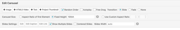
Now in your carousel, as your fixed height, write: 100vh
Let me know if it works, if it doesn't do the trick, post the link to where you have the problem. Thx
 I try also with 100vh - 110px and with free drag selected but not work.
I also code custom websites or custom Lay features.
💿 Email me here: 💿
info@laytheme.com
Before you post:
- When using a WordPress Cache plugin, disable it or clear your cache.
- Update Lay Theme and all Lay Theme Addons
- Disable all Plugins
- Go to Lay Options → Custom CSS & HTML, click "Turn Off All Custom Code", click "Save Changes"
This often solves issues you might run into
When you post:
- Post a link to where the problem is
- Does the problem happen on Chrome, Firefox, Safari or iPhone or Android?
- If the problem is difficult to explain, post screenshots / link to a video to explain it