Inconsistent dimensions with add ons
-
Hi -
I have all three add-ons uploaded to my website and am now noticing the consistent inconsistencies within them.
-
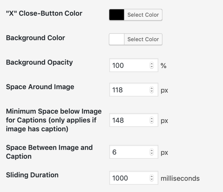
My carousel feature is set to have a caption appear 10px below it. When i add a caption to Lightbox feature, I have to set it to 6px to appear close to what the carousel caption is at. Am I doing something wrong?
-
I want my carousel & lightbox images to both be centered on the pages, with the same amount of padding around them, however I can't seem to make it work. Any advice?
-
-
Dear @jfrederick
-
Thank you for letting us know. We will look into this.
-
Can you show a rough sketch do illustrate what you have in mind?
Best!
Marius
-
-
Dear @jfrederick
-
Thank you for letting us know. We will look into this.
-
Can you show a rough sketch do illustrate what you have in mind?
Best!
Marius
@mariusjopen Thank you, as always Marius!
- I have included screen grabs of the issue.
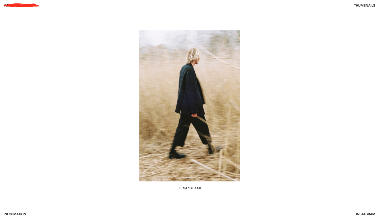
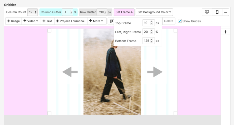
The Carousel page is designed like so.
FRONT END

BACK END

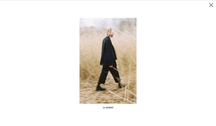
Thumbnail PAge ft. LIGHTBOX
FRONT END

BACK END

Any help on how I can get these images perfectly centered to be the exact same with padding the same, would be greatly appreciated!
-
-
I also code custom websites or custom Lay features.
💿 Email me here: 💿
info@laytheme.com
Before you post:
- When using a WordPress Cache plugin, disable it or clear your cache.
- Update Lay Theme and all Lay Theme Addons
- Disable all Plugins
- Go to Lay Options → Custom CSS & HTML, click "Turn Off All Custom Code", click "Save Changes"
This often solves issues you might run into
When you post:
- Post a link to where the problem is
- Does the problem happen on Chrome, Firefox, Safari or iPhone or Android?
- If the problem is difficult to explain, post screenshots / link to a video to explain it