Videos & Single Images width & height
-
Hey Guys
I have a simple split screen scenario where I present content on either side. I figured our how to keep the carousell slider "Fullscreen" (on one side of the screen) all of the time, but single images and videos still get resized the wrong way (white space on the left/right side or on top/bottom), depending on the size of the Browser window.Examples of a single image: https://thisisthis.ch/rush-hour
Example of a video: https://thisisthis.ch/durst
I'd like the single images and videos to be resized to fill the right side all of the time, no matter the Browser window size.
Like this carousell slider for example: https://thisisthis.ch/versus_installation/Thanks for any Tips!
Cheers -
-
Dear Marius
Thank you for your Feedback, I created a class .videothis for the video and added.videothis {
height: 100vh !important;
object-fit:cover !important;}
But this is the result:
https://thisisthis.ch/durstany ideas what I could be missing?
I tried a lot but I can't seem to strech it over the whole side when.
When the window is resized to a smaller desktop/Tablet size, the video keeps at full width, but sticks it to the top?
Thank you!
Joel -
Dear @this
probably you need to also adress the video inside your class..videothis video { height: 100vh !important; object-fit:cover !important; }Best!
Marius
-
Dear @mariusjopen
With the video beeing also adressed, it just sticks to the bottom now:
https://thisisthis.ch/durstMaybe this example gives you another idea/hint of where the problem may lay?
Thanks a lot!
Joel -
-
Dear @mariusjopen
I tried that already, this snippet simply sticks the video to the top, but it doesn't cover the whole height or get's scaled up in any way...
Would you like to have access to the site so you can see more details?
Best
Joel -
Dear @this
.html5video {
    position: relative;
    height: 100vh;
This is what I meant with parent classes.
Best!
Marius
-
Dear @mariusjopen
It works!
Only problem is, the .html5video class also effects other elemtens like the one on the right side of the homepage. This Video now moves up?!I added a sketch for reference because I didn't want the snippet to stay in there.
I tried to switch classes or to reset some properties in another class, added to that video on the homepage - without success...Also I was not able to strech a single image the same way like the Video, I tried adding the snippet to the .img class and added my own class .einzelbild to the image in the lay editor, but I could not get it to work...
https://thisisthis.ch/rush-hourThank you so much for all your help!
Joel !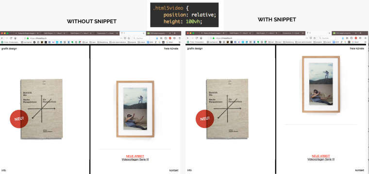
-
Dear @this
as well you need to give 100vh to the video element. Use object fit. And of course to the parent element to give it the space to stretch out.Best!
Marius
-
Dear @mariusjopen
I did give "height: 100vh;" to the video element as you suggested, but this resulted in a missplaced video element on the front page, as shown in the screenshot above.
I also added "object-fit: cover;" to the parent element (which is .ph I think?), but it didn't help.Here's all the costum CSS I use right now, maybe you see a flaw?
.col .lay-carousel {
height: 100vh;
top: 0px !important;
margin-top: 0px !important;
padding: 0px !important;
}.flickity-slider {
height: 100vh;
top: 0px !important;
}.lay-carousel-slide {
top: 0 !important;
height: 100vh;
margin-top: 0px !important;
}.col .lay-carousel img.h100 {
height: 100vh !important;
top: 0;
object-fit: cover!important;
width: 100%;
}.videothis video {
height: 100vh !important;
object-fit:cover !important;
}.html5video {
position: relative;
height: 100vh ;
object-fit: cover !important;
}.ph{
object-fit: cover !important;
} -
Dear @this
I added this and it works:video { object-fit: cover !important; height: 100vh !important; }:-) ?
Best!
Marius
I also code custom websites or custom Lay features.
💿 Email me here: 💿
info@laytheme.com
Before you post:
- When using a WordPress Cache plugin, disable it or clear your cache.
- Update Lay Theme and all Lay Theme Addons
- Disable all Plugins
- Go to Lay Options → Custom CSS & HTML, click "Turn Off All Custom Code", click "Save Changes"
This often solves issues you might run into
When you post:
- Post a link to where the problem is
- Does the problem happen on Chrome, Firefox, Safari or iPhone or Android?
- If the problem is difficult to explain, post screenshots / link to a video to explain it