element grid - problem with spaces when set to zero
-
Hi there,
thanks for the great theme, and also for updating regularly - appreciate the amazing support. But I have found a bug which bothers me....
Using the element grid with no spaces between the images causes - depending on the browser window size - spaces, which looks not very nice... I get horizontal and vertical white spaces between my images depending on the browser size... When using the browser window fullscreen - everything works fine....
Is there any solution?
Thanks....Patrick -
Dear @contact
Can you post a link to our website?
Then we can have a look and inspect that.But I think I know what you mean…
Best!
Marius
-
Dear @contact
Can you post a link to our website?
Then we can have a look and inspect that.But I think I know what you mean…
Best!
Marius
Hi, for example we-shoot-portraits.com , but it happens on all my wesites I use your theme... Just change windiw size than you see spaces (horizontal or vertical, depending on size of browser window) thanks. Patrick,
-
Dear @contact
this looks like a bug.I will let Armin know!
Thank you for using LayTheme!
Best!
Marius
-
sorry for the late reply, i was on holidays
i cannot reproduce the issue, neither on chrome nor safari
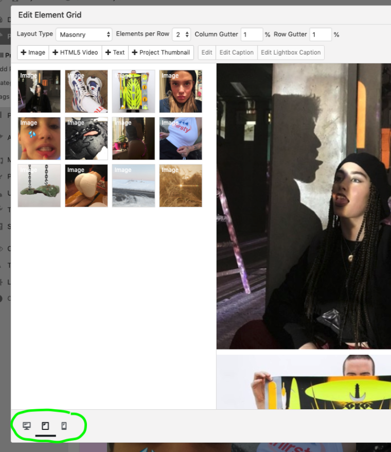
maybe it has to do with this: when you edit an element grid, you need to set the column gutter and row gutters for tablet and phone sizes also when clicking these buttons, otherwise they will have a default value of 1% i think:

I also code custom websites or custom Lay features.
💿 Email me here: 💿
info@laytheme.com
Before you post:
- When using a WordPress Cache plugin, disable it or clear your cache.
- Update Lay Theme and all Lay Theme Addons
- Disable all Plugins
- Go to Lay Options → Custom CSS & HTML, click "Turn Off All Custom Code", click "Save Changes"
This often solves issues you might run into
When you post:
- Post a link to where the problem is
- Does the problem happen on Chrome, Firefox, Safari or iPhone or Android?
- If the problem is difficult to explain, post screenshots / link to a video to explain it