Lay Theme Forum

    • Register
    • Login
    • Search
    • Recent
    • Tags
    • Popular
    • Users
    • Search

    Breaking point for Tablet

    Bug Reports
    2
    6
    162
    Loading More Posts
    • Oldest to Newest
    • Newest to Oldest
    • Most Votes
    Reply
    • Reply as topic
    Log in to reply
    This topic has been deleted. Only users with topic management privileges can see it.
    • E
      evey_k last edited by

      Hi there!

      I actually have finished my website sometime ago, and i remember i never had this problem with the breaking point on a tablet.

      Only recently, when i scale down my browser to tablet size, the layout disintegrated, and i have no idea what could be the problem.

      Could you please help?

      http://eveykwong.com/

      1_1573338295021_Screenshot 2019-11-09 at 23.23.34.png 0_1573338295021_Screenshot 2019-11-09 at 23.12.42.png

      1 Reply Last reply Reply Quote 0
      • mariusjopen
        mariusjopen Global Moderator last edited by

        Dear @evey_k
        you can set a breakpoint for mobile and for phone.

        You tried this?

        Best!

        Marius

        www.mariusjopen.world

        1 Reply Last reply Reply Quote 0
        • E
          evey_k last edited by evey_k

          Yes it is already set by default for Tablet 1024px and iPhone 600px. But i think the problem lies that there's not really a tablet layout to arrange / organise my layout. Perhaps that explains why it breaks?

          And strangely i only have this problems on my main page. The content pages (with almost the same layout) are not affect.

          Could you please advise how i could resolve this? Thx in advanced!

          @mariusjopen

          1 Reply Last reply Reply Quote 0
          • mariusjopen
            mariusjopen Global Moderator last edited by

            Dear @evey_k
            you could set your own breakpoint for this specific case with media query and CUSTOM CSS. I think that this is the fastest way.

            Best!

            Marius

            www.mariusjopen.world

            1 Reply Last reply Reply Quote 0
            • E
              evey_k last edited by

              I'm very sorry @mariusjopen, i really need your help on this. I'm not fit in media query.
              All i know is i have to put these on my CSS, but i don't know what should appear on the HTML content / head:

              @media only screen
              and (min-device-width : 768px) {
              }

              @media only screen
              and (min-device-width: 481px)
              and (max-device-width: 1024px)
              and (orientation:portrait) {
              }

              @media only screen
              and (min-device-width: 481px)
              and (max-device-width: 1024px)
              and (orientation:landscape) {
              }

              --
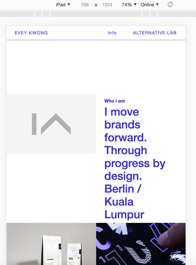
              Here is again screenshot when scaled down (tablet size):
              0_1574107227688_Screenshot 2019-11-18 at 20.59.40.png
              http://eveykwong.com/

              Please help, thank you so much!

              1 Reply Last reply Reply Quote 0
              • mariusjopen
                mariusjopen Global Moderator last edited by

                 @media only screen and (max-width: 700px) {
                       ._h5 {
                            font-size: 30px;
                        }   
                 } 
                

                Try to add something like this into the CUSTOM CSS section.

                Best!

                Marius

                www.mariusjopen.world

                1 Reply Last reply Reply Quote 0
                • First post
                  Last post

                Before you post

                Use the Search Feature. Maybe there is already a solution to your issue.

                1. Update Lay Theme and all Lay Theme Addons
                2. Disable all Plugins
                3. Go to Lay Options → Custom CSS & HTML, click "Turn Off All Custom Code ", click "Save Changes"
                4. Now see if your problem solved itself
                5. Go here, see if your problem is listed here:
                Troubleshooting

                When you post:
                1. Post a link to where the problem is
                2. If the problem is difficult to explain, post screenshots / link to a video to explain it

                Thanks!

                Online Users

                S

                Recent Topics

                • T

                  OpenType Feature

                • T

                  Split Screen just on front page / subpages without the split?

                • T

                  problem when I click on the category filter buttons on mobile

                • G

                  z index has different behaviors on different pages

                laytheme.com