Can a background colour be applied to multiple rows and the row gutter inbetween them?
-
Hi guys,
Thanks so much for the theme. Its great and easy to use.
I was wondering if it is possible to add a back ground colour to multiple rows and the row gutter between them?
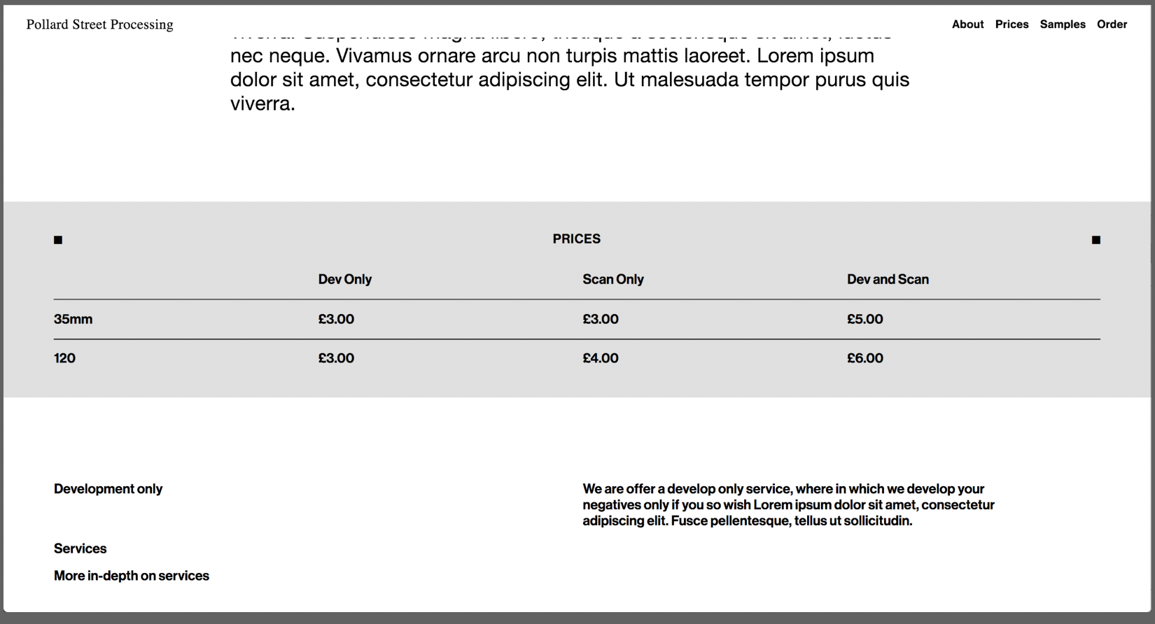
For example here:

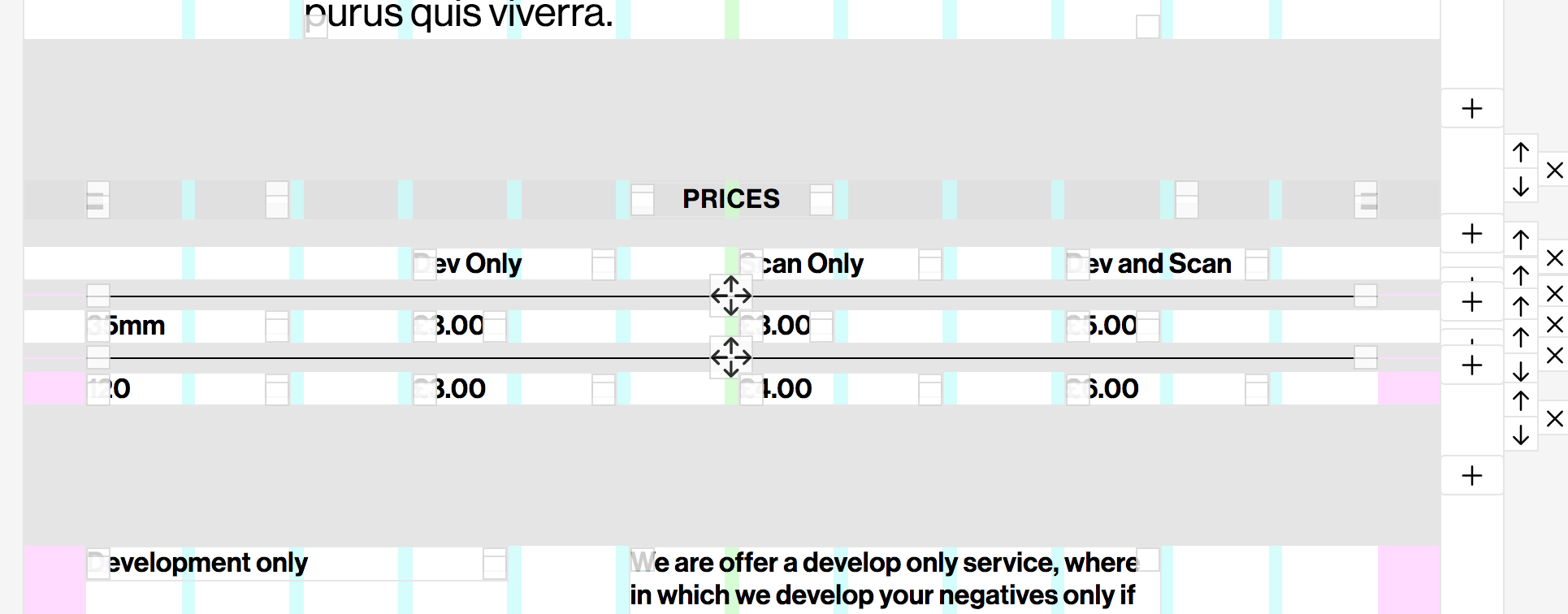
I want to apply a background colour to that entire 'prices' section.
I'm aware I can set background colour of the individual rows, but not the spaces between them. I can also use custom classes and CSS colour the rows, but the space between the rows would still be the background colour of the page back ground.
I want this section to have a big box of colour around it to separate it from the normal page background colour.
Thank you for your time,
Jack
-
P.S.
I have tried the stack element but this table requires multiple elements to be on the same row and attached to columns for responsive-ness reasons.
It is also hard to make the table neat enough when using the stack element (as I know it is not intended for this purpose).
Thanks again
-
A good example of what I mean would be this website: https://anime-architecture.org/
-
Dear @J-KMB
can you send a link to the page where you want to adjust the background colours?Best!
Marius
-
Hi Marius.
A link to the (incomplete) site is here :http://box5394.temp.domains/~pollard4
and this image is roughly how I'm trying to get the prices section to look, as described above

Thanks,
Jack -
I don't think you can have spaces between the rows because those spaces will be white.
But there's a work-around.Here's a way:
- right click on each of the rows that should have a background colour and apply the colour you want.
- right click the dividing lines and give them a space above and below of maybe 1-2%.
- right click the text field where it says "PRICES" and give this a space below and above. Here maybe 3%.
- right click the text field on the bottom row and give this a space below of 3% as well.
- adjust the space between the rows to 0%
- update page.
Bonus: to get the two squares on the first row to align with "PRICES" just select them and click align to middle in the toolbar or give them the same space above and below.
That should work. :)
-
Dear @Anders
great reply!
Thank you!Marius
-
Sweet!
Thank you for letting us know!
I also code custom websites or custom Lay features.
💿 Email me here: 💿
info@laytheme.com
Before you post:
- When using a WordPress Cache plugin, disable it or clear your cache.
- Update Lay Theme and all Lay Theme Addons
- Disable all Plugins
- Go to Lay Options → Custom CSS & HTML, click "Turn Off All Custom Code", click "Save Changes"
This often solves issues you might run into
When you post:
- Post a link to where the problem is
- Does the problem happen on Chrome, Firefox, Safari or iPhone or Android?
- If the problem is difficult to explain, post screenshots / link to a video to explain it