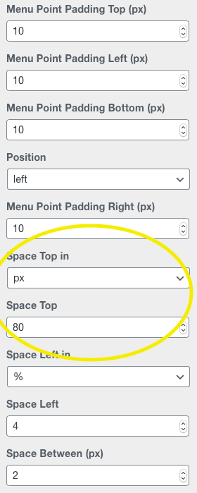
Mobile Menu top space top does not work
-
The domain is http://2020ennoschramm.de/now
In the mobile version I'm using the Desktop Menu Style.
Now the top space doesn't apply.I chose top space 80px but the menu is still at the top of the mobile version.
Any idea?
Many thanks
Daniel


-
Dear @danny
we are looking into it.
Best!
Marius -
Dear @mariusjopen, any news?
Best!
Daniel -
Sorry to revive this thread but I'm also interested in this!
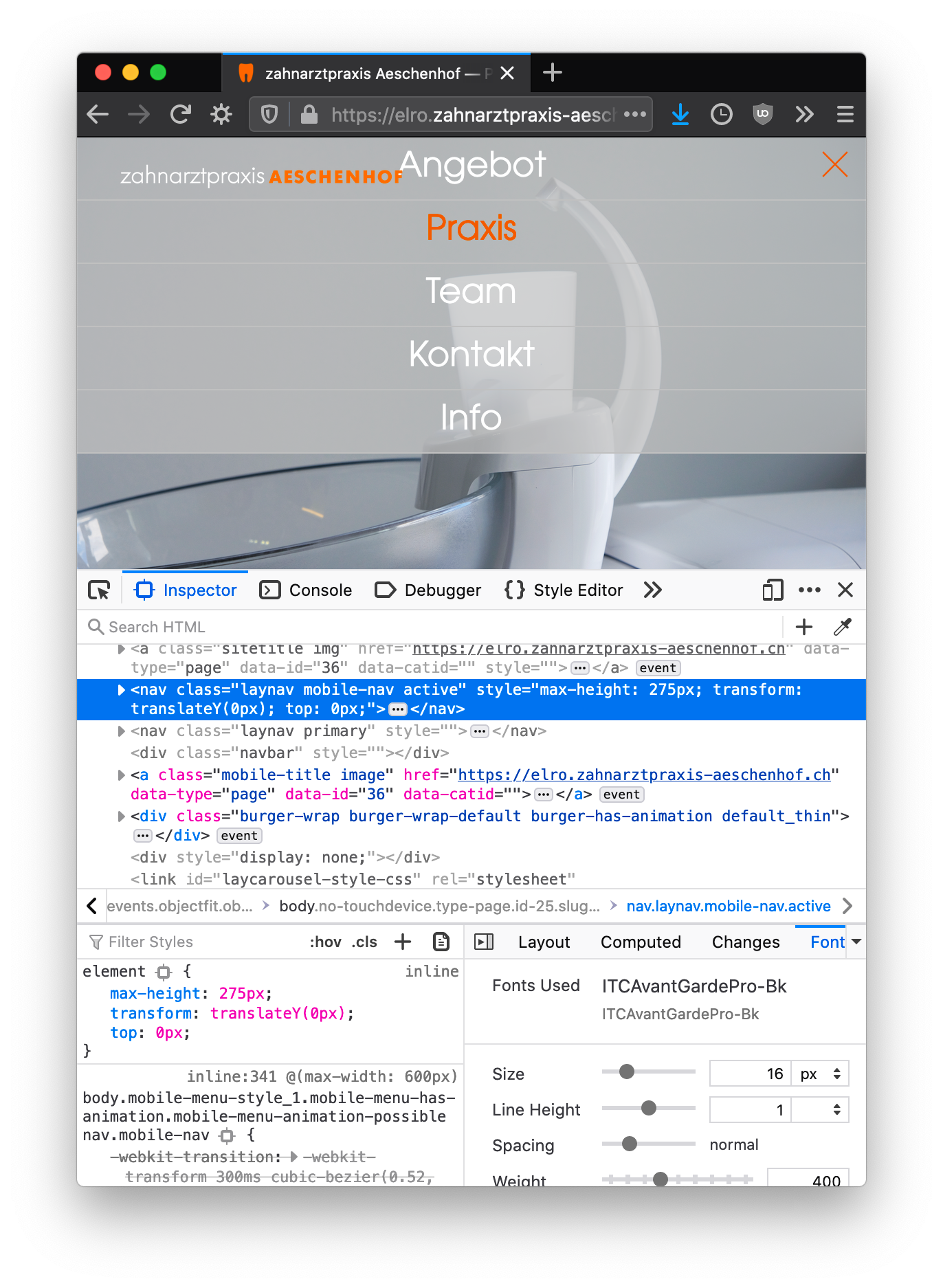
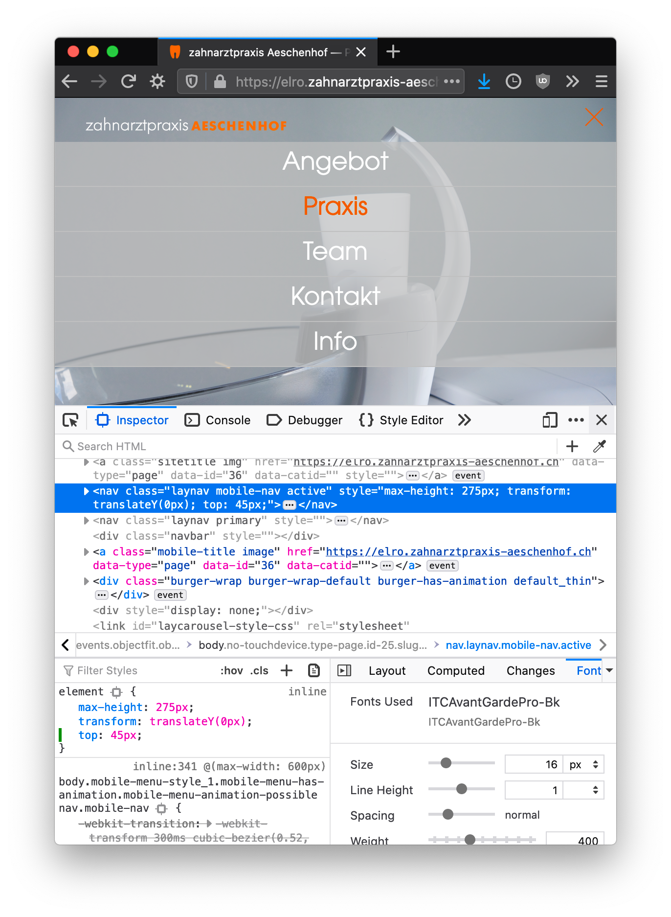
I'm trying to add some space above the activated mobile menu.
This is what I have:

This is what I want:

I tried using custom CSS
.laynav mobile-nav active{
    top: 45px;
}
but this does not work. (The wanted screenshot is done with editing inside the inspector). Is there a different class or is my code wrong?
Cheers and many thanks in advance!
-
Dear @DasZitat
I can't quite make out the full website address, could you post a link and i can take a better look :)
Best Wishes
Richard@Richard-Keith Ah sure, sorry for that!
https://elro.zahnarztpraxis-aeschenhof.ch -
Dear @DasZitat
Don't be sorry, happy to help :)
Try putting this code into your "Lay Options - Custom CSS & HTML" .
nav.laynav.mobile-nav.active {
    padding-top: 45px;
}
Let me know how it goes and please feel free to ask any further questions,
Thank for being a Lay Theme user!
Sincerely
Richard -
Dear @DasZitat
Don't be sorry, happy to help :)
Try putting this code into your "Lay Options - Custom CSS & HTML" .
nav.laynav.mobile-nav.active {
    padding-top: 45px;
}
Let me know how it goes and please feel free to ask any further questions,
Thank for being a Lay Theme user!
Sincerely
Richard
I also code custom websites or custom Lay features.
💿 Email me here: 💿
info@laytheme.com
Before you post:
- When using a WordPress Cache plugin, disable it or clear your cache.
- Update Lay Theme and all Lay Theme Addons
- Disable all Plugins
- Go to Lay Options → Custom CSS & HTML, click "Turn Off All Custom Code", click "Save Changes"
This often solves issues you might run into
When you post:
- Post a link to where the problem is
- Does the problem happen on Chrome, Firefox, Safari or iPhone or Android?
- If the problem is difficult to explain, post screenshots / link to a video to explain it
