Sub-Menu points horizontally aligned after update
-
helloo! after doing some research and not finding similar problems, i'm asking for help concerning the order of the nav menu points in the sub-menu bar.
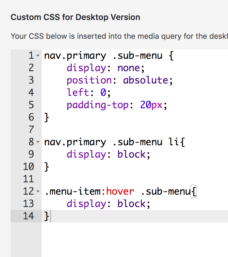
-> to have them stacked on top of each other (vertically) i've once copied a custom css from here actually (can't remember the thread tho). now, after the update, it doesn't seem to work anymore tho (also, i'm not even able to see if theres any info concerning the alignment in the css at all im so sorry lol). am i missing some info in the css? or is there any other way to t e l l the submenu how it should align? so sorry for the dumb question
enclosed, you'll see my problem (sub-menu points horizontally besides each other instead of below each other) and the custom css i've added
thanks in advance for reading this!


btw the website is this one: https://christinejaksch.de/
-
hm seems to work again right?
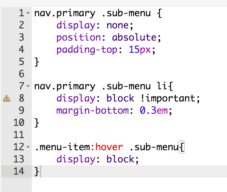
nav.primary .sub-menu li {
display: block !important;
margin-bottom: 0.3em;
}the display: block!important;
must have done the tricknice website
-
thank!!
i got the tip to use the "important" command/tag(?) and now it works again perfectly :)the snippet looks like this now:

hope that helps others too
I also code custom websites or custom Lay features.
💿 Email me here: 💿
info@laytheme.com
Before you post:
- When using a WordPress Cache plugin, disable it or clear your cache.
- Update Lay Theme and all Lay Theme Addons
- Disable all Plugins
- Go to Lay Options → Custom CSS & HTML, click "Turn Off All Custom Code", click "Save Changes"
This often solves issues you might run into
When you post:
- Post a link to where the problem is
- Does the problem happen on Chrome, Firefox, Safari or iPhone or Android?
- If the problem is difficult to explain, post screenshots / link to a video to explain it