Probably not a bug but -> "Mobile spaces" vs. "Set frame" - welppp
-
HUHU ITS ME AGAIN :-)
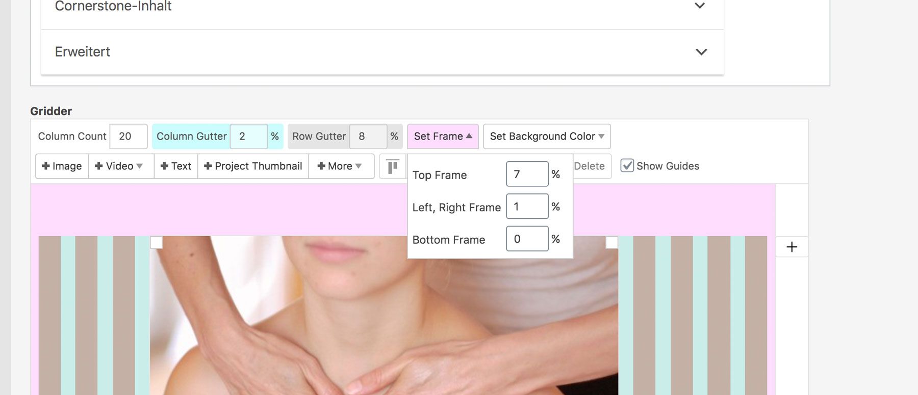
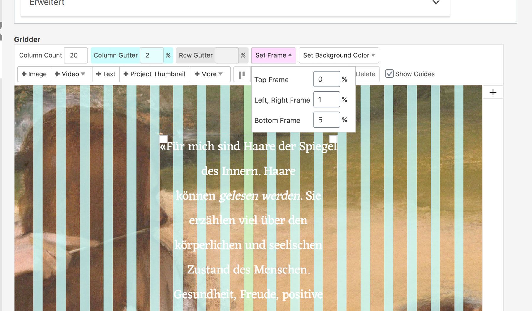
I've got a question concerning the mobile spaces vs the "set frame". I'm outlining my problem first and then i'm gonna show an example: I like working with the Gridder possibilities and I've set different top spaces for the desktop version via "Set frame" for multiple sites. Some sites have a browser-height image as a starter with 0% top space, others have 15% top space:
Example1:

Example2:

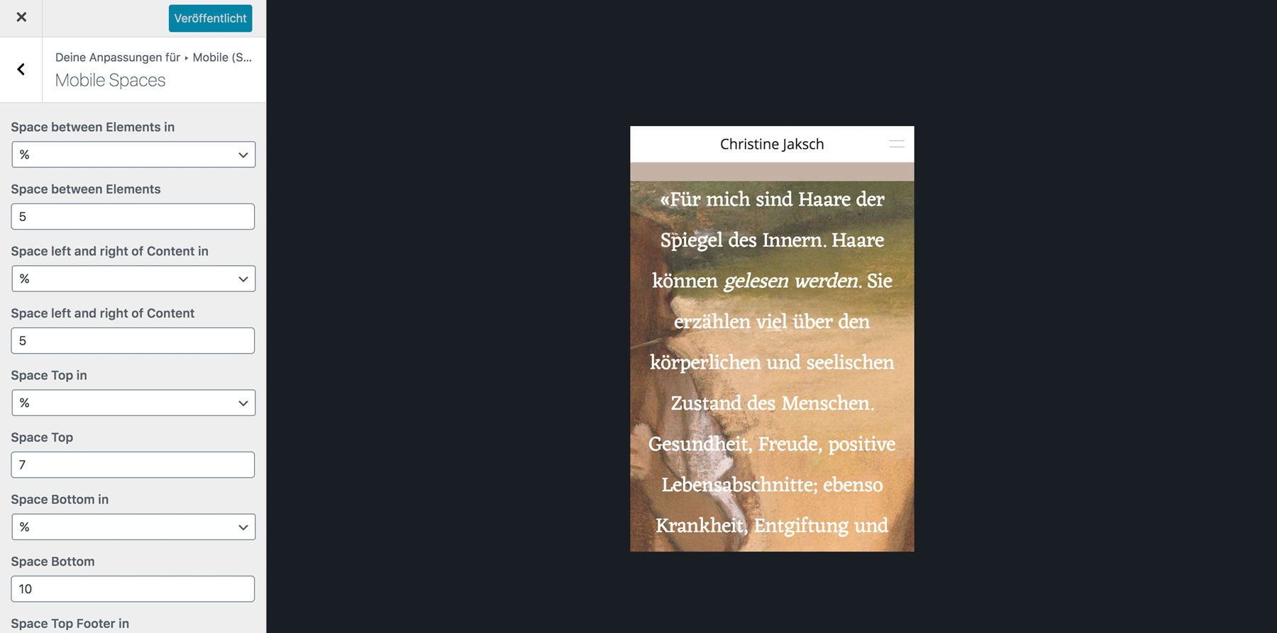
The mobile version, however, just lets me chose one possible top frame value:

-> This results in overwriting the spaces I have set via the gridder in the desktop version. I get that this is a useful tool, however I don't see a possibility right now where I can kind of "keep the spaces I've set in the gridder version"?
-> Website: https://christinejaksch.de/
Hope my explanation is understandable :) & sorry if my thinking about the problem might seem a lil dumb. I'd be happy about tipps! thanks in advance <3
-
Dear @katrinkrumm
did you check in the mobile layout if the distance to the top is still active?
Best!
Marius -
Hi @mariusjopen
thanks for replying! do you mean in the customizer? i don't know anywhere else where i can change the top distance for mobile.if you mean the customizer -> as you can see in the screenshot above, the space top is still active on the mobile version
i try to describe my question in another way: i only have 4 sites where i don't want the space top & those four sites have full-screen headers:
-> http://christinejaksch.de/
-> http://christinejaksch.de/haargesundheit/
-> http://christinejaksch.de/aktuelles/
-> http://christinejaksch.de/wortzauber/so i probably need a "css for mobile code" which kind of says: "when full-screen header is active don't use space top"
it should be an exception, right?or alternatively: i would need a css code which said "ignore the space top value for mobile version but use the specific gridder values from the sites"
thanks again for helping!
-
Dear @katrinkrumm
when the phone layout is active you can set the distances to the top, bottom, left, right in the LayGridder.
Did you try to switch it off there?
Best!
Marius -
Ah yes danke @mariusjopen! I had the custom phone layout option in the LayTheme Options deactivated lol. THANKS FOR THE PATIENCE <3
I also code custom websites or custom Lay features.
💿 Email me here: 💿
info@laytheme.com
Before you post:
- When using a WordPress Cache plugin, disable it or clear your cache.
- Update Lay Theme and all Lay Theme Addons
- Disable all Plugins
- Go to Lay Options → Custom CSS & HTML, click "Turn Off All Custom Code", click "Save Changes"
This often solves issues you might run into
When you post:
- Post a link to where the problem is
- Does the problem happen on Chrome, Firefox, Safari or iPhone or Android?
- If the problem is difficult to explain, post screenshots / link to a video to explain it