Re: Mobile Background not working (II)
-
Re: Mobile Background not working
Dear Armin/Marius,
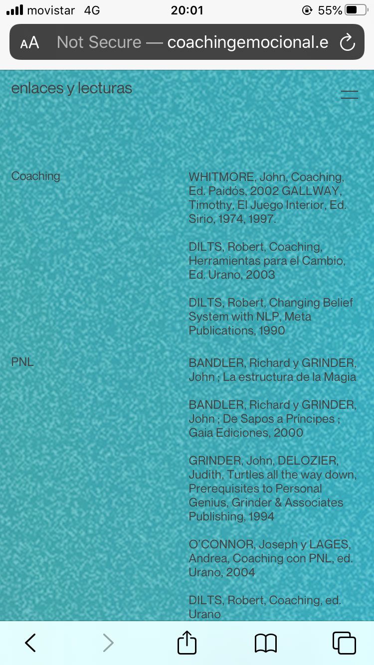
Following up on your helpful suggestions in this previous thread I was wondering if what I am after is now a possibility? Using your css, the results I am getting are the attached with the following results:
—Image is stretched and blurry
—Image is repeated when it reaches the bottom of it
—Image is followed by white when it reaches the bottom of itIdeally I am looking for it to behave as the desktop is doing with a fixed background with only the text scrolling — is this option not available?
http://coachingemocional.es/es/enlaceylecturas/
I have tried using background image in customize for mobile, the gridder and with css, (no success) is there any way you could enlighten me/point me in the right direction?
Thanks so much for your help and great template!
Christian


-
Also just noticed that the 'Customize' section actually shows me what I want (background fixed, only text scrolling), however testing it on browsers, only the aboved mentioned results are seen! So there seems to be an incoherence with what I see on the customize section and the final result! Not sure if this is helpful or not, but though I should flag it just in case :)
Thanks again!! -
Dear @cschm-tz
Did you find a solution to your issue?
Are we still able to help?
Best Wishes
Richard -
Dear Richard, great to hear from you!!
No, background images still get stretched based on the length of the page on mobile version and really desperate to find a solution. Several things I have tried:
—object fit and background attachment: cover
—width: 100%
—background-attachment: fixed
— background-repeat: no-repeatNone of these seem to solve anything, only create new issues/alternatives to simply having a non stretched, static, consistent background on all pages...
Any ideas would still be hugely appreciated!
Thanks again for your time and hope all is very well on your side.All the best,
Christian -
hey @cschm-tz i'm very sorry for the late reply
i should have gotten this earlier as a bug report, richard should have sent this to me way earlieri'm looking into this now
-
hey @cschm-tz
so i have just tested setting a background image in customizer → mobile → mobile background image
and wow i found this:
https://developer.apple.com/forums/thread/99883apparently Apple has just disabled this feature for background images for iPhones.
Better use a solid background color
if u want to use a picture better use a portrait format picture, not a landscape format picture for phone this way it wont be stretched too much
-
hey @arminunruh thanks so much for looking into this!
The image I have used is portrait and in roughly the proportions of a smartphone, 2106 × 3579 pixels which i hoped would solve something...
Do we have any other ideas to potentially solve this? Im afraid that if I use a solid background colour, the switch from desktop to phone will have a more abrupt result than what the client is after... :|
Thanks again for your time and all the best,
Christian -
if you're good at CSS you can
create a fixed div using lay options -> custom html and css
and then put the image in there
and use a z-index so the image is beneath the content
and make sure the content does not have a background image applied, so you can see through to the fixed divgood luck!
if ur css skills are not enough to do this maybe try to find someone to do this for you in the "custom coding" subforum -
Dear @cschm-tz
Awesome! Great to hear :)
Best of luck on the rest of your Lay Theme journey
Sincerely
Richard
I also code custom websites or custom Lay features.
💿 Email me here: 💿
info@laytheme.com
Before you post:
- When using a WordPress Cache plugin, disable it or clear your cache.
- Update Lay Theme and all Lay Theme Addons
- Disable all Plugins
- Go to Lay Options → Custom CSS & HTML, click "Turn Off All Custom Code", click "Save Changes"
This often solves issues you might run into
When you post:
- Post a link to where the problem is
- Does the problem happen on Chrome, Firefox, Safari or iPhone or Android?
- If the problem is difficult to explain, post screenshots / link to a video to explain it