Having trouble using javascript and custom mobile layouts.
-
I am currently in the process of building a website and I'm having trouble with some javascript when I try to set up a custom mobile layout for a page. I've created a form inside a div that expands and contracts when you click on a link. The javascript is used to set the height so that I don't have to define it exactly so that I can change the form however I like and the animation will be responsive and adjust automatically.
I've set up a form in a div using the Lay Theme html element. I styled the div in the custom css section and have some javascript code that I have added to the custom html section of the site under the lay options section in wordpress. It all works perfectly fine on the desktop version and the mobile version if I let Lay Theme do the default of automatically creating the mobile version of the site.
The trouble is when I go to lay options, activate custom phone layouts and try to create a custom layout for the page the javascript stops working. I click the link and nothing happens.
html:
<div>
<a href="#" onclick="growDiv()">Submit an EOI.</a>
<div id='grow' class="_Default">
    <form name="submit-to-google-sheet" onsubmit="submitted()" action="/thankyou" method="POST">
        <label for="first_name">First Name:</label>
        <div class="padding"><input type="text" id="fname" name="first_name" class="_Default" required></div>
        <label for="last_name">Last Name:</label>
        <div class="padding"><input type="text" id="lname" name="last_name" class="_Default" required></div>
        <label for="contact">Email Address:</label>
        <div class="padding"><input type="email" id="contact" name="contact" class="_Default" required></div>
        <label for="what">What would you like to do?</label>
        <div class="padding"><textarea id="what" name="what" class="_Default" required></textarea></div>
        <label for="when">When would you like to do it?</label>
        <div class="padding"><textarea id="when" name="when" class="_Default" required></textarea></div>
        <label for="contact">If you have an exact date in mind let us know here:</label>
        <div class="padding"><input type="date" id="date" name="date" class="_Default" required></div>
        <button type="submit" class="_Default">Submit EOI</button>
    </form>
</div>
</div>
css:
#grow {
  -moz-transition: height .5s;
  -ms-transition: height .5s;
  -o-transition: height .5s;
  -webkit-transition: height .5s;
  transition: height .5s;
  height: 0;
  overflow: hidden;
}
javascript
<script>
function growDiv() {
    var growDiv = document.getElementById('grow');
    if (growDiv.clientHeight) {
        growDiv.style.height = 0;
        }
    else {
          growDiv.style.height = growDiv.scrollHeight+'px';
        }
    }
</script>
The weird thing is that it works if Lay Theme just stacks all the elements for the mobile site but as soon as I click the custom mobile layout it all breaks.
You can see the WIP site at http://www.twosixty.com.au/welcome-test
I've tried it on my phone and in my desktop browser, chrome and safari. It stops working as soon as you resize the browser window to mobile sizes.
Any help on a work-around would be appreciated, thanks!
edit:
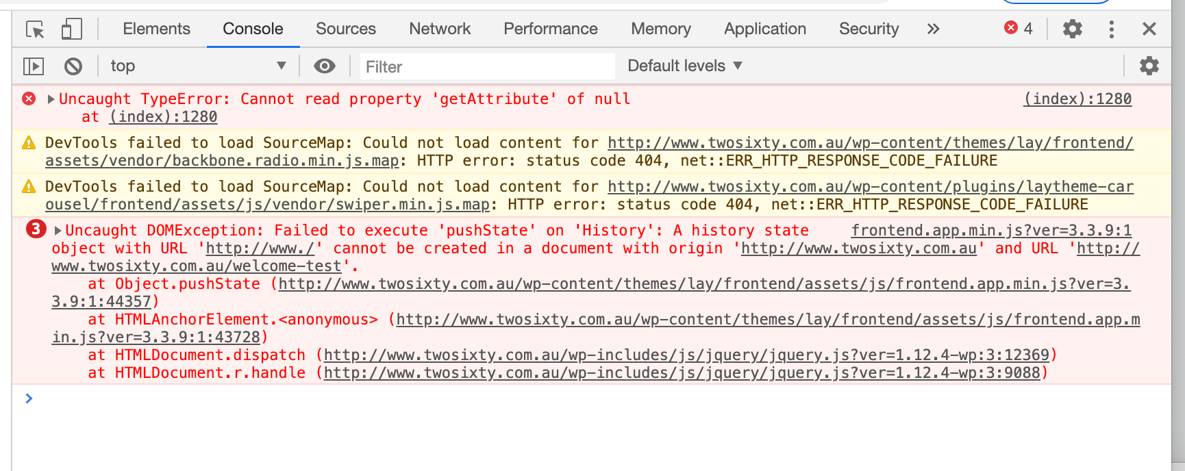
I'm not a web developer so I have no idea how to interpret this but I noticed in the console when clicking on the link that this error popped up on the mobile site, specifically the uncaught DOMException:

Okay so I've gone a bit deeper to try to figure it out but still no luck. I've managed to get rid of any errors the console was throwing up. I had a look at the documentation for javascript and tried to copy what was in there and this was the code I ended up using in the custom <head> content section:
<script>
jQuery(document).on("click", ".clickme", function growDiv()
    {
    var growDiv = document.getElementById('grow');
    if (growDiv.clientHeight)
        {
        console.log("shrink!");
        growDiv.style.height = 0;
        }
    else
        {
          console.log("grow!");
          growDiv.style.height = growDiv.scrollHeight+'px';
        }
    console.log("yay!");
    console.log(growDiv.style.height);
    }
);
</script>
All the console logs show up when they should, but for some reason when in the mobile site the log for "growDiv.style.height" never changes from 0. Works on the regular site though. As far as I can tell the "growDiv.style.height = growDiv.scrollHeight+'px';" isn't actually changing the height on the mobile version but I'm not sure why it's different.
-
hey
dont use an anchor element <a> in your html to bind a click onto to expand sth. anchors should only be used for real links
also if you're going to use custom phone layout, now your markup will exist twice in the html
so you cannot do
var growDiv = document.getElementById('grow');because this will only select one element
you need to bind the click event as you did in ur last post and then use sth like jQuery(this) to select the clicked on element and then find out how to select the parent container using jQuery's "parent" function (google it)
sorry there was no answer for such a long time, my support coworker is new and he kind of just didnt answer here …
good luck
-
That makers a lot of sense, I'll have look at the parent function.
Cheers!
I also code custom websites or custom Lay features.
💿 Email me here: 💿
info@laytheme.com
Before you post:
- When using a WordPress Cache plugin, disable it or clear your cache.
- Update Lay Theme and all Lay Theme Addons
- Disable all Plugins
- Go to Lay Options → Custom CSS & HTML, click "Turn Off All Custom Code", click "Save Changes"
This often solves issues you might run into
When you post:
- Post a link to where the problem is
- Does the problem happen on Chrome, Firefox, Safari or iPhone or Android?
- If the problem is difficult to explain, post screenshots / link to a video to explain it