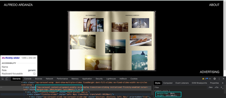
How to make a project with a carousel as in the example?
-
hey it seems that this website is not a lay theme website:
https://naranjoetxeberria.com/loewe-x-ibiza/this page uses fullscreen slider, not carousel:
http://alfredoardanza.com/test -
Good morning @Richard-Keith and @arminunruh.
Yes, now I have the fullscreen Addon on my website but the link that passes you I do not know why it has been changed to www........../test when it is alfredoardanza.com/prueba. In this link I used the carousel and I placed the photos to test and that it stayed more or less as in the example but I do not get itIf you can look at it and help me, I appreciate it.
http://alfredoardanza.com/pruebaThanks :)
-
Dear @fredyatb
Just to let you know that i'm looking into it and will get back to you tomorrow :)
Thank you for using Lay Theme.
Best wishes
Richard -
Dear @fredyatb
I had replied (tomorrow) but obviously a mistake on my part with the message getting through!!!!
Using Custom CSS in "Lay Options"

I have changed the carousel to "80vh" and given it a "margin-top" of 10vh.
We could create the necessary space above the carousel with the "top frame" option in the gridder:

secondly we could apply a top frame to all pages if this works for you in 'Gridder Defaults' :

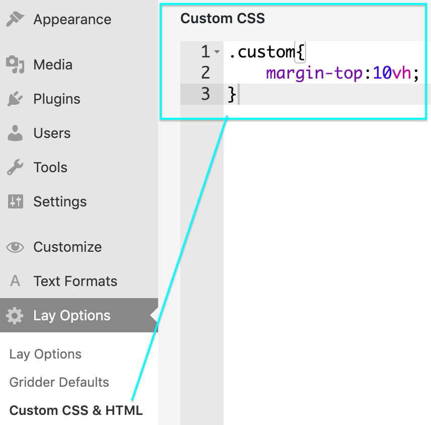
Thirdly we could add a custom class to your carousel and target it with Custom CSS:


As well as making our carousel "80vh"

Adding the Margin top in CUSTOM CSS:

Hope this Helps!!
Best Wishes
Richard -
Dear @fredyatb
I had replied (tomorrow) but obviously a mistake on my part with the message getting through!!!!
Using Custom CSS in "Lay Options"

I have changed the carousel to "80vh" and given it a "margin-top" of 10vh.
We could create the necessary space above the carousel with the "top frame" option in the gridder:

secondly we could apply a top frame to all pages if this works for you in 'Gridder Defaults' :

Thirdly we could add a custom class to your carousel and target it with Custom CSS:


As well as making our carousel "80vh"

Adding the Margin top in CUSTOM CSS:

Hope this Helps!!
Best Wishes
Richard@Richard-Keith said in How to make a project with a carousel as in the example?:
Dear @fredyatb
I had replied (tomorrow) but obviously a mistake on my part with the message getting through!!!!
Using Custom CSS in "Lay Options"Dont worry, I understand that you have to attend to many things and with your answer I am grateful.
I try it now :) -
HI again.
-I have applied the changes but it leaves me a lot of space at the top, it is not completely centered.
-Background photos should be full size and not the same size as the pages of the book.
-The text is very extended from margin to margin, how could I make it stay centered and in block. -
-
Dear @fredyatb
Three Questions - Three answers
1 - Change the "Margin-top" from 10vh to 3.5vh or 4 vh depending on what you prefer, play around and set the webpage how you like it.
2 - The Background photo's should be full size of the Carousel? or full size of the webpage? the Carousel has a wide viewport on it filling up the space and enlarging the images would either crop areas away or stretch quite badly your image. Am i correct in what you are after maybe?
3 - As for the text - add this code and play with the percentages equally ( should equal each other ) to create the distance you desire from the sides of the browser.
p._ABOUT {
    padding-left:25%;
    padding-right:25%;
}
Hope this Helps :)
Best Wishes
Richard
I also code custom websites or custom Lay features.
💿 Email me here: 💿
info@laytheme.com
Before you post:
- When using a WordPress Cache plugin, disable it or clear your cache.
- Update Lay Theme and all Lay Theme Addons
- Disable all Plugins
- Go to Lay Options → Custom CSS & HTML, click "Turn Off All Custom Code", click "Save Changes"
This often solves issues you might run into
When you post:
- Post a link to where the problem is
- Does the problem happen on Chrome, Firefox, Safari or iPhone or Android?
- If the problem is difficult to explain, post screenshots / link to a video to explain it