Portrait Landscape Font Bug
-
Re: Font-size problem on mobile
I have the same issue and tried putting the html code provided and still:
When I switch from landscape to portrait on mobile my project text gets way too big.
What can I do?
-
Link is for example:
http://www.tobiaskirschner.de/cairo-s-o/
Browser:
Chrome, newest updateLay Theme, newest update
Cache cleared multiple times
-
Think I found the problem. It works if I change the phone breakpoint to 2500 which is then bigger than the landscape of my iPhone 11 (2436px). The problem is now on my old macbook (1440 px) I then only see my mobile version even in my browser window on my laptop........
Can I tell the mobile version any other indicator that it’s being watched on a phone other than the pixelwidth?!
-
Dear @Dominik-Gauly
Its been 5 days, i wanted to follow up and see if you came to any conclusion of if help is still needed?
Apologies for the delay and thank you for using Lay Theme
Sincerely
Richard -
Hi @Richard-Keith!
Thank you for getting back to me.
I could not solve the problem yet.
I double checked the following things:
– tried the code Armin providedhtml {
-webkit-text-size-adjust: 100%; /* Prevent font scaling in landscape while allowing user zoom */
}– I cleared the text style and set it to standard
– created a new text format, with only one fontsize for desktop/mobile and created a custom phone layoutThe only thing that changed anything on the textsize of my mobile landscape was setting the mobile breakpoint to 2500 px which then doesn’t allow to see my desktop version on my laptop.
It seems to me switching to landscape does tell the text to switch to the desktop version but ONLY for the credits, you know?I hope we can find a solution to this.
Best,
Dominik -
Dear @Dominik-Gauly
Its been 5 days, i wanted to follow up and see if you came to any conclusion of if help is still needed?
Apologies for the delay and thank you for using Lay Theme
Sincerely
RichardHey @Richard-Keith,
is there anything I can do about it?
-
Dear @Dominik-Gauly
A breakdown of the issue just to get back on the same page.
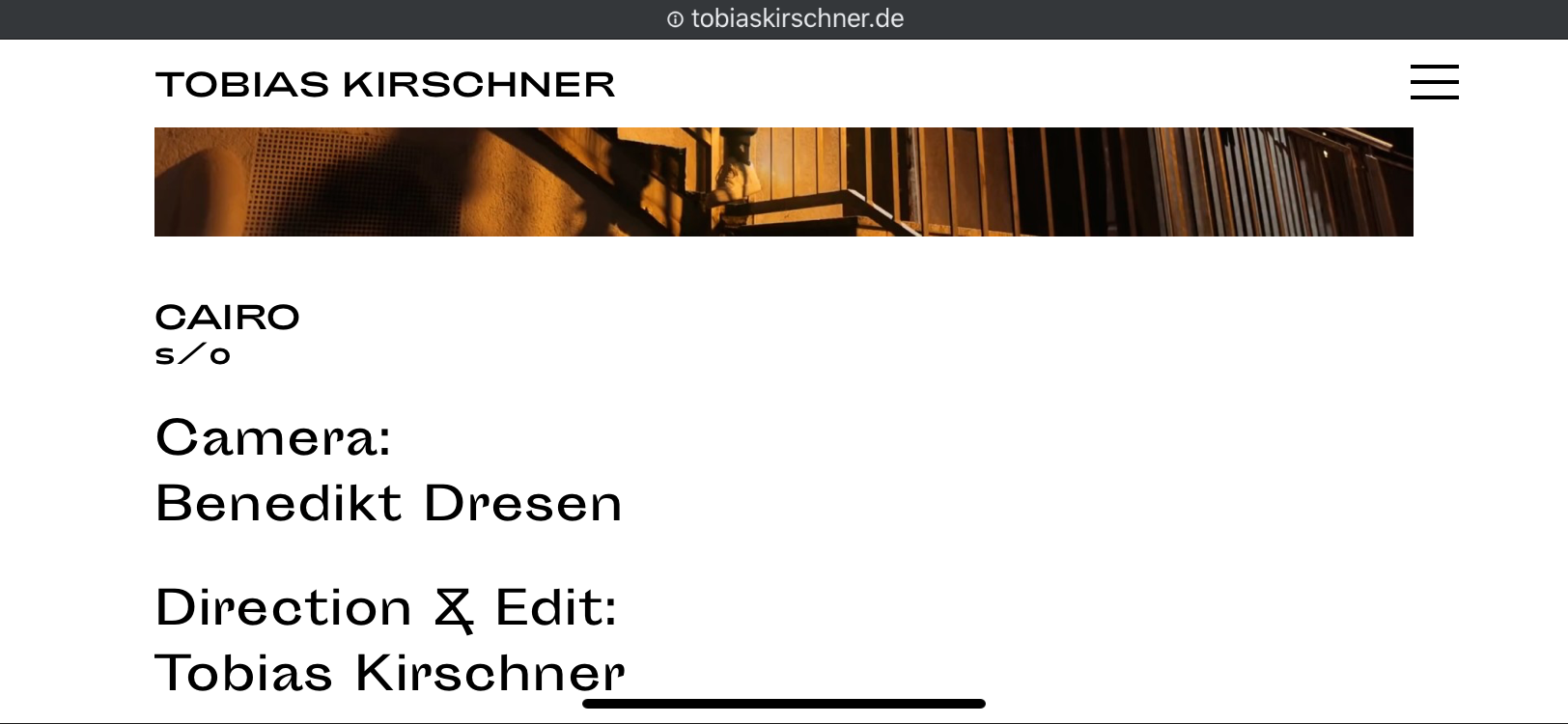
http://www.tobiaskirschner.de/cairo-s-o/-
Problem is related to text:
-
Landscape view on phone is wide ( large number of pixels across )
so when you then revert back to portrait mode the text retains the Landscape mode size ( too big )
-
You have changed the mobile breakpoint to be quite wide (2500px ) so basically all devices now use the "Mobile Layout"
-
You have added from Armin :
html {
-webkit-text-size-adjust: 100%; /* Prevent font scaling in landscape while allowing user zoom */
}to the Custom CSS area within 'Lay Options - Custom CSS & HTML' and this doesn't fix your problem.
Is this all Correct? :)
Best
Richard -
-
Dear @Dominik-Gauly
A breakdown of the issue just to get back on the same page.
http://www.tobiaskirschner.de/cairo-s-o/-
Problem is related to text:
-
Landscape view on phone is wide ( large number of pixels across )
so when you then revert back to portrait mode the text retains the Landscape mode size ( too big )
-
You have changed the mobile breakpoint to be quite wide (2500px ) so basically all devices now use the "Mobile Layout"
-
You have added from Armin :
html {
-webkit-text-size-adjust: 100%; /* Prevent font scaling in landscape while allowing user zoom */
}to the Custom CSS area within 'Lay Options - Custom CSS & HTML' and this doesn't fix your problem.
Is this all Correct? :)
Best
RichardHi @Richard-Keith,
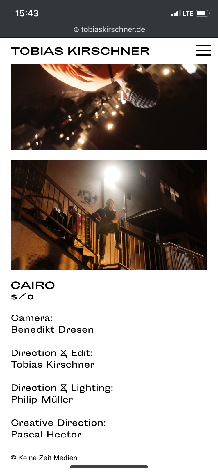
that’s correct with one addition concerning point „2.“:
When I revert back to portrait mode the text switches back to the correct small size set for phone.What I don’t understand is that the text elements „CAIRO s/o“ and „Keine Zeit Medien“ work correctly.
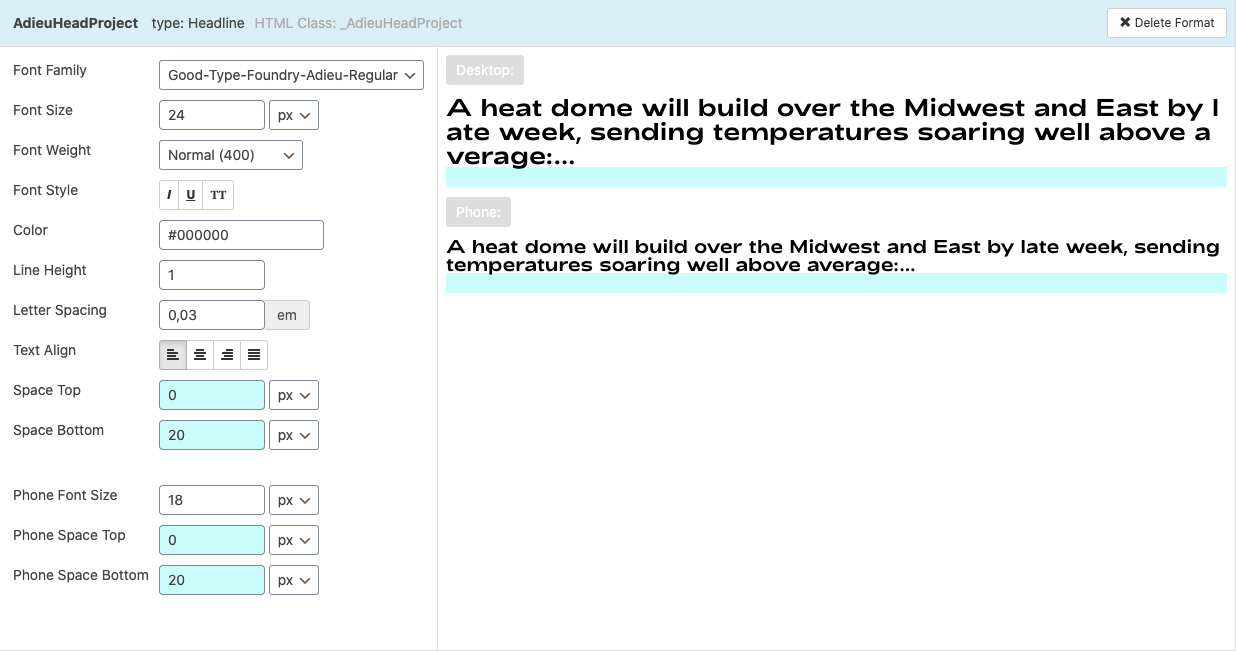
It’s only the credits „Camera: Benedikt Dresen...“ (using the Default text setting) that seem to confuse mobile landscape with desktop. I attached an image of my default text setting.Best,
Dominik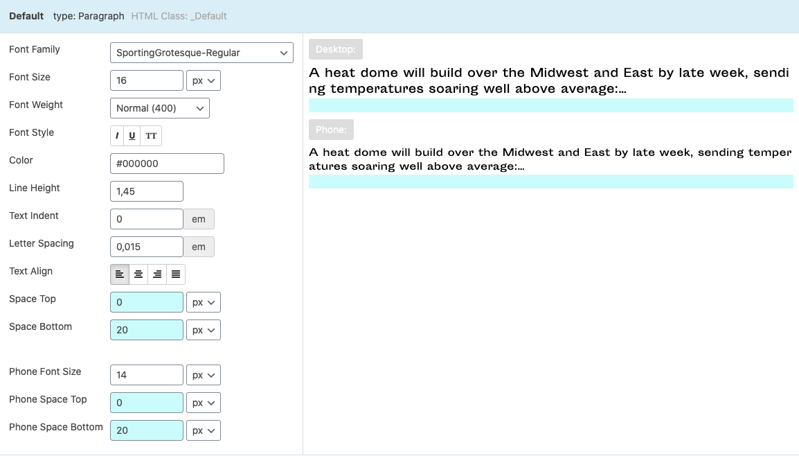
-
-
Dear @Dominik-Gauly
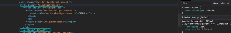
Sorry for the delay, could you please post an image of the text type that does work - the H1 'CAIRO' text type and then i can compare, I think i may have it:
Alternatively,
Could you please send your website address, /wp-admin/ username and password and a link to this topic to me in "Private Chats" ( do not show private info on this thread :)And i will try to get back to as shortly as possible with something :)
Let me know & best wishes, thank you for your patience
Richard
-
Dear @Dominik-Gauly
Sorry for the delay, could you please post an image of the text type that does work - the H1 'CAIRO' text type and then i can compare, I think i may have it:
Alternatively,
Could you please send your website address, /wp-admin/ username and password and a link to this topic to me in "Private Chats" ( do not show private info on this thread :)And i will try to get back to as shortly as possible with something :)
Let me know & best wishes, thank you for your patience
Richard
@Richard-Keith
Hey Richard!
Thank you for looking into the problem!
Attached I am sending you the photo of my H1 Text Setting.
I will also send you the requested information via private chats.
Best,
Dominik
-
Dear @Dominik-Gauly
I have logged in and the Mobile text seems fine?
Have you tried clearing your browsers Cache to see if this is the issue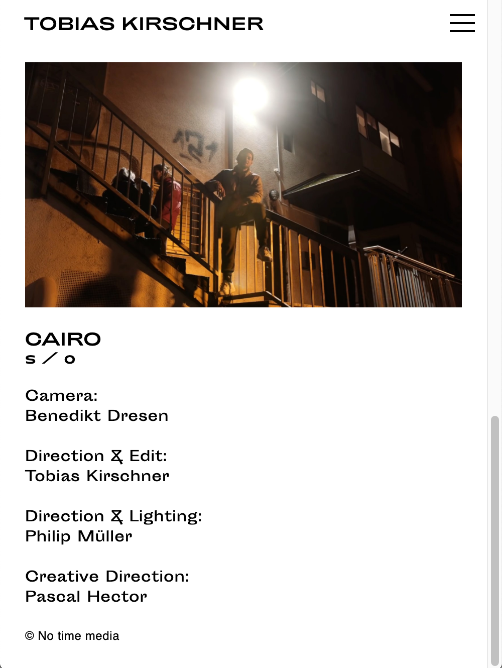
Am i missing something, im sorry this is taking so long , i wish to help :)
Best
Richard -
Dear @Dominik-Gauly
I have logged in and the Mobile text seems fine?
Have you tried clearing your browsers Cache to see if this is the issueAm i missing something, im sorry this is taking so long , i wish to help :)
Best
Richard@Richard-Keith
Hey Richard-Keith,
the problem occurs when you switch to landscape view.
Best,
Dominik -
Dear @Dominik-Gauly
Some things/ options i have found out after some research:
Its difficult to find a solution for Landscape Mobile that doesn't affect Desktop but i have found this:
 @media (not: pointer) and (orientation: landscape) {
._Default {
font-size: 10px !important;
}
}
Try adding this to Custom CSS and hopefully this has some success.
Or:
I think your best approach is to choose for landscape a smaller font size, as mobile landscape acts the same as desktop or tablet e.gfont-size:10px;Or Forcibly stop the user being able to view mobile in Landscape, stop the orientation ability, this may be a more suitable approach for you:
https://stackoverflow.com/questions/43634583/prevent-landscape-orientation-mobile-website
The Browser & Lay Theme with understand a shift from Desktop to Mobile, But when you start to dictate these changes based on Screen width you will likely never be able to find a solution that works for everything.
I see here a limitation on the part of Lay Theme that i will put into the development notes for the future.
With Lay Theme and with many other websites, the styling settings are based on viewport width, Phones are changing rapidly and are basically becoming desktop handhelds and we are seeing more clashes.
I do'nt think you will be able to have in both ways, Control over Landscape in both Desktop and Mobile, Sadly i think its best to choose a font size that works for both.
Best wishes & sorry the inconvenience
Richard
-
@Richard-K
Hey, thank you very much for researching my issue.
I couldn’t fix the problem yet.
One last question:
Why are all other elements fine for mobile?
Only the text (Screenshot) switches to some bigger version, even if I give them the same size for mobile and desktop?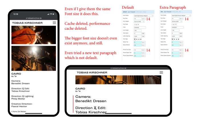
I also code custom websites or custom Lay features.
💿 Email me here: 💿
info@laytheme.com
Before you post:
- When using a WordPress Cache plugin, disable it or clear your cache.
- Update Lay Theme and all Lay Theme Addons
- Disable all Plugins
- Go to Lay Options → Custom CSS & HTML, click "Turn Off All Custom Code", click "Save Changes"
This often solves issues you might run into
When you post:
- Post a link to where the problem is
- Does the problem happen on Chrome, Firefox, Safari or iPhone or Android?
- If the problem is difficult to explain, post screenshots / link to a video to explain it