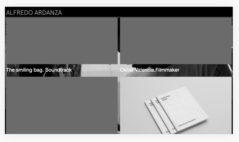
Problems with the layout in mobile version
-
Good afternoon family.
For the mobile version, I have created another layout with some variations. It happens that when I have the mobile vertically, it respects this layout but when I rotate it and put it horizontally, I get the desktop screen layout and it looks like this:

Link: http://alfredoardanza.com/edmmond-studios-s19-lookbook
It seems that also when the mobile is horizontal it takes the Full Screen Adon (for the desktop screen version I use it) that for the mobile version I have it disabled.
Is there any way to fix this?
Have a nice weekend :) -
Dear @fredyatb
The website will be displayed based on the Viewport width. So a calculation occurs where if the Browser width is less than say :600px it becomes the TABLET mode and when the browser width becomes less than say: 480px it become Mobile mode.
This isn't a bug exactly because the website is doing what it should and is displaying what should be displayed based on screen width.
Let me know your thoughts :)
Best wishes
Richard
I also code custom websites or custom Lay features.
💿 Email me here: 💿
info@laytheme.com
Before you post:
- When using a WordPress Cache plugin, disable it or clear your cache.
- Update Lay Theme and all Lay Theme Addons
- Disable all Plugins
- Go to Lay Options → Custom CSS & HTML, click "Turn Off All Custom Code", click "Save Changes"
This often solves issues you might run into
When you post:
- Post a link to where the problem is
- Does the problem happen on Chrome, Firefox, Safari or iPhone or Android?
- If the problem is difficult to explain, post screenshots / link to a video to explain it