Menu + spaces between adapt to browser width
-
Hello there,
Thanks for this great Theme and for all your effort! Right now I am wondering how to make a responsive menu. I have four menu points (just words in the same typesize) and I want them to take the whole browser width, for all desktop/tablet browser sizes. That means the spaces between the menu points should change. Is there a way to implement this? Thanks a lot! -
Dear @PC
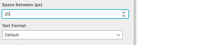
I see in the 'Customize' menu that only px are available atm..
However you could target the menu adding CSS and then give the Menu a 'Viewport' margin OR 'VH' setting "viewheight"
The menu points will space themselves based on your browser's height:
https://css-tricks.com/fun-viewport-units/So in 'Lay-options - 'Custom CSS & HTML" you would add some code to the top section - 'Custom CSS'
Example:
.laynav .menu-item {
    margin-bottom:10vh !important;
}
Good Luck and let me know how you go! :)
Best Wishes
Richard
I also code custom websites or custom Lay features.
💿 Email me here: 💿
info@laytheme.com
Before you post:
- When using a WordPress Cache plugin, disable it or clear your cache.
- Update Lay Theme and all Lay Theme Addons
- Disable all Plugins
- Go to Lay Options → Custom CSS & HTML, click "Turn Off All Custom Code", click "Save Changes"
This often solves issues you might run into
When you post:
- Post a link to where the problem is
- Does the problem happen on Chrome, Firefox, Safari or iPhone or Android?
- If the problem is difficult to explain, post screenshots / link to a video to explain it