Issue with sub menu clashing with text on the webpage. Can we set a white background to the sub menu?
-
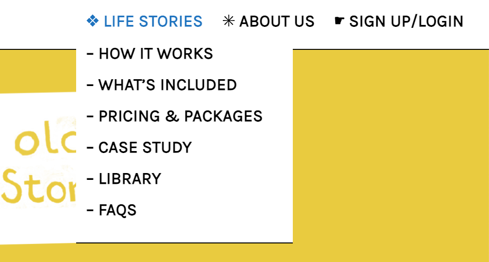
I have an issue with sub menu clashing with text on the webpage like this:

Can we set a white background to the sub menu?
This is the site I'm working on:
Thanks!
Hannah
-
Dear Hannah @HannahFincham
Lets do that! :)
Please add the following Code within 'Lay Options - Custom CSS & HTML' in the top section CUSTOM CSS
.laynav .sub-menu {
    background-color: white;
    padding-left: 5px;
    padding-bottom: 5px;
    border: solid 2px black;
}
I added the padding and border for you to see better but i think some small fixing will be needed to make it nice. Unsure of how you would like it to look! :)
Hope this helps Hannah and thanks for using Lay Theme in 2021
Richard
-
Oh amazing, thanks so much Richard! I've got that looking pretty much exactly as I'd like in terms of the padding now :) just one thing I can't figure out - how to make slightly more padding between each item in the submenu?
Also! One issue is that they haven't all transferred to the mobile menu...
Thanks again!
-
Dear Hannah @HannahFincham
Great to hear its working out! :)
So to access the menu-items we would need to go:
.laynav .sub-menu .menu-item {
    padding-bottom: 15px;
}
Changing this padding to your wishes
Could you post a screenshot of the Mobile issue and what your would like to happen? :)
Best
Richard -
Dear Hannah @HannahFincham
Great to hear its working out! :)
So to access the menu-items we would need to go:
.laynav .sub-menu .menu-item {
    padding-bottom: 15px;
}
Changing this padding to your wishes
Could you post a screenshot of the Mobile issue and what your would like to happen? :)
Best
RichardHey Richard,
Sorry for my slow response!
That padding is perfect thank you :)
So with the Mobile menu issue, when I click on the menu in the corner there:

It only brings up the main menu options:

And there's no way of accessing anything from the sub-menu which are all these:
I don't know if there's be a way of making a sub menu accessible for mobile? Otherwise, we could just have them all listed out after "Life Stories" in the main menu, if that makes sense?
Thanks so much,
Hannah
-
Just another thought, if the sub menu is displayed within the main menu could they be indented like this:
❖ LIFE STORIES
.... – HOW IT WORKS
.... – WHAT’S INCLUDED
.... – PRICING & PACKAGES
.... – CASE STUDY
.... – LIBRARY
.... – FAQS
✳︎ ABOUT US
☛ SIGN UP/LOGINIgnore all the ".....", my spaces just weren't showing up on the preview 😂
-
Hi Hannah @HannahFincham
What method are you using to get your Sub-menu?
Some custom Code? a plugin? or a workaround within Lay Theme options?This will determine how it may work in Mobile
Best wishes
Richard -
Hi Hannah @HannahFincham
What method are you using to get your Sub-menu?
Some custom Code? a plugin? or a workaround within Lay Theme options?This will determine how it may work in Mobile
Best wishes
Richard@Richard-K Oh ok!
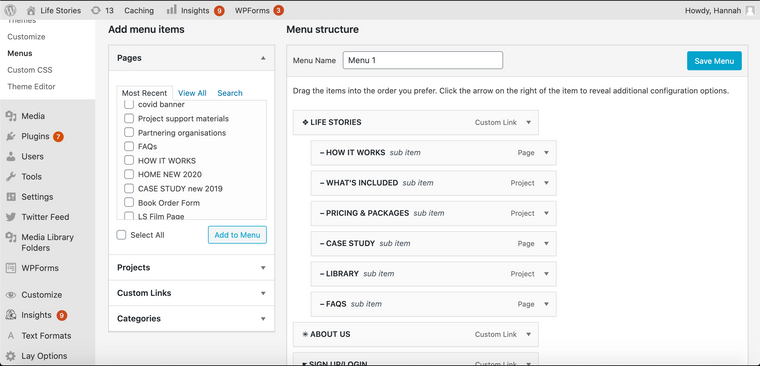
It's through appearance > Menus
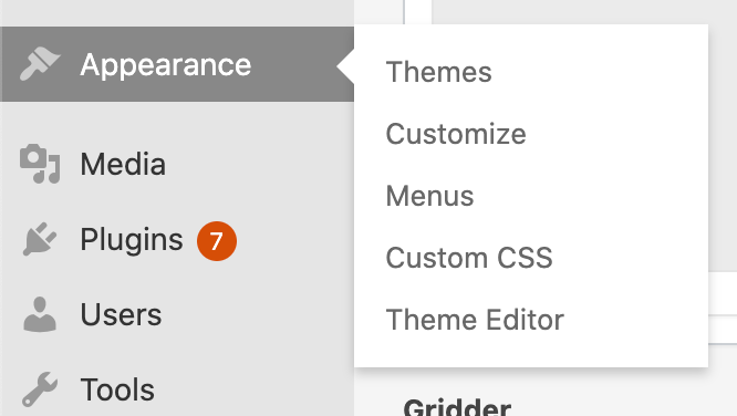
And then I just arranged the items like this:
-
Dear @HannahFincham
Cool thanks :)
And am i correct that this is your Custom CSS?
nav.primary .sub-menu li{
    display: block;
    position: relative;
		padding-bottom: 5px;
}
.sub-menu{
    padding-top: 16px!important;
    opacity: 0;
    transition: opacity 200ms ease;
    -webkit-transition: opacity 200ms ease;
    pointer-events: none;
    position: absolute;
    left:-10px;
    padding-bottom: 0px;
}

nav.primary li:hover .sub-menu{
    opacity: 1;
		padding: 10px;
		color: white;
    pointer-events: auto;
}

.hideformobile .sub-menu li{
	position: absolute;
	color: white;
}

.laynav .sub-menu {
    background-color: white;
    padding-right: 5px;
    padding-bottom: 10px;
    border-bottom: solid 0.7px black;
}

.laynav .sub-menu .menu-item {
    padding-bottom: 15px;
}
Best wishes & talk soon
Richard -
Dear @HannahFincham
Cool thanks :)
And am i correct that this is your Custom CSS?
nav.primary .sub-menu li{
    display: block;
    position: relative;
		padding-bottom: 5px;
}
.sub-menu{
    padding-top: 16px!important;
    opacity: 0;
    transition: opacity 200ms ease;
    -webkit-transition: opacity 200ms ease;
    pointer-events: none;
    position: absolute;
    left:-10px;
    padding-bottom: 0px;
}

nav.primary li:hover .sub-menu{
    opacity: 1;
		padding: 10px;
		color: white;
    pointer-events: auto;
}

.hideformobile .sub-menu li{
	position: absolute;
	color: white;
}

.laynav .sub-menu {
    background-color: white;
    padding-right: 5px;
    padding-bottom: 10px;
    border-bottom: solid 0.7px black;
}

.laynav .sub-menu .menu-item {
    padding-bottom: 15px;
}
Best wishes & talk soon
Richard@Richard-K yes it is! Probably a bit of a mess where I was trying to figure some things out 😅
-
Dear Hannah @HannahFincham
Thanks :)
There is a few things to think about.
The Sub-menu appears because it goes from 'opacity: 0' to 'opacity:1' when you hover.nav.primary li:hover .sub-menu{ opacity: 1; padding: 10px; color: white; pointer-events: auto; }In your CSS you are addressing 'nav.primary' which is fine but you also need to add some code doing the same addressing 'mobile-nav' ( the Desktop Navigation & Mobile are two seperate Nav's. depending on browser width - one is active and the other is turned off.
CSS
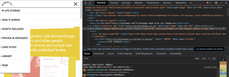
nav.mobile-nav .sub-menu li{
    display: block;
    position: relative;
		padding-bottom: 5px;
}

nav.mobile-nav li:hover .sub-menu{
    opacity: 1;
		padding: 10px;
		color: white;
    pointer-events: auto;
}
However in general you may wish to design the Mobile menu different because the functionality may not be best for users with phones, here i have the sub-menu on the phone active:
There is also issue with it blocking the menu underneath because of position:absolute - When i remove this CSS we get this:
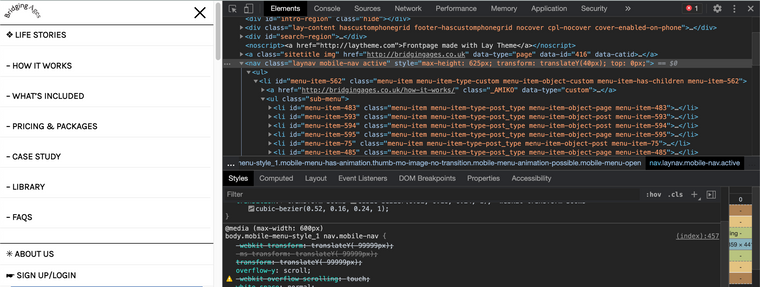
In Conclusion Hannah :)
This is why your were having trouble seeing the Sub-menu - However you may wish to design a little differently to suit the Mobile format.Hope I have been helpful and let me know your thoughts, have a wonderful day!
Sincerely
Richard -
Thanks so much Richard, that works!!
-
Dear Hannah @HannahFincham
Thanks :)
There is a few things to think about.
The Sub-menu appears because it goes from 'opacity: 0' to 'opacity:1' when you hover.nav.primary li:hover .sub-menu{ opacity: 1; padding: 10px; color: white; pointer-events: auto; }In your CSS you are addressing 'nav.primary' which is fine but you also need to add some code doing the same addressing 'mobile-nav' ( the Desktop Navigation & Mobile are two seperate Nav's. depending on browser width - one is active and the other is turned off.
CSS
nav.mobile-nav .sub-menu li{
    display: block;
    position: relative;
		padding-bottom: 5px;
}

nav.mobile-nav li:hover .sub-menu{
    opacity: 1;
		padding: 10px;
		color: white;
    pointer-events: auto;
}
However in general you may wish to design the Mobile menu different because the functionality may not be best for users with phones, here i have the sub-menu on the phone active:
There is also issue with it blocking the menu underneath because of position:absolute - When i remove this CSS we get this:
In Conclusion Hannah :)
This is why your were having trouble seeing the Sub-menu - However you may wish to design a little differently to suit the Mobile format.Hope I have been helpful and let me know your thoughts, have a wonderful day!
Sincerely
Richard@Richard-K Actually, I spoke too soon! Got the mobile menu to look how I wanted:
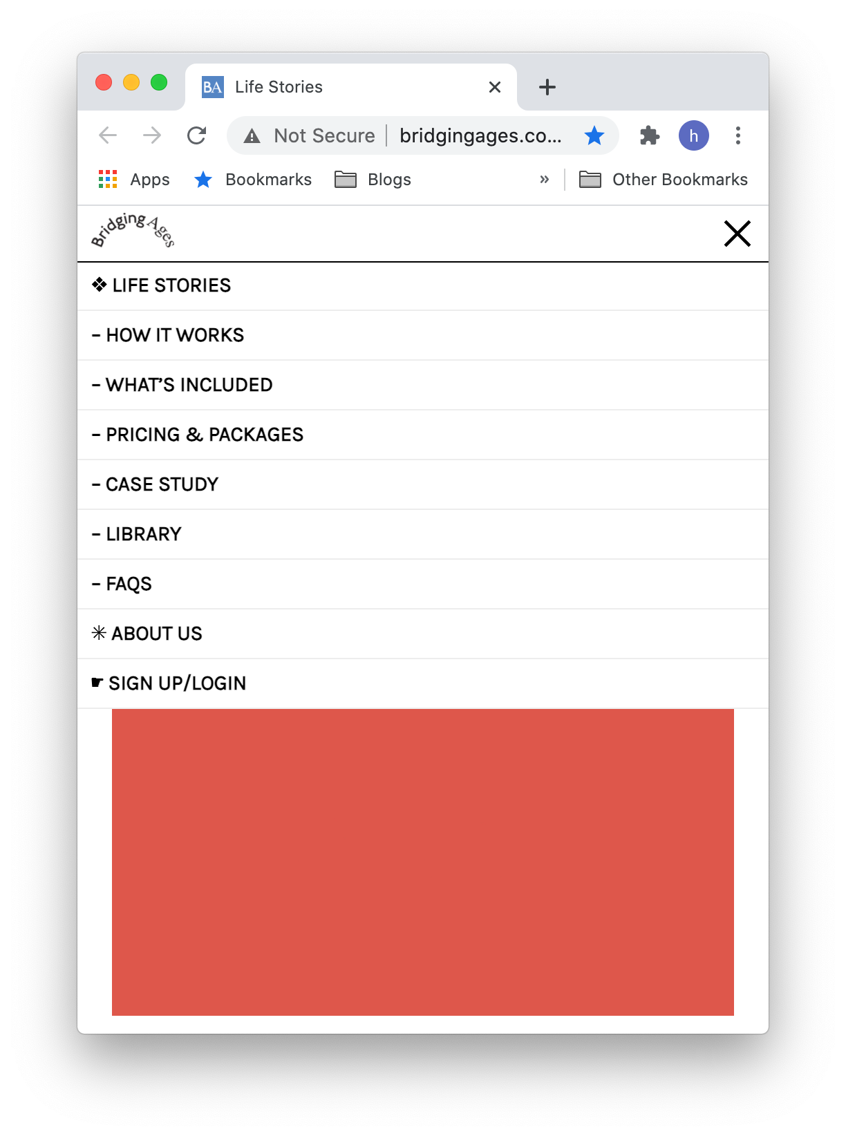
But then realised it had compromised the desktop:

Do you think there's a way of achieving the above mobile menu and still keep the desktop like this:

Sorry, wish I could figure it out!
-
Dear @HannahFincham
There is for sure a way to have desktop and Mobile CSS seperate with media query: this is why they were made :)
https://www.w3schools.com/css/css_rwd_mediaqueries.aspI think currently you have removed your Mobile CSS?
Talk soon and have a wonderful day :)
Richard
-
Hey Richard, (messaging on behalf of @HannahFincham here) I've been having a look at this.
But still such a huge novice we're both struggling. I can't even seem to get back to the point where we had the mobile nav working and desktop not working.
Is there anyway you're able to see what it is I'm missing? Is there just a bit of code i can put into mobile CSS? Or do i need to have in both CSS area's.
Sorry to still be asking on this. Thanks for all the advice so far.
-
This post is deleted!
-
Dear @NAS Also on behalf of @HannahFincham :)
This is no worries and will try to help as best i can!
Am i correct that the Desktop is how you wish:
The problem lies with the Sub-menu points not working for Mobile? you wish them all to display as a long list? or the Sub menu points should show only when hovering ( keep in mind that 'Hover' doesnt work on Mobiles as they have no 'Mouse' essentially..)
And this is your CSS for Mobile?
.buttonstyle a{
    padding: 15px 20px;
    display: inline-block;
    border-radius: 3px;
    border-style: solid;
    line-height: 1;
    text-decoration: none;
    border-bottom: solid;
    color: black;
    opacity: 1;
    white-space: nowrap;
}

.buttonstyle a:hover{
    background-color: #f0f0f0;
    text-decoration: none;
    border-bottom: solid;
    color: black;
    opacity: 1;
}
.buttonstyle2 a{
    padding: 15px 20px;
    display: inline-block;
    border-radius: 3px;
    border-style: solid;
    line-height: 1;
    text-decoration: none;
    border-bottom: solid;
    color: white;
    opacity: 1;
    white-space: nowrap;
}

.buttonstyle2 a:hover{
    background-color: #f0f0f0;
    text-decoration: none;
    border-bottom: solid;
    color: black;
    opacity: 1;
}
Just wish to understand better, so i can help better ( The thread is quite long now, so unsure of which part needs fixing! :)
Have a wonderful day & talk soon
Richard -
Thanks Richard.
you're spot on.Desktop displaying as is.
And would like to display full list on mobile.currently mobile is just this
code_text
.buttonstyle a{
    padding: 15px 20px;
    display: inline-block;
    border-radius: 3px;
    border-style: solid;
    line-height: 1;
    text-decoration: none;
    border-bottom: solid;
    color: black;
    opacity: 1;
    white-space: nowrap;
}

.buttonstyle a:hover{
    background-color: #f0f0f0;
    text-decoration: none;
    border-bottom: solid;
    color: black;
    opacity: 1;
}

nav.mobile-nav .sub-menu li{
    opacity: 1;
    display: block;
    pointer-events: auto;
    padding: 10px;
	color: white;
    position: relative;
	padding-bottom: 5px;
}
thanks for your patience
-
Dear @NAS
Please remove:
nav.mobile-nav .sub-menu li{
    opacity: 1;
    display: block;
    pointer-events: auto;
    padding: 10px;
	color: white;
    position: relative;
	padding-bottom: 5px;
}
From your above Custom Mobile CSS and replace with:
.laynav .sub-menu{
    opacity: 1;
    position: relative;
    pointer-events: auto;
    border-bottom: none;
    width:100%;

    padding-top: 0px !important;
    padding-bottom: 0px;
    padding-left: 10px;
    padding-right: 0px;
}

.laynav .sub-menu .menu-item{
    padding-bottom:0px;
}
This gives me this appearance:
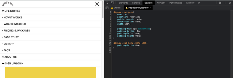
Hope this helps & have a wonderful day :)
Sincerely
Richard
I also code custom websites or custom Lay features.
💿 Email me here: 💿
info@laytheme.com
Before you post:
- When using a WordPress Cache plugin, disable it or clear your cache.
- Update Lay Theme and all Lay Theme Addons
- Disable all Plugins
- Go to Lay Options → Custom CSS & HTML, click "Turn Off All Custom Code", click "Save Changes"
This often solves issues you might run into
When you post:
- Post a link to where the problem is
- Does the problem happen on Chrome, Firefox, Safari or iPhone or Android?
- If the problem is difficult to explain, post screenshots / link to a video to explain it