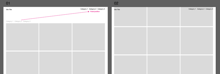
Category Filter position
-
Dear @XLD
Yeah! :) now i gotcha
With some custom CSS we can target the filter titles like this and change to fixed position:
._Default_no_spaces.lay-thumbnailgrid-filter {
    position:fixed;
    top:0;
    right:0;
    margin-top:20px;
    margin-right:20px;
}
Maybe you wish to use 'padding' instead of margins ;)
Let me know how you go & best wishes for 2021!
Sincerely
Richard -
Hi @Richard-K ,
thanks for this helpful line of code. I had the same issue but am still not able to fix the category filter above my menu. I added the
z-index: 100 !important;and but the filter is still behind the menu bar.
Could you please help me?
Thanks a lot,
Paul -
Dear @paulstolle
Happy to help :)
Could you post a link to the page with Category filter in question & i can have a better understandingTalk soon & have a wonderful day!
Sincerely
Richard -
This post is deleted!
-
Dear @paulstolle
Depending on your design needs,
You have a background colour set for your Navbar:.navbar {
background-color: rgba(255,255,255,1);
}Here with it removed we have all menu's visible:

settings can be altered in Customizing ▸ Menu Style >
Menu BarThe font-size likely needs adjusting for your design as well
Talk soon :)
Richard -
Thanks a lot, @Richard-K.
The only problem is that I need the white navbar. There will be more projects in future so while scrolling the fixed menu should be on top of a white background. How can I deal with that? Should I build a div block with white background and z-index to simulate the navbar and lay it between menu items and content?
I'm just wondering if thumbnail grid and grid filter are stack on the same layer so that I can't put the filter above the navbar … Do you know why the simple z-index is not working?
Would be happy to hear from you!
All the best,
Paul -
Dear @paulstolle
Yes it is a bit odd...
Setting the z-index of the navigation also works but will likely slip behind the Grid then, (unless you place grid into 'negative' z-index).navbar{ z-index:0; }This also lets the Filter menu through - My thoughts are that the problem is related to how "background-color" operates in relation to z-index, but still not 100% sure.
Given the fixed nature of the Menus - a white <div> box is a quick solution and the navigation is basically that anyway:
<div class="navbar"></div>If that solution works for you, im sure it will take less time that playing with z-indexes :)
Hope this has helped, apologies if not,
Sincerely
Richard -
Hi @Richard-K
This z-index is driving me crazy … BUT, I finally found a way to solve my problem:
I built a link area with HTML on the bottom of each site. The menubar has to be nested inside of the div container, otherwise it would overlay everything else.
<div class="submenu site_menu">
    <ul>
        <li><a href="https://onzgi.com/exhibition/" class="_Submenu"><span>All</span></a></li>
    </ul>
    <div class="menubar"></div>
</div>
The main problem was the stacking context of my site. Therefore the z-index was not working as I aspected.
Maybe it's not the sexiest solution but it's definitely working well. Cheers.
All the best
Paul -
Dear Paul @paulstolle
Thanks for the update - just happy that its working and the frustration is over! :)
Best
Richard -
M marcos referenced this topic on
-
T Toby referenced this topic on
-
D dcc referenced this topic on
I also code custom websites or custom Lay features.
💿 Email me here: 💿
info@laytheme.com
Before you post:
- When using a WordPress Cache plugin, disable it or clear your cache.
- Update Lay Theme and all Lay Theme Addons
- Disable all Plugins
- Go to Lay Options → Custom CSS & HTML, click "Turn Off All Custom Code", click "Save Changes"
This often solves issues you might run into
When you post:
- Post a link to where the problem is
- Does the problem happen on Chrome, Firefox, Safari or iPhone or Android?
- If the problem is difficult to explain, post screenshots / link to a video to explain it
