Skip to content
  • Recent
  • Tags
  • Popular
  • Users
  • Search
Skins
  • Light
  • Cerulean
  • Cosmo
  • Flatly
  • Journal
  • Litera
  • Lumen
  • Lux
  • Materia
  • Minty
  • Morph
  • Pulse
  • Sandstone
  • Simplex
  • Sketchy
  • Spacelab
  • United
  • Yeti
  • Zephyr
  • Dark
  • Cyborg
  • Darkly
  • Quartz
  • Slate
  • Solar
  • Superhero
  • Vapor

  • Default (No Skin)
  • No Skin
Collapse

Lay Theme Forum

  1. Home
  2. General Discussion
  3. Access gridders left and right frame through addtional media query for very big screens

Access gridders left and right frame through addtional media query for very big screens

Scheduled Pinned Locked Moved General Discussion
6 Posts 2 Posters 151 Views
  • Oldest to Newest
  • Newest to Oldest
  • Most Votes
Reply
  • Reply as topic
Log in to reply
This topic has been deleted. Only users with topic management privileges can see it.
  • J Offline
    J Offline
    julianbauer
    wrote on last edited by
    #1

    Hi there,

    I was wondering if there's a way to change the gridders left/right frame of a page with an additional media query.
    I really like the way how my new page is starting to look but on very large screens i would like to have a bigger left and right margin.
    I would just give some margin to the grid or grid-inner class but because I use a lot of different row background colors and one full width background video that won't work.

    I tried my best to decipher the css in the inspector but I couldn't find a solution on my own.

    best regards,
    Julian

    1 Reply Last reply
    0
    • RichardR Offline
      RichardR Offline
      Richard
      Global Moderator
      wrote on last edited by
      #2

      Dear Julian @julianbauer

      I think i understand, however would you be able to post a link to your website and even better an example of what you wish to achieve? ( can just be a rough sketch :)

      Then i can probably help more efficiently!

      Best wishes
      Richard

      1 Reply Last reply
      0
      • J Offline
        J Offline
        julianbauer
        wrote on last edited by julianbauer
        #3

        Dear Richard

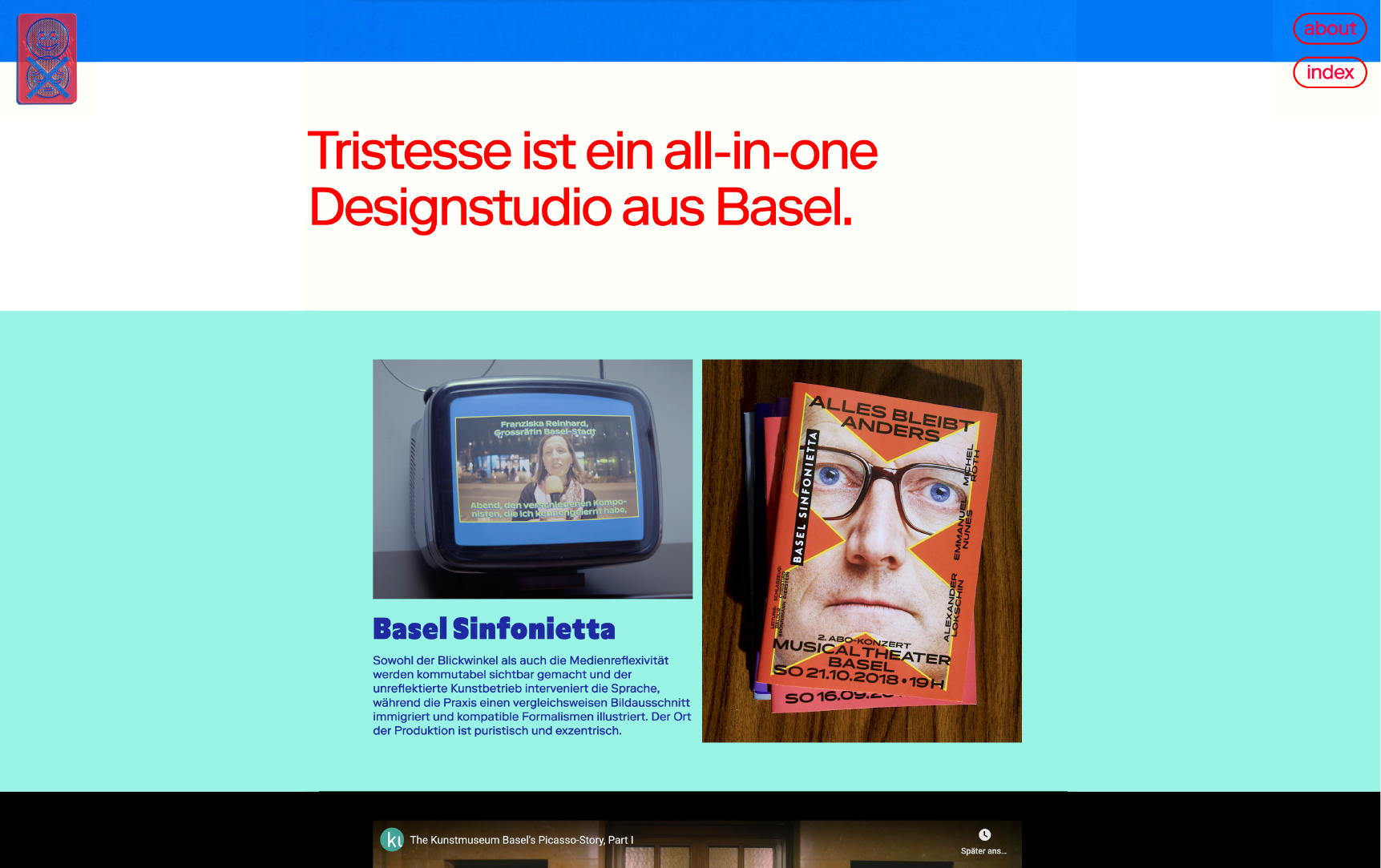
        this is the website I'm currently working:
        https://lay.tristesse.ch/

        At the moment the content just grows and shrinks with the size of the Browser window. Wich is perfectly fine for example a 15" Screen.

        This is what that looks like:

        max-width-content-01.png

        What I'd like to achieve ist that the content stops growing after a certain Browser width and forms a column in the middle, without having white Borders left and right, like in this Mockup:

        max-width-content-02.png

        kind regards,
        Julian

        1 Reply Last reply
        0
        • RichardR Offline
          RichardR Offline
          Richard
          Global Moderator
          wrote on last edited by
          #4

          Dear Julien @julianbauer

          This is possible but would need some tinkering to get right with a few elements. Because the overall row is what set's you background colour you don't want to apply restrict this width, however the row-inner is the next element nesting within that could be targeted:

          .row-inner {
              max-width: 600px;
              margin-left: auto;
              margin-right: auto;
          }
          

          This is an exaggerated example but it will give you the idea

          Best wishes :)
          Richard

          1 Reply Last reply
          0
          • J Offline
            J Offline
            julianbauer
            wrote on last edited by
            #5

            Dear Richard

            Thanks for your help, that was exactly what I was looking for!

            Best wishes,
            Julian

            1 Reply Last reply
            0
            • RichardR Offline
              RichardR Offline
              Richard
              Global Moderator
              wrote on last edited by
              #6

              Dear @julianbauer

              Great ! :) best of luck with your project, its looking great

              Sincerely
              Richard

              1 Reply Last reply
              0
              Reply
              • Reply as topic
              Log in to reply
              • Oldest to Newest
              • Newest to Oldest
              • Most Votes


              I also code custom websites or custom Lay features.
              šŸ’æ Email me here: šŸ’æ
              info@laytheme.com

              Before you post:
              1. When using a WordPress Cache plugin, disable it or clear your cache.
              2. Update Lay Theme and all Lay Theme Addons
              3. Disable all Plugins
              4. Go to Lay Options → Custom CSS & HTML, click "Turn Off All Custom Code", click "Save Changes"

              This often solves issues you might run into

              When you post:
              1. Post a link to where the problem is
              2. Does the problem happen on Chrome, Firefox, Safari or iPhone or Android?
              3. If the problem is difficult to explain, post screenshots / link to a video to explain it
              Online Users
              Forgot your key, lost your files, need a previous Lay Theme or Addon version? Go to www.laykeymanager.com
              laytheme.com
              • Login

              • Don't have an account? Register

              • Login or register to search.
              • First post
                Last post
              0
              • Recent
              • Tags
              • Popular
              • Users
              • Search