Hover Images change on Refresh and responsive positioning
-
Dear @mariusjopen, @Richard-K
Hope you are doing great.https://lasalbercas.com/ver-hacer-2
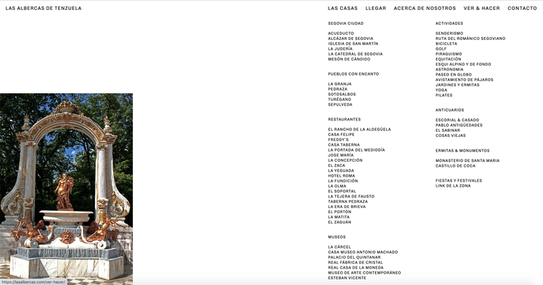
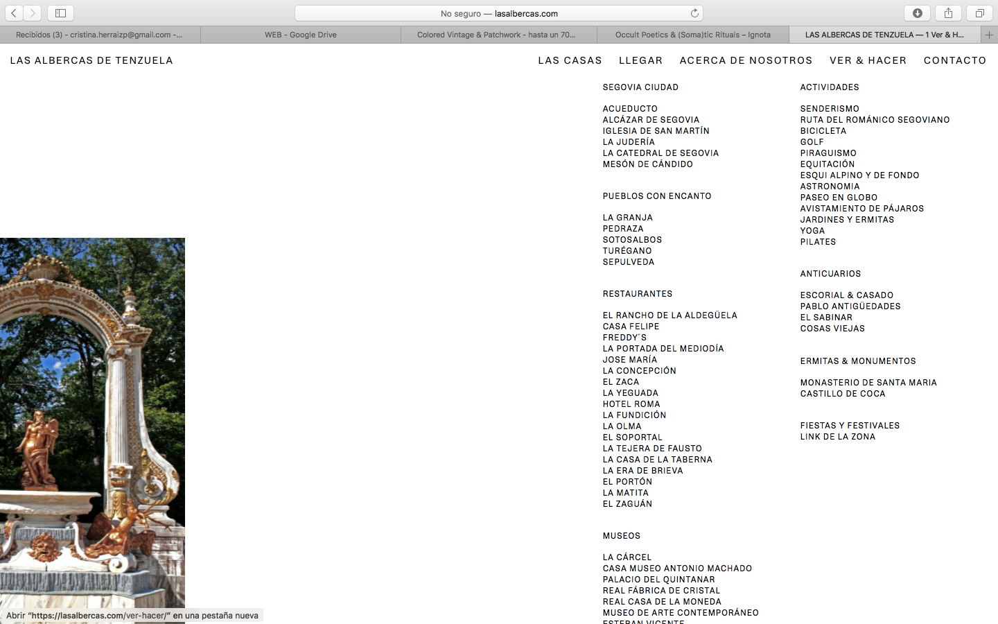
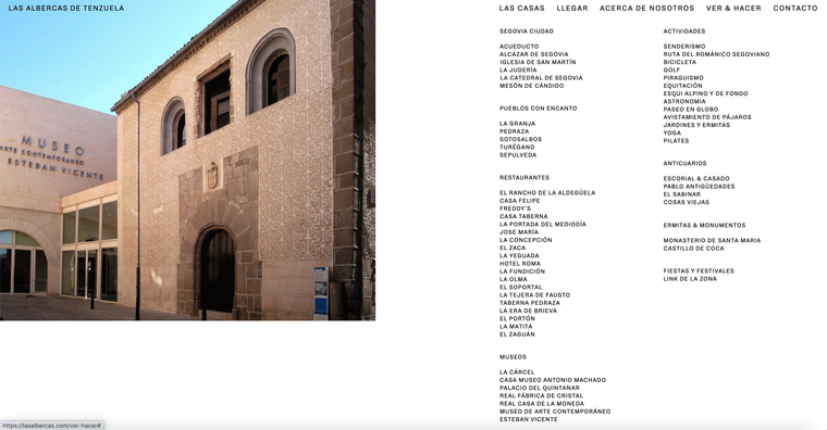
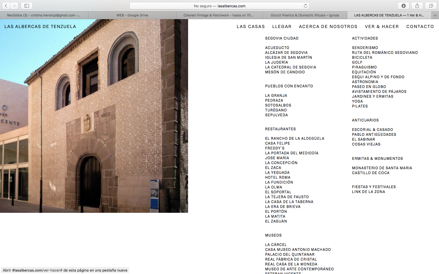
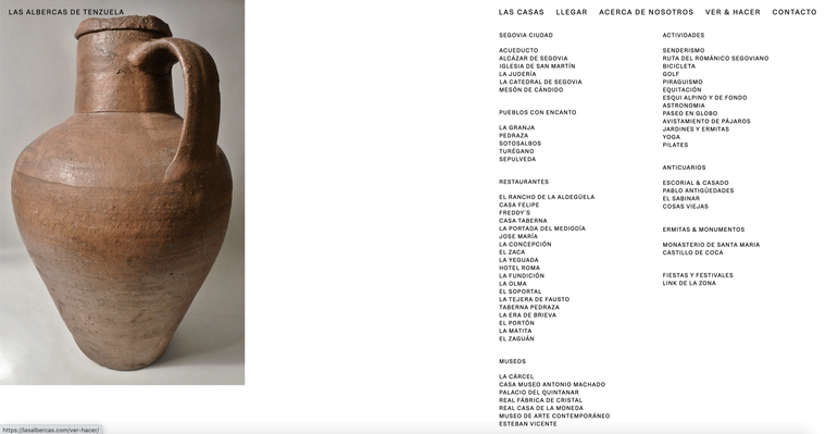
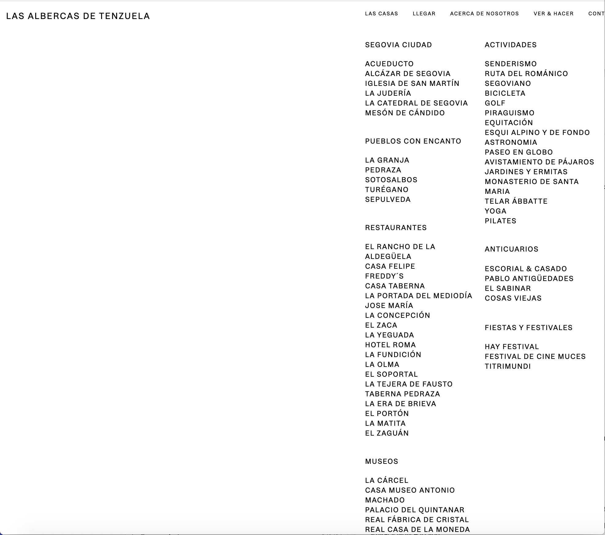
I am experiencing some odd issues with the hover images. On this page, particularly on the words 'Restaurante' 'Museos' and 'Ermitas & Monumentos' the images keep changing every time the page is refreshed, sometimes they don't even appear. Do you know why this could be?
I also wanted to know whether there is any particular way of determining a 'responsive' position of the images? In the case of portrait images the cropping in small screens is quite significant so some control over this would be necessary! Any thoughts? Please find screenshots of both 15" and 13" screens.
Thanks a lot for your help in advance!
All the bestChristian
-
Dear Christian
@cschm-tzI have sent you a message via chats :)
Best wishes and talk soon
Richard -
@Richard-K
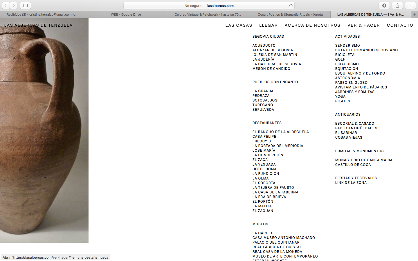
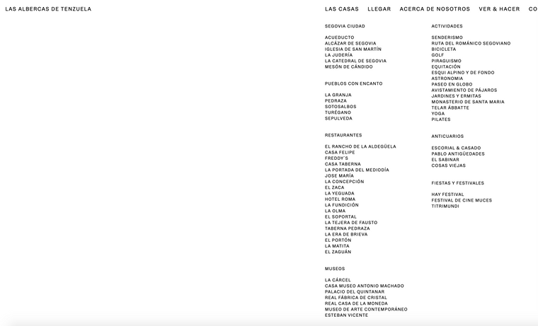
This is the example I was referring to where the text boxes misalign with the navigation menu. Is there a way to control this?The aligned version is a Macbook 15inch screen shot, and the first version (which is wrong) is taken from an iMac. Any thoughts on how to make it behave 'responsively'? Thank you so much!!
-
Dear @cschm-tz
The width of the navigation bar is determined by the Menu Items. I believe yours are set to px and therefore on a larger screen being font-size: 16px do not take up as much room and therefore fill-out less width that on a smaller screen. You can change the Font size to em or vw to have the font size determined by the browser's size. If you want to force the Menu bar to always have a specific width this is also possible but depending on how big the font-size is they menu items may not have enough room to spread out on smaller screens.
There are always options :)
Best
Richard -
Dear @Richard-K
Thanks so much for your suggestions, it sounds like using em's or vw is exactly what I need, is there any chance you can guide me as to where this is applied? How do I address the nav through css etc?
Thanks again for your time and patience.
All the bestChristian
-
Dear @cschm-tz
Sorry for the delay! do you still need help addressing the Nav elements?
Best wishes and talk soon :)
Richard -
Dear @cschm-tz
Sorry for the delay! do you still need help addressing the Nav elements?
Best wishes and talk soon :)
Richard -
Dear Christian @cschm-tz
In Customizing ▸ Menu Style > Primary Menu
You are able to set the menu-items based on %However if you wish to target them with CSS we can 'call' the class 'menu-item' in the navigation:
.laynav .menu-item {
    font-size:1.5vw !important;
}
We are addressing the menu-item and setting its 'font-size' with CSS ( Custom CSS can be added in 'Lay Options - Custom CSS & HTML' )
When using 'vw' the font-size will be calculated based on the user's browser/screen width ( viewport ).
https://css-tricks.com/fun-viewport-units/
Hope this helps christian :)
Sincerely
RichardDear @Richard-K,
Thankso so much for your tips and links, will definitely be handy in future scenarios.
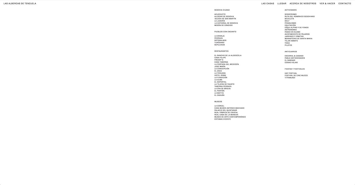
In this case, I am not after controlling the size of the text, it is got more to do with the width/position it occupies. Using 'vw' as suggested still makes the position vary and forces the text to change size. (see attachments)
Is there a way of avoiding this, i.e telling it to stay aligned to my other columns and with the same text size until it reaches the next breaking point?
Thanks again and hope youre having a great week
Christian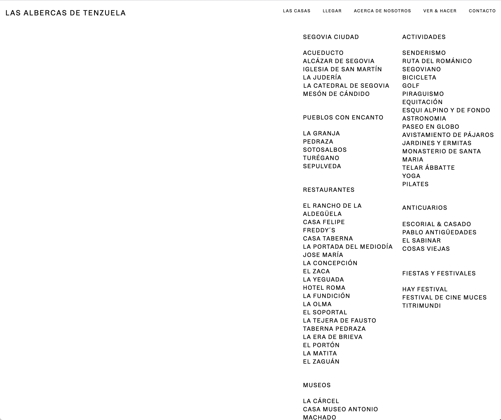
-
Dear Christian @cschm-tz
Give this a go:
nav.laynav.primary {
    max-width: 38.5%;
}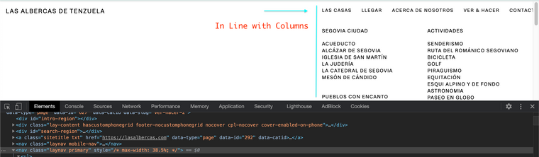
Best wishes & have a wonderful day
Richard
-
Dear Christian @cschm-tz
Give this a go:
nav.laynav.primary {
    max-width: 38.5%;
}
Best wishes & have a wonderful day
Richard
@Richard-K said in Hover Images change on Refresh and responsive positioning:
nav.laynav.primary {
max-width: 38.5%;
}Dear @Richard-K
Thanks so much!!!
Will this always affect text size? Ideally the text stays the same until it snaps in the first breaking point. This is mainly got to do with the fact that, if not, the text size ends up being very different to the site title, and the spacing becomes odd :/
Can anything be done?
Thanks again for all your help!C
-
Dear @cschm-tz
If your font-size is VW then it will of course be affected by the browser-width this is its purpose - so if you don't want it to change remove the VW settings and it will be PX, it wont change size until the first breaking point and all will be fine.
Best
Richard -
Dear @cschm-tz
If your font-size is VW then it will of course be affected by the browser-width this is its purpose - so if you don't want it to change remove the VW settings and it will be PX, it wont change size until the first breaking point and all will be fine.
Best
RichardDear @Richard-K
Hope you are havin a lovely week!
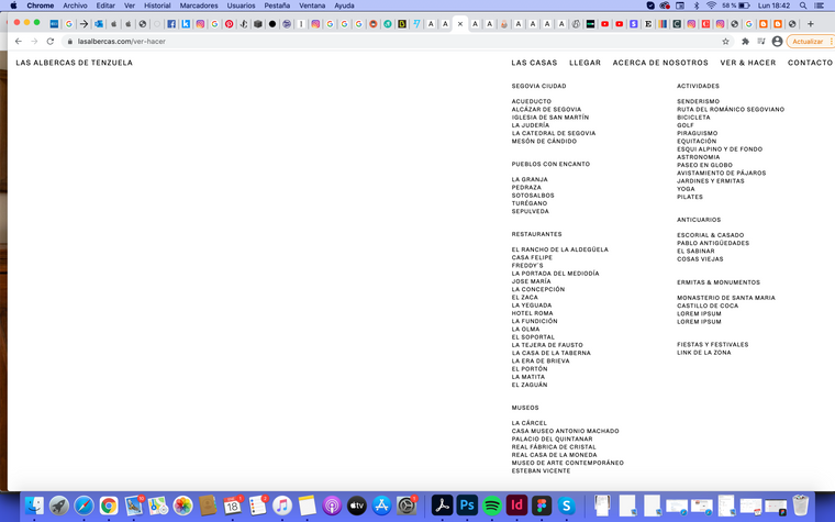
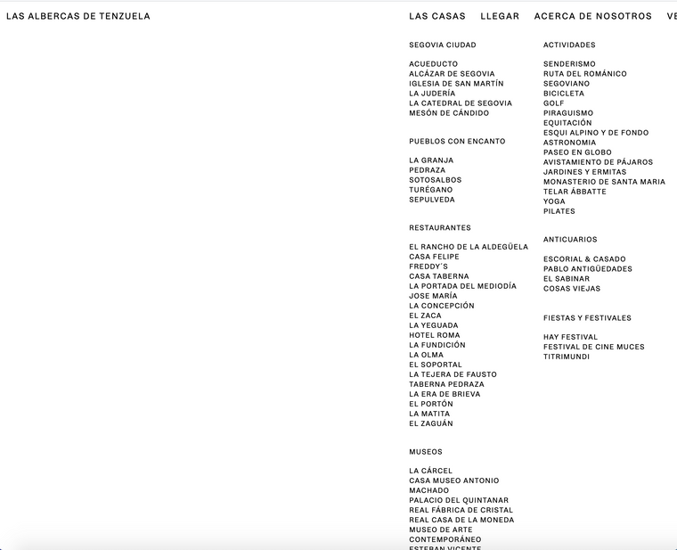
Thanks so much for your tips, its almost perfect.This scenario still leaves some info out/crops the nav when shrinking the browser as shown in the following screenshots. Any way to avoid this? Tweaking the max width only made the issue bigger for me ;(
Thanks and all the best
Christian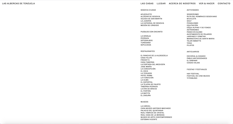
-
Dear Christian @cschm-tz
This needs to be thought about as a design issue not a coding issue:
You want the Menu to start at the same left margin as the page content/text, this is already achieved:
Font size is responsive so when you re-size the browser/page and text expands - it will go off the edge of page, or the spaces between the menu items will shrink until they clash and go into each other.
If Font-size is 'px' and stays the same size when page is resized it wont match the font-size of the content ( because content is responsive ). Menu items are pixels and non responsive and will stay the same size - thats its function when using pixels - its 'set'
This is a design choice that is up to you Christian.
Best wishes
Richard
I also code custom websites or custom Lay features.
💿 Email me here: 💿
info@laytheme.com
Before you post:
- When using a WordPress Cache plugin, disable it or clear your cache.
- Update Lay Theme and all Lay Theme Addons
- Disable all Plugins
- Go to Lay Options → Custom CSS & HTML, click "Turn Off All Custom Code", click "Save Changes"
This often solves issues you might run into
When you post:
- Post a link to where the problem is
- Does the problem happen on Chrome, Firefox, Safari or iPhone or Android?
- If the problem is difficult to explain, post screenshots / link to a video to explain it