Possible to have different mobile & desktop text styles when mobile version is 'turned off'?
-
Hi there - I've turned off my mobile by going into the Lay Options > Phone Breakpoint (set that to 0) in order to get the columns / gridder effect that I have on desktop for mobile.
Though, I'd like to still change the type size for my text formats on mobile. Is there a way to do this?
I've tried a bunch of different options to achieve this scouring through the support forums, but I can't seem to find a solution that allows me to have different mobile & desktop type style (specifically different font-sizes), while the mobile functionality is turned off.
Conversely, if there's a way to turn mobile back 'on', and then get the same gridder look as desktop, that would work too.
Thanks in advance!
-
Dear @kl
I think there are a few options to think about.
When clicking on the phone layout icon in the top-right of the Gridder, we can select the same layout for mobile too:

Different Font-sizing based on Mobile or Desktop has already be built into Lay Theme and can be set within Text-formats, but if you really want your mobile breakpoint to not exist then these wont be applied.
If this is not an option for you, targeting the Text and applying Custom CSS may suit.
Within 'Lay Options - Custom CSS & HTML' there is a Mobile CSS area that has a built in 'media query' so that it will only be applied to a certain screen size.
In "Text Formats' you may notice that each format has its own HTML class - you can use this to target that text format and apply CSS
E.g -- Class:_default -- fontsize :24px:
._default{
font-size:24px;
}
adding the following code within the Custom CSS area will make the text format:default get a font-size of 24px.
(note: this could be px , em, % , vw vh or any other css unit: https://www.w3schools.com/cssref/css_units.asp)It would help to read on the documentation page about CSS if this is what you need:
https://laytheme.com/documentation.html#custom-css-stylingIt is possible to have different text formats for Mobile & desktop, thats the main thing :)
Have a wonderful day & best wishes
Richard
-
Thanks so much Richard for this reply!
I'm curious, and perhaps I'm not understanding two things, but
-
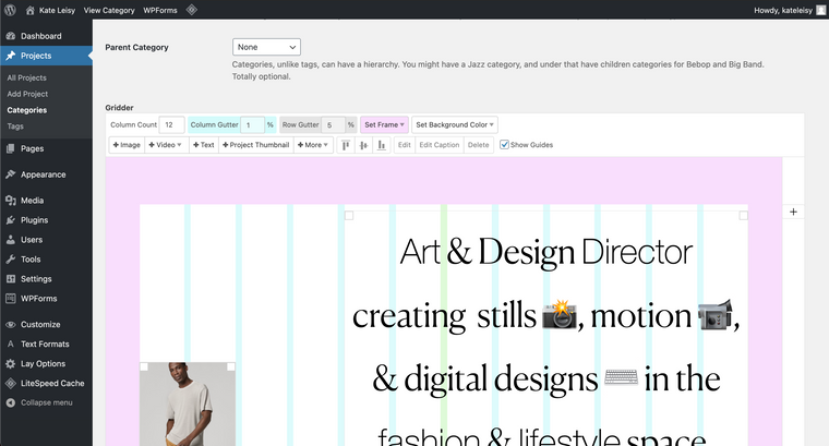
I don't seem to have a phone layout icon in the top right of the gridder? See screenshot below

-
Will targeting the text with custom CSS work even if the mobile breakpoint does not exist? I can't seem to get this to work, and have tried this in the Custom CSS area. Perhaps my syntax is wrong? I've been using ._H1 and ._H2 and ._default
Thank you so much for your help!
-
I also code custom websites or custom Lay features.
💿 Email me here: 💿
info@laytheme.com
Before you post:
- When using a WordPress Cache plugin, disable it or clear your cache.
- Update Lay Theme and all Lay Theme Addons
- Disable all Plugins
- Go to Lay Options → Custom CSS & HTML, click "Turn Off All Custom Code", click "Save Changes"
This often solves issues you might run into
When you post:
- Post a link to where the problem is
- Does the problem happen on Chrome, Firefox, Safari or iPhone or Android?
- If the problem is difficult to explain, post screenshots / link to a video to explain it