Collapse mobile navigation after click
-
Hello,
I am building a very simple one-pager with three anchors that you can jump to in the menu. That also works quite fine with the mobile burger navigation. But I want the navigation to close after a menu item has been clicked.
To close the navigation after clicking on one menu item I used some code line I found here:
http://laythemeforum.com:4567/topic/4005/collapse-mobile-nav-on-click-menu-item butBut sadly the suggested solution doesn't work as expected. It actually messes up the scrollTo action, so now it scrolls up to the top and than to the anchor. And I don't understand why. I also tried the suggested toggleClass, but it worked even less.
This is the script I have in Custom HTML at bottom:
<script>
jQuery(document).ready(function(){
jQuery('body').on('click', 'li.menu-item > a', function(event) {
event.preventDefault();
var id = jQuery(this).attr('href');
jQuery('html, body').animate( { scrollTop: jQuery(id).offset().top }, 750 );
});jQuery(document).on("click", ".mobile-nav ul li a", function(event) {
jQuery(".mobile-nav").removeClass('active');
jQuery(".mobile-nav").css('transform','translateY(-180px)');
});
});
</script>This is the link to the page I am talking about: http://wendelstein-steuerberatung.de
I am very much looking forward to your answer.
Best regards, Miriam -
Dear Miriam
Did you find a solution? :)
<script>
jQuery(document).ready(function(){
jQuery('body').on('click', 'li.menu-item > a', function(event) {
event.preventDefault();
var id = jQuery(this).attr('href');
jQuery('html, body').animate( { scrollTop: jQuery(id).offset().top }, 750 );
});

jQuery(document).on("click", ".mobile-nav ul li a", function(event) {
jQuery(".mobile-nav").removeClass('active');
jQuery(".mobile-nav").css('transform','translateY(-180px)');
});
});
</script>
Best Wishes
Richard -
Hi Richard,
yes, I deleted the upper part of the script. It probably duplicated the default settings in the theme and was the reason for the interference. It works fine now.
<script>
jQuery(document).ready(function(){jQuery(document).on("click", ".mobile-nav ul li a", function(event) {
jQuery(".mobile-nav").removeClass('active');
jQuery(".mobile-nav").css('transform','translateY(-180px)');
});});
</script>But as usual a new problem appeared. 😅 If an item is clicked in the menu and the menu is disappeared, the "close-x" remains (see screenshot). Instead, the burger menu should appear again. Do you have an idea how to solve this?
Thanks for your help again,
Miriam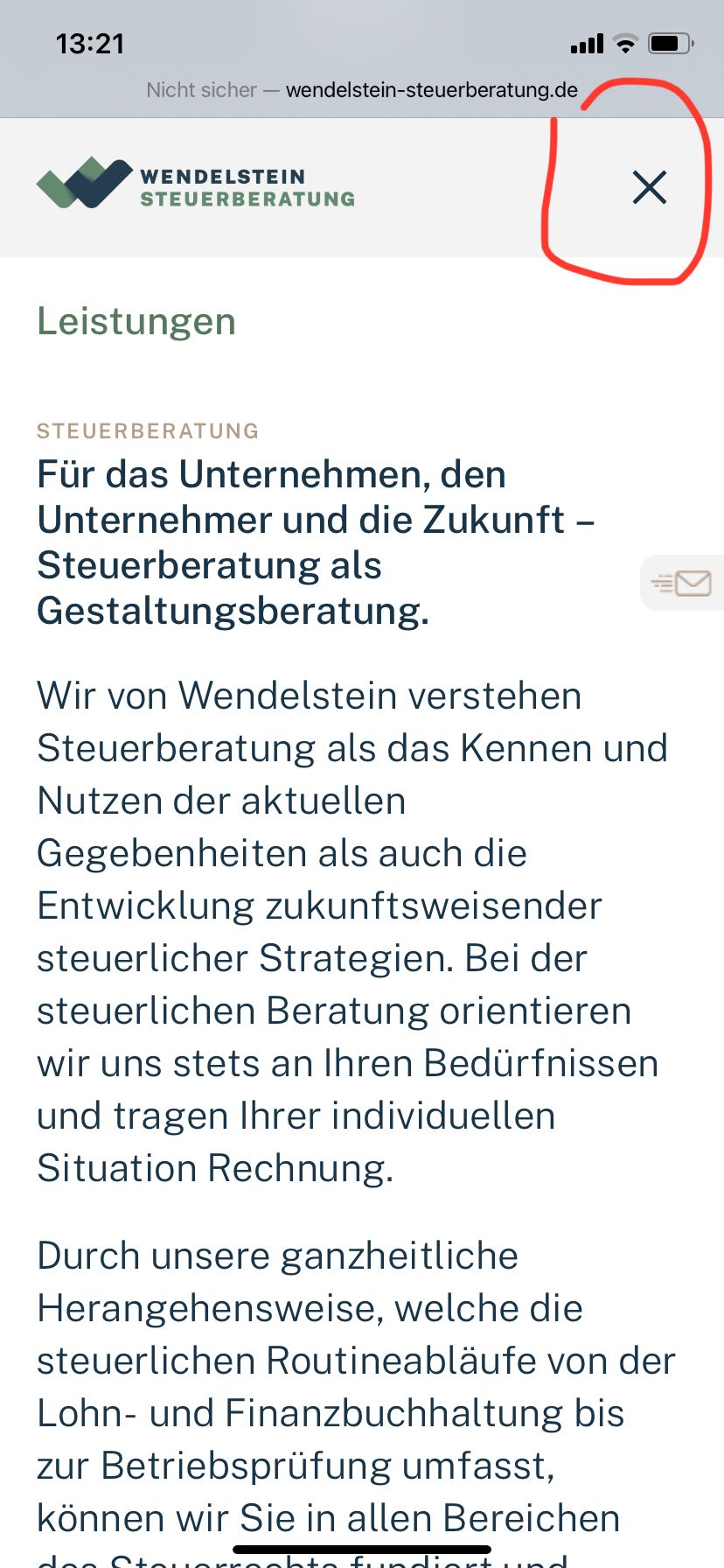
-
Dear Miriam @miriamb
Your code is good! :)
The Mobile Icon "burger" also gets a class .active added and removed. This class .active gives new CSS telling it to change shape, you can see here the class be added and removed on click:
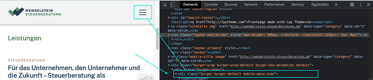
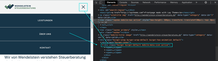
Here in the below code i have added that the 'mobile-menu-icon' must also remove its class .active when you click & that way it will return to its original state:
jQuery(document).ready(function(){

jQuery(document).on("click", ".mobile-nav ul li a", function(event) {
jQuery(".mobile-nav").removeClass('active');
jQuery(".mobile-menu-icon").removeClass('active');
jQuery(".mobile-nav").css('transform','translateY(-180px)');
});

});
Now when you click a menu-item the .active should be removed from the mobile-icon and all should work as desired!
Hope this helps Miriam and have a wonderful day - Website looks great :)
Sincerely
Richard -
Dear Miriam @miriamb
Your code is good! :)
The Mobile Icon "burger" also gets a class .active added and removed. This class .active gives new CSS telling it to change shape, you can see here the class be added and removed on click:
Here in the below code i have added that the 'mobile-menu-icon' must also remove its class .active when you click & that way it will return to its original state:
jQuery(document).ready(function(){

jQuery(document).on("click", ".mobile-nav ul li a", function(event) {
jQuery(".mobile-nav").removeClass('active');
jQuery(".mobile-menu-icon").removeClass('active');
jQuery(".mobile-nav").css('transform','translateY(-180px)');
});

});
Now when you click a menu-item the .active should be removed from the mobile-icon and all should work as desired!
Hope this helps Miriam and have a wonderful day - Website looks great :)
Sincerely
Richard
I also code custom websites or custom Lay features.
💿 Email me here: 💿
info@laytheme.com
Before you post:
- When using a WordPress Cache plugin, disable it or clear your cache.
- Update Lay Theme and all Lay Theme Addons
- Disable all Plugins
- Go to Lay Options → Custom CSS & HTML, click "Turn Off All Custom Code", click "Save Changes"
This often solves issues you might run into
When you post:
- Post a link to where the problem is
- Does the problem happen on Chrome, Firefox, Safari or iPhone or Android?
- If the problem is difficult to explain, post screenshots / link to a video to explain it