Mobile Version Text Format
-
Dear @Richard,
I'm using the desktop version of http://testshila.de/onepage/ for the mobile version, which works well.
Is it possible to only change the text format for the mobile version? As the breaking point is 0 the mobile text format doesn't apply.
Thanks and best wishes,
Daniel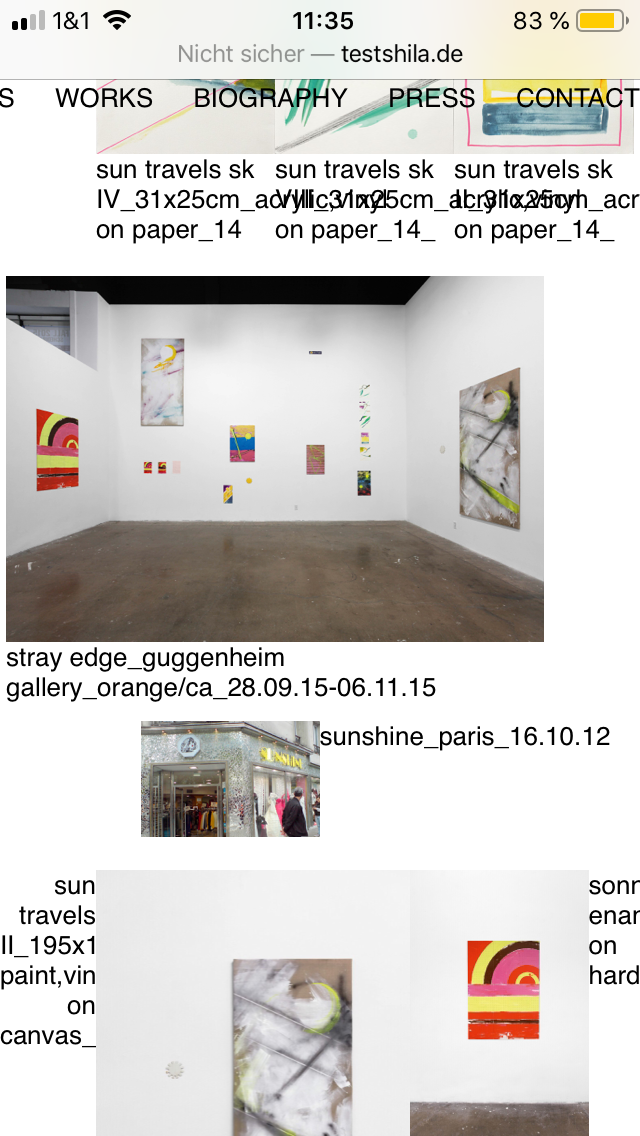
-
Dear Daniel
@danny
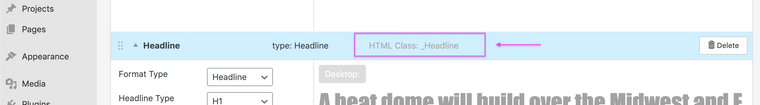
When the time comes you can set those text formats to change on Mobile even if you have a 0 breakpoint Mobile Layout.
Text formats can be given a Class, then using some Custom CSS you can change them:
Best wishes 🌞
Richard
-
Dear Daniel
@danny
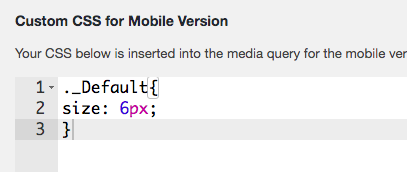
Very close 🌝
._Default{
font-size:6px;
}
Now the trick is how to apply it only on mobile even though you have set no mobile breakpoint for the CSS to apply to?
A: We can use a 'Media Query'
@media only screen and (max-width: 600px) {
     ._Default{
    font-size:6px;
    }
}
The above says:
For a screen 600px and under - Apply the following CSS Rules - Class: _Default now gets a font-size of 6px.In some cases you may need to apply the term
!important
to override any CSS that has already been set that may interfere.!importantwill always take precedence. However use it sparingly as a rule.@media only screen and (max-width: 600px) { ._Default{ font-size:6px !important; } }
Hope this helps Daniel and best wishes ✨
Richard
-
Dear @Richard,
thanks so much, works great!!
Would it be possible that you have a look at my other questions on the Lightbox Captions (http://laythemeforum.com:4567/topic/6880/lightbox-caption-alignment)
and the size and colour of the menu points?
http://laythemeforum.com:4567/topic/6872/different-font-for-each-menu-point
Thanks again.
It is really fun to work with the theme,
Best wishes and a nice day,
Daniel
-
Dear Daniel
@danny
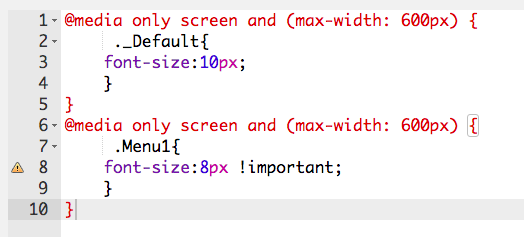
You can declare your CSS rules within one 'media query'. You do not need to make muiltiple - E.g:
@media only screen and (max-width: 600px) {
     ._default{
             font-size:10px;
     }

     .Menu{
             font-size:8px !important;
     }
}
Please note, respectfully Daniel that if you wish to go deeper into customising Lay theme it is up to you to research how Basic CSS and HTML function, i am unfortunately unable to maintain a tutorial like this even though i wish to help.
Have a wonderful day Daniel and thank you for supporting Lay theme.
Best
Richard
I also code custom websites or custom Lay features.
💿 Email me here: 💿
info@laytheme.com
Before you post:
- When using a WordPress Cache plugin, disable it or clear your cache.
- Update Lay Theme and all Lay Theme Addons
- Disable all Plugins
- Go to Lay Options → Custom CSS & HTML, click "Turn Off All Custom Code", click "Save Changes"
This often solves issues you might run into
When you post:
- Post a link to where the problem is
- Does the problem happen on Chrome, Firefox, Safari or iPhone or Android?
- If the problem is difficult to explain, post screenshots / link to a video to explain it