Responsive font size
-
Yeah, I think it would be good to be able to either define font sizes in px or in vw. When defined as vw, the font size resizes with the browser. https://css-tricks.com/viewport-sized-typography/
Should only be used for big text though. Small text could become way too small at a certain size. Like here: http://shop.mango.com/iframe.faces?state=he_004_AL
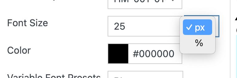
:scream:Edit: In version 1.022 the font-size can now be set in % in Text Formats and the Customizer
-
Yeah, I think it would be good to be able to either define font sizes in px or in vw. When defined as vw, the font size resizes with the browser. https://css-tricks.com/viewport-sized-typography/
Should only be used for big text though. Small text could become way too small at a certain size. Like here: http://shop.mango.com/iframe.faces?state=he_004_AL
:scream:Edit: In version 1.022 the font-size can now be set in % in Text Formats and the Customizer
@arminunruh Hi, how i can convert font size (px) to % ? there is a tool or something helse? Thank you
-
in textformats you can set font sizes to %
not sure how you'd convert this though
I also code custom websites or custom Lay features.
💿 Email me here: 💿
info@laytheme.com
Before you post:
- When using a WordPress Cache plugin, disable it or clear your cache.
- Update Lay Theme and all Lay Theme Addons
- Disable all Plugins
- Go to Lay Options → Custom CSS & HTML, click "Turn Off All Custom Code", click "Save Changes"
This often solves issues you might run into
When you post:
- Post a link to where the problem is
- Does the problem happen on Chrome, Firefox, Safari or iPhone or Android?
- If the problem is difficult to explain, post screenshots / link to a video to explain it