Mobile Fixed Background Video
-
Re: Use a video as page background
I'm trying to create a fixed background video. On desktop everything works fine, just on the mobile breakpoint the video gets cut and isn't fullscreen anymore.
I could change .coulmn-wrap to position: fixed as well and everything would work,
however, in the final application this is not an option.My html
<video playsinline="" muted="" loop="" class="autoplay loaded bg-videoo" autoplay=""><source src="https://www.domain.de/wp-content/uploads/2021/06/file-name.webm" type="video/webm"></video>and CSS
 .bg-videoo {
    object-fit: cover;
    width: 100vw;
    height: 100vh;
    position: fixed;
    top: 0;
    left: 0;
  }
In general videos like this work on mobile. Like with this Pen https://codepen.io/chriscoyier/pen/jmXapj?editors=1100
So it has to have something to do with laytheme.Could you help me?
-
Dear @mw
Sorry for the delay over the weekend.
When inspecting the code 🔍 i removed the following:bg-videoo { /* object-fit: cover; */ /* width: 100vw; */ /* height: 100vh; */ /* position: fixed; */ /* top: 0; */ /* left: 0; */ }And added:
video.bg-videoo {
    max-width: 100vw;
}
Giving this result:
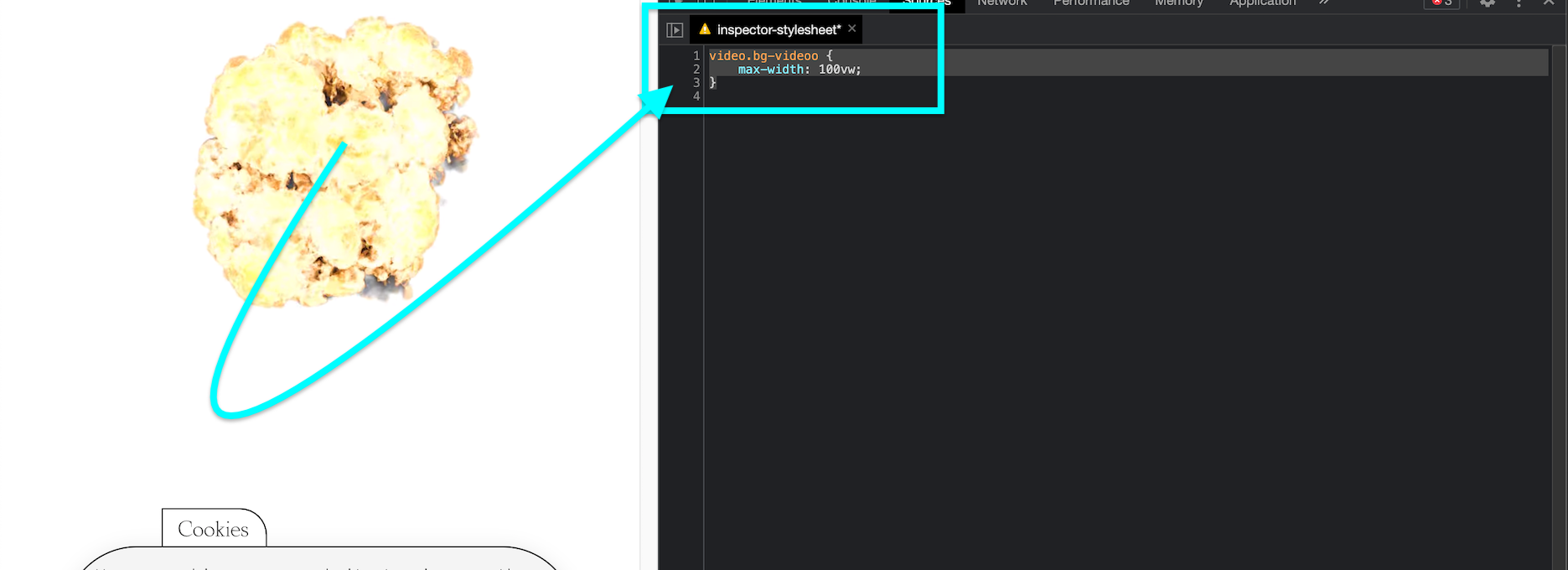
This is of course not full height of the Browser, but is the correct width while keeping aspect ratio of Video - what is your desired (width/height/etc)
Talk soon & have a wonderful day 🌝
Richard
-
Thank you for your answer @Richard . I need the video to be fixed and to cover the whole body (100vh)
Now I found out that the behavior is down to position fixed, causing this problem in the mobile view. Using your code (or my code) with position fixed is causing this error. Without fixed positioning, everything works as expected.
Is there something that I need to know about the theme in order to work with fixed positioning? Cause I remember some issues in the past that I had with fixed positioning.
Would love to hear from you
Best, Markus
I also code custom websites or custom Lay features.
💿 Email me here: 💿
info@laytheme.com
Before you post:
- When using a WordPress Cache plugin, disable it or clear your cache.
- Update Lay Theme and all Lay Theme Addons
- Disable all Plugins
- Go to Lay Options → Custom CSS & HTML, click "Turn Off All Custom Code", click "Save Changes"
This often solves issues you might run into
When you post:
- Post a link to where the problem is
- Does the problem happen on Chrome, Firefox, Safari or iPhone or Android?
- If the problem is difficult to explain, post screenshots / link to a video to explain it