Use mobile menu on desktop, easy tutorial? Drop down menu right aligned text?
-
Re: Use mobile menu on desktop
Did anyone have any luck creating a burger menu for desktop? Or could someone point me in the direction of an easy tutorial (I've searched and see a lot of results for 'squarespace' or others).
I'm very amateur so I'm not sure if I'd have the skillset to code this myself? Any help would be greatly appreciated!
On a side note — I've tried the new dropdown menu feature (amazing!) but with a right hand side menu, the dropdown titles run 'off the page' so to speak.
Not sure if there are any tips here? Other than moving the menu away from the right hand side of my site?
Many thanks!
-
Dear @sarahmorrison
Yes the New sub-menu feature!
I was going to suggest that a Burger Menu is very similar to a Submenu, except for the burger Icon and 'X' close icon. It will probably be much simpler for you to use the Sub-menu option then if needed i can help you change the title text (sub-menu title) into an image (e.g a Burger) then if you click the image, menu items will appear (the same as a traditional burger menu).If the issue with menu items running off the page continues i can help with that.
Talk soon Sarah and have a wonderful day 🌻
Richard
@Richard thanks so much for your help.
I would love to know how to change the dropdown menu title to an image so I can use a burger and 'X' icon. Could you please advise?
I wasn't sure the best practice as to what menu item to use as the 'menu' dropdown title. So I have used a category page for this. Is this correct? (screenshot attached)
I have resolved the titles running off the page (vertical alignment, right align) yay!
Is there a way to adjust (increase) the line spacing between drop down menu items? I tried to change the text format but it is still tight. (screenshot attached)
-
Dear Sarah
@sarahmorrison
I can help you with the above questions 🌝
What was your website domain again? or were you working offline ( I feel we talked about this on another thread sorry, but i loose track! )
Talk soon & have a wonderful day Sarah 🏖
Richard
-
Dear Sarah
@sarahmorrison
I can help you with the above questions 🌝
What was your website domain again? or were you working offline ( I feel we talked about this on another thread sorry, but i loose track! )
Talk soon & have a wonderful day Sarah 🏖
Richard
@Richard no problem, thanks so much for the help. Our site is wonderandwork.com but it's currently just a holding page. Let me know what you need?!
Another side question, I also noticed the close 'X' on mobile doesn't use the prescribed padding, it locks to the top right with 0px padding.
-
Dear Sarah
@sarahmorrison
it's currently just a holding page
I see, allgood i can setup some basic example's on a test site for you.
First Question:
I would love to know how to change the dropdown menu title to an image so I can use a burger and 'X' icon. Could you please advise?
If you wish to use Lay Theme's built in Burger Menu then you will have to create all Layout's within your Mobile Layout. If you do not wish to use only Mobile Layouts then it will need to be custom coded to appear on Desktop Layouts.
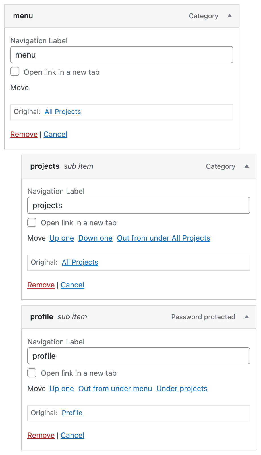
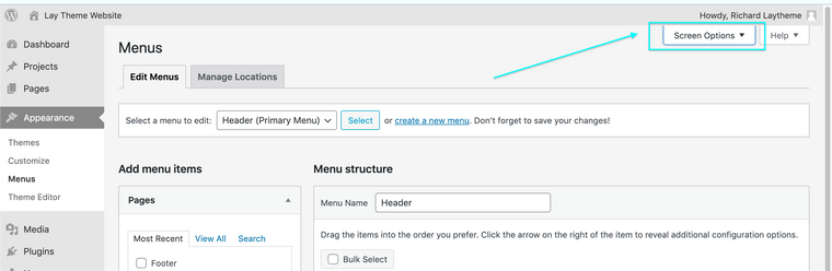
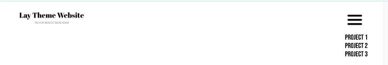
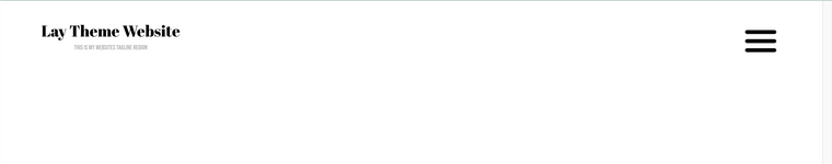
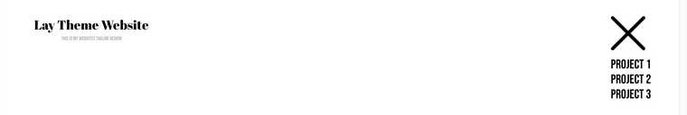
Here is a basic setup, a Sub-menu with three projects inside (please note: my "sub-menu" was created with the "custom-links" option, we will be using it's data-type later) :
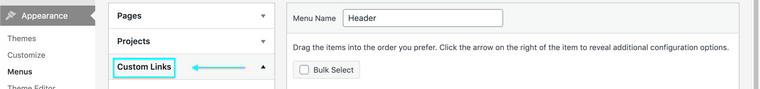
I want to give this "Sub-menu" a custom class so i can easily target it. To do this I go into my Menu options and click "screen Options" in the right hand top corner:
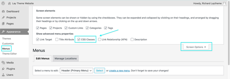
Then i choose the Option "CSS Classes"
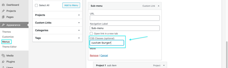
Now i can give my Sub-menu Title a CSS Class, for example
custom-burger
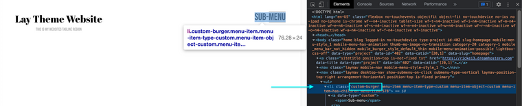
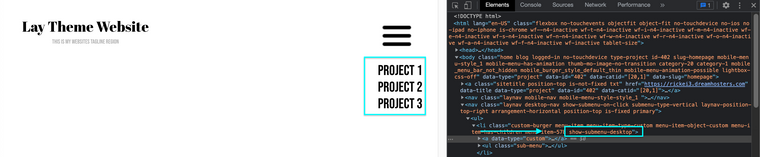
Checking on the Front-end i can confirm that my Sub-menu now has the added class
custom-burger( right-click - inspect ):
We could use jQuery to replace text with image but for this we can make use of some simple css ( here the custom link comes in handy to specify ), (Code can be inserted into your Lay Theme website via > Lay Options > Custom CSS & HTML or > Customize > CSS:
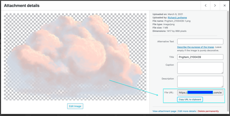
.custom-burger [data-type="custom"] { content: url(https://rickei3.dreamhosters.com/wp-content/uploads/2021/11/menu.png); }The above code is replacing the text with an image defined by it's URL path. You can get url path of any image from your Media Library. > Appearance > Media >
Upload any image and then see it's details, in the bottom right corner you can copy the URL file path and insert it into the above code, replacing my example:
Your code may look like similar too this:
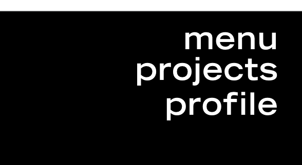
.custom-burger [data-type="custom"] { content: url(https://sarahswebsite/wp-content/uploads/2021/11/menu.png); }Lets see the result, Closed sub-menu:
Open Sub-menu:
so now we need the final piece which it to make sure that the Burger is replace by an 'x' when then sub-menu is open.
When the Sub-menu is 'open' a class is added calledshow-submenu-desktop. We can take advantage of this for our 'X' button:
Here the code defines that only when this class is added (meaning the sub-menu is open) do we change the image.
.show-submenu-desktop [data-type="custom"] { content: url(https://rickei3.dreamhosters.com/wp-content/uploads/2021/11/close.png); }This image is an 'x' remembering i took the URL file path and inserted into the code. Lets see the Result!
Submenu closed:
And sub-menu open:
I wont go into dimensions of the Image Sarah and will leave this up to you, this will be dependent on your design needs and how you want your site.
Questions 2:
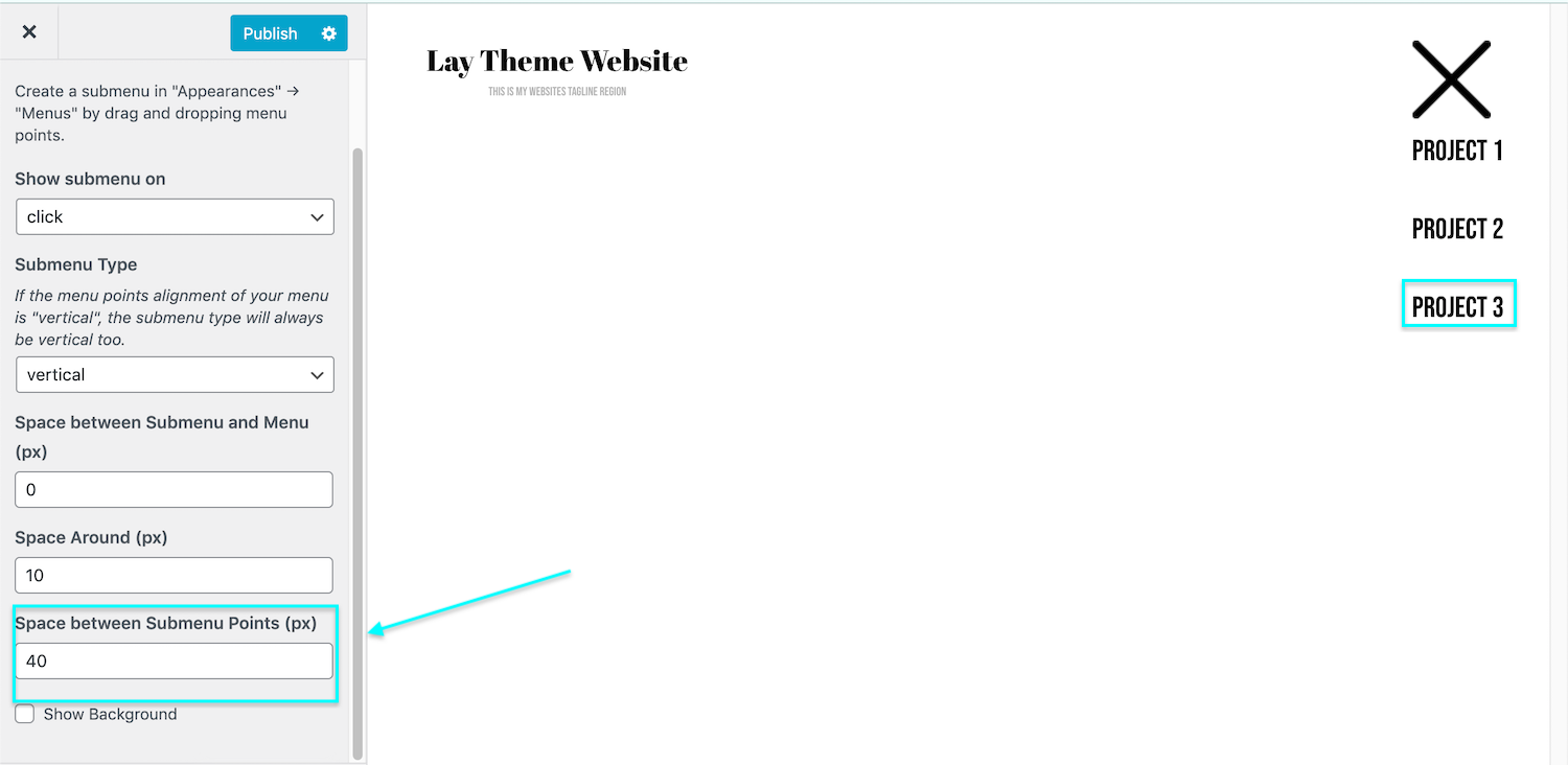
"Is there a way to adjust (increase) the line spacing between drop down menu items? I tried to change the text format but it is still tight. (screenshot attached)"
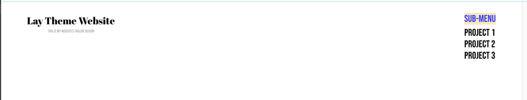
You can adjust the space between menu-items via > Customize > Menu styles > Submenus > Space between submenu points >
Here i have exaggerated 40px to show you:
Hope this helps you Sarah, the finer tuning will need to be done by you, but this is one way of changing the sub-menu into a "burger-menu" while still using Desktop Layouts.
Best wishes & have a wonderful day 🌻
Richard
-
Thank you SO much @Richard this has all worked brilliantly! I really appreciate your help, thanks again for such an awesome theme! :)
-
Great to hear all is working @sarahmorrison Have a great day and thank you for supporting Lay Theme 🌝
-
Hi @Richard, @mariusjopen,
the described workaround, seems to be a very easy way to implement a burger menu in the desktop view. Thanks for this.
I tried to implement it, but in my sub-menu are custom links witch have also the data-type="custom". So also the submenu items get displayed as the image. Is there a way to use also custom links as submenu items?
thx
-
Dear @FesT
This is a good point and actually not very good from me to not realise! so sorry.
I'm sure there are a few ways but this is quick.
We can add a custom class to our Sub-menu, here i create one calledmagic-world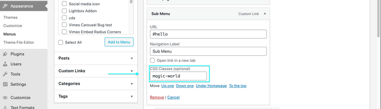
Then i can check and see if this registered:
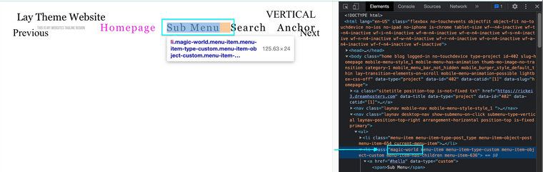
Cool it did! ✨
Lets make use of this target now, adding some simple jQuery saying get me "magic-world" and its child (which is an <a> or link element) give that child a class calledwham!jQuery(".magic-world").children('a').addClass("wham!");When the code is inserted into your webpage via > Lay Options > Custom CSS & HTML > we should really wrap it in a newpage event to work properly with Lay Theme e.g:
window.laytheme.on("newpageshown", function(){
     jQuery(".magic-world").children('a').addClass("wham!");
});
Now we dont need to use
data-type- customto specify we can usewham!: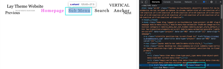
Therefore the code earlier on this thread:
.custom-burger [data-type="custom"] { content: url(https://rickei3.dreamhosters.com/wp-content/uploads/2021/11/menu.png); }would now be
.custom-burger .wham! { content: url(https://rickei3.dreamhosters.com/wp-content/uploads/2021/11/menu.png); }( i see that earlier i gave it a custom class of
custom-burgerand this time ive called itmagic-worldmaybe dont call it magic world 🌝 but stick to the custom burger for continuities sake! )Sorry if ive confused, let me know if i can clear anything up
Best wishes
Richard
-
Dear @FesT
This is a good point and actually not very good from me to not realise! so sorry.
I'm sure there are a few ways but this is quick.
We can add a custom class to our Sub-menu, here i create one calledmagic-worldThen i can check and see if this registered:
Cool it did! ✨
Lets make use of this target now, adding some simple jQuery saying get me "magic-world" and its child (which is an <a> or link element) give that child a class calledwham!jQuery(".magic-world").children('a').addClass("wham!");When the code is inserted into your webpage via > Lay Options > Custom CSS & HTML > we should really wrap it in a newpage event to work properly with Lay Theme e.g:
window.laytheme.on("newpageshown", function(){
     jQuery(".magic-world").children('a').addClass("wham!");
});
Now we dont need to use
data-type- customto specify we can usewham!:Therefore the code earlier on this thread:
.custom-burger [data-type="custom"] { content: url(https://rickei3.dreamhosters.com/wp-content/uploads/2021/11/menu.png); }would now be
.custom-burger .wham! { content: url(https://rickei3.dreamhosters.com/wp-content/uploads/2021/11/menu.png); }( i see that earlier i gave it a custom class of
custom-burgerand this time ive called itmagic-worldmaybe dont call it magic world 🌝 but stick to the custom burger for continuities sake! )Sorry if ive confused, let me know if i can clear anything up
Best wishes
Richard
-
This post is deleted!
I also code custom websites or custom Lay features.
💿 Email me here: 💿
info@laytheme.com
Before you post:
- When using a WordPress Cache plugin, disable it or clear your cache.
- Update Lay Theme and all Lay Theme Addons
- Disable all Plugins
- Go to Lay Options → Custom CSS & HTML, click "Turn Off All Custom Code", click "Save Changes"
This often solves issues you might run into
When you post:
- Post a link to where the problem is
- Does the problem happen on Chrome, Firefox, Safari or iPhone or Android?
- If the problem is difficult to explain, post screenshots / link to a video to explain it