Mobile image size not correct / too big
-
Also i encounted another issue.
The full screen cover image does not show on mobile devices (iOS and Android)
eg.: https://www.leopoldfiala.com/neonoir/Actually it does not show on Desktop as well. Very strange!
Any idea how to fix that?
Best
Leo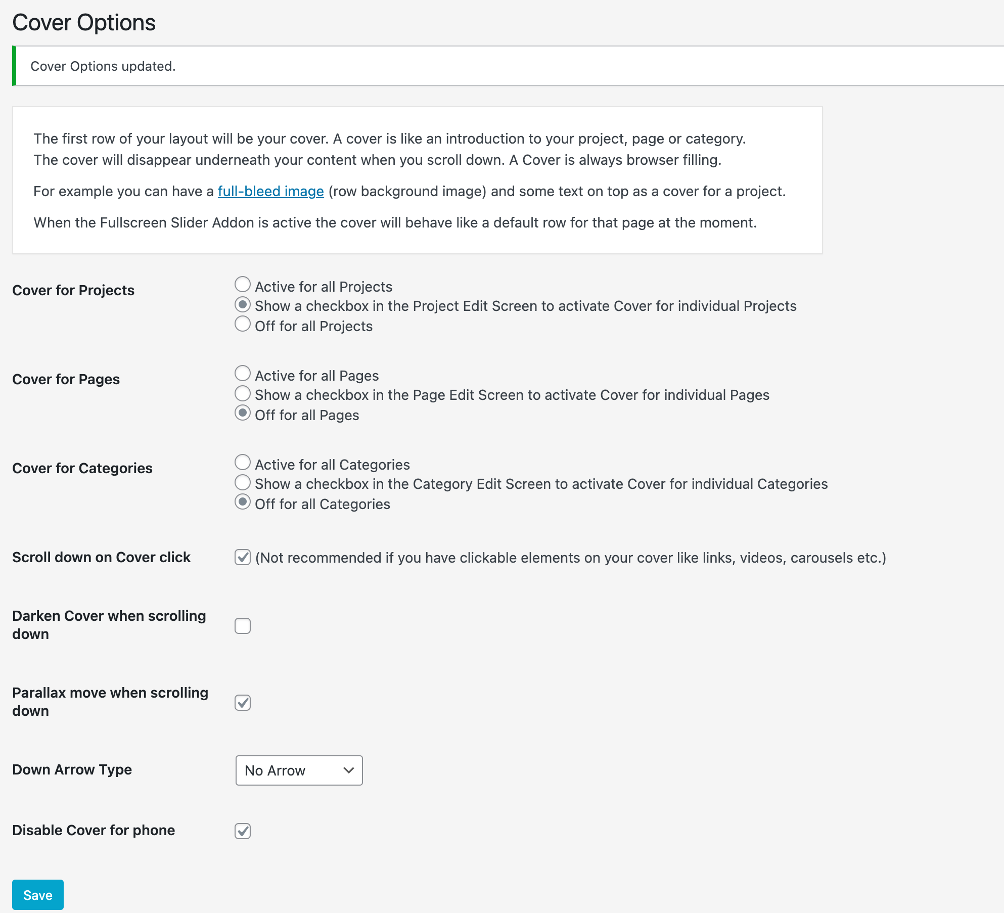
Cover shows on mobile and is not visible on desktop (the cover text is visible though)
-
Dear Leo
@leo01
Cool website!, could you please confirm the following before other debugging:
Wordpress, Lay Theme & Laytheme's Addons are all up to date ?
Any custom CSS or JS that may interfere is temporarily removed.
Any third-party plugins are de-activated to see if this resolves the issue.
If using a WordPress Cache plugin, disable it or clear your cache.
If your WordPress Dashboard shows a warning "PHP Update required” Please update your PHP version in your webhost control panel.
Possibly your website is running PHP 8.0 this has been known in some cases to cause issue.
Talk soon Leo and have a great day 🌻
Richard
THANKS!
@Richard said in Mobile image size not correct / too big:
Dear Leo
@leo01
Cool website!, could you please confirm the following before other debugging:
Wordpress, Lay Theme & Laytheme's Addons are all up to date ?
JES
Any custom CSS or JS that may interfere is temporarily removed.
No but it worked before. I do have some custom css in the laytheme options
Any third-party plugins are de-activated to see if this resolves the issue.
Not many active, just realised the issue comes from Imagify. It serves WEP images for the website
This setting causes the error:
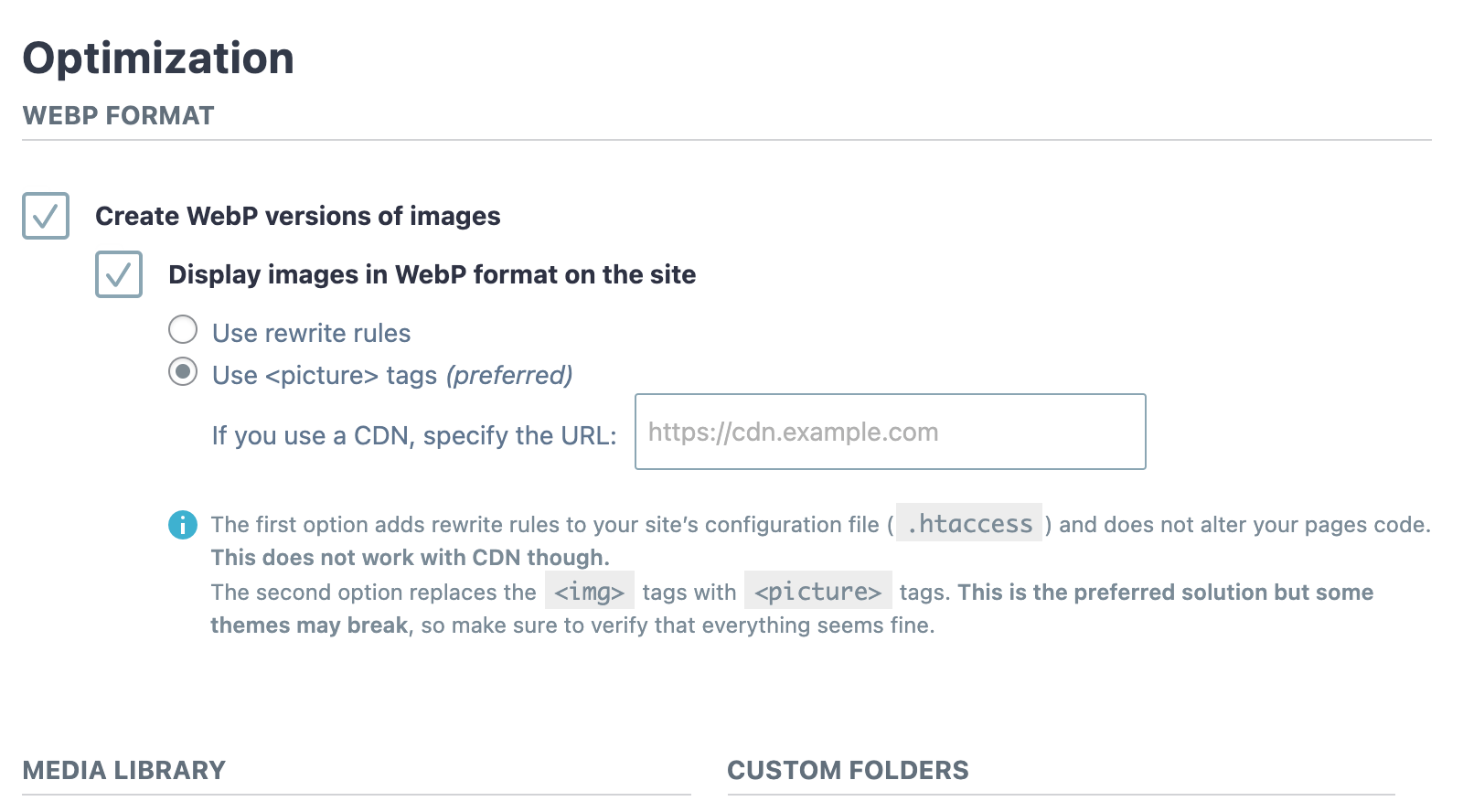
If i switch it to rewirite it works.
Can you recommend that setting.If using a WordPress Cache plugin, disable it or clear your cache.
Done before checking
If your WordPress Dashboard shows a warning "PHP Update required” Please update your PHP version in your webhost control panel.
Possibly your website is running PHP 8.0 this has been known in some cases to cause issue.
Talk soon Leo and have a great day 🌻
Richard
Best
Leo -
Dear Leo
@leo01
Thanks for the above info, great to know and happy you solved one of the issues.
Regarding the 'Cover' Still visible on Mobile, can we test in an Ingocnito window to make sure it's not your Browsers Cache & also test on a true mobile device to make sure it's not the use of a Desktop or Laptop (but in Mobile width) that is triggering the Cover response.
Best wishes Leo! 🌞
Richard
-
Dear Leo
@leo01
Thanks for testing. Unsure why you are having issue, due to exact setup, but we can easily disable the Cover region manually if you want to.
The following code can be added into > Lay Options > Custom CSS & HTML >
If you want the cover to only be disabled for Mobile then add the code into the "Mobile CSS" area or if you want it disabled for both Desktop and Mobile then just add it to "Custom CSS" Area..cover-region { display:none; }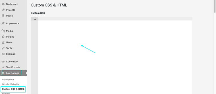
Talk soon Leo and let me know how you go! 🌝
Richard
-
@Richard said in Mobile image size not correct / too big:
.cover-region {
    display:none;
}Thanks Richard.
Very stange i added the code in the css mobile field. Purged cache and minify Cache and still the same - cover shows on mobile (iphone in incognito mode)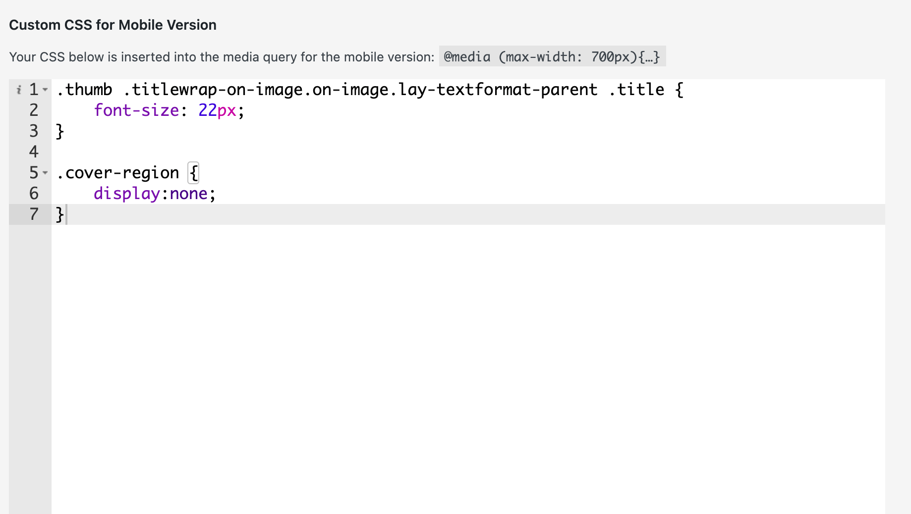 image url)
 -
Dear @leo01
Sorry that my initial code didn't work. Here when testing on Mobile within a Browser it's fine:

But within a Mobile Simulator (& true mobile device) its not:
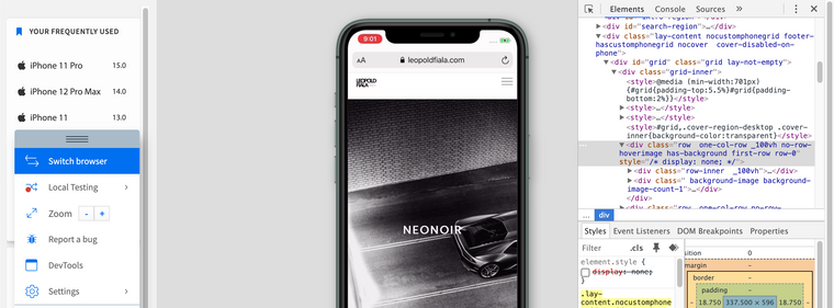
Could you please also add the following code in the Mobile CSS Area & let me know how you go:
.first-row {
display:none;
}
Talk soon Leo, once again sorry that it was correct the first time 🌻
Richard
-
Hi.
I deleted the first Mobile css aoption and replced it.
Still the same problem.
In Iphone 11 at least.Clearecd Cache and all after changing as well

This is all the CSS i have in the Mobnile css section:
.thumb .titlewrap-on-image.on-image.lay-textformat-parent .title {
font-size: 22px;
}.first-row {
display:none;
}Best
Leo -
Dear Leo
@leo01
You have a number of Third-party plugins installed. This is likely the cause of issue. Problems with Jetpack and Yoast SEO are known, also a large stored Cache.
After de-activating to test, I see on Mobile devices the "cover-region" is working as it should - 'Not Visible' as set within > Lay Options > Cover Options.
Here testing on a true mobile device (this is the first row of your layout and not the "cover-region"):
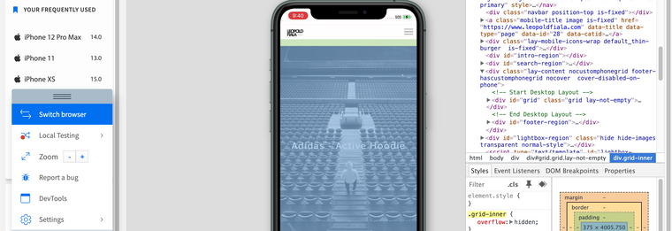
Hope this helps & best wishes ✨
Richard
-
Dear Leo
@leo01
Sorry but there may be a mis-understanding. The Cover is the first row.

If you do not want this image on mobile you can just delete the row?
Originally i thought the issue was "Cover is disabled for phone"

Was applied but the cover behaviour was still there. Now everything is working fine no? the ROW exists but the cover behaviour does not.
" The cover will disappear underneath your content when you scroll down. A Cover is always browser filling."
Happy to help however i can Leo and reach a solution that you want.
Best wishes ✨
Richard
I also code custom websites or custom Lay features.
💿 Email me here: 💿
info@laytheme.com
Before you post:
- When using a WordPress Cache plugin, disable it or clear your cache.
- Update Lay Theme and all Lay Theme Addons
- Disable all Plugins
- Go to Lay Options → Custom CSS & HTML, click "Turn Off All Custom Code", click "Save Changes"
This often solves issues you might run into
When you post:
- Post a link to where the problem is
- Does the problem happen on Chrome, Firefox, Safari or iPhone or Android?
- If the problem is difficult to explain, post screenshots / link to a video to explain it