Best way to create column layout
-
Hi Armin,
I'd like to create a column layout like this with the least possible modifications to LAY. It works well but the columns stack in small screen mode and I'd like to keep them intact.
http://codepen.io/cestdani/pen/VKgPZV
What do you suggest? Do I use this additional CSS for column layout or use flexbox columns? Or use tables?
Is there an FAQ on the layout formatting of the site that I can reference?
Thanks!
Daniel -
Hey dani! Yes yes, you used the custom phone layout. Good :)
-
Hey dani! Yes yes, you used the custom phone layout. Good :)
Tables and CSS might be a better solution for the columns since the custom phone layout doesn't update automatically with the desktop layout if there are changes.
-
Only the elements can update if they are synced as described here http://laytheme.com/documentation.html#custom-phone-layouts
Hmm anytime you do a change on the desktop version you can delete the custom phone layout version
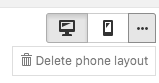
and then click the phone button again to create the phone layout again by "copy same layout"
I also code custom websites or custom Lay features.
💿 Email me here: 💿
info@laytheme.com
Before you post:
- When using a WordPress Cache plugin, disable it or clear your cache.
- Update Lay Theme and all Lay Theme Addons
- Disable all Plugins
- Go to Lay Options → Custom CSS & HTML, click "Turn Off All Custom Code", click "Save Changes"
This often solves issues you might run into
When you post:
- Post a link to where the problem is
- Does the problem happen on Chrome, Firefox, Safari or iPhone or Android?
- If the problem is difficult to explain, post screenshots / link to a video to explain it