Menu size on mobile is changing
-
Hi Armin,
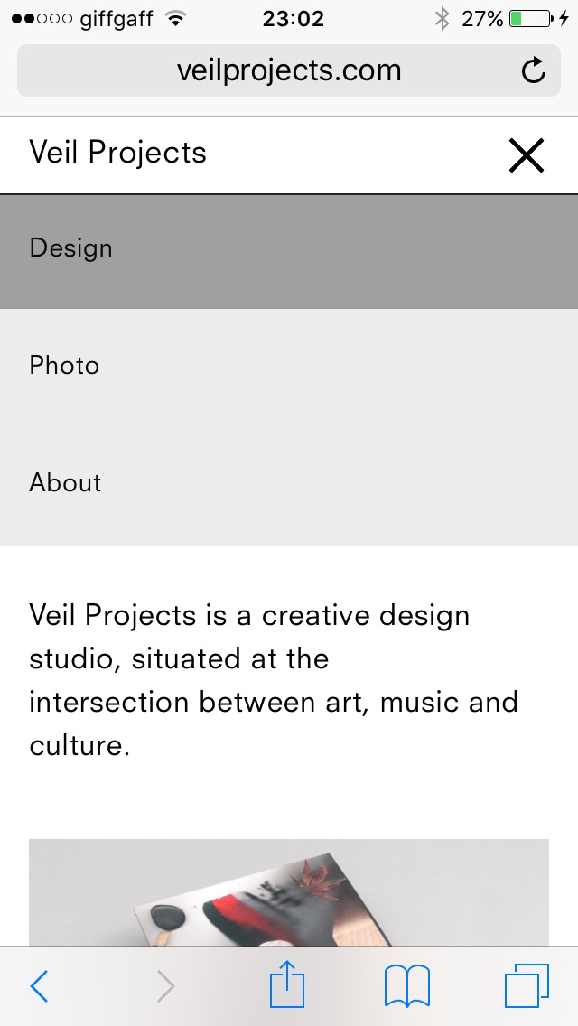
Just sorting out the last bits on my website and editing the phone layout.
I noticed the menu points size seems to be changing. As you can see from the pictures it starts small upon first loading - but if you turn the phone into landscape, the text gets bigger - fine, because its landscape its resized. But when you turn the phone back into portrait, the menu size is stuck on the landscape size, and navigating through the site doesnt fix it, its stuck like that.
Any way to resolve this do you think?
Thanks man!
D

-
Hey DMB!
Yes I had this error too on another website that I did last week (without lay theme). Really not sure what is causing this. I wrote it down.
In "Lay Options" you can try to set the "Breakpoint to Phone version" to a higher number :/
Not sure if that will help. -
Hey DMB!
Yes I had this error too on another website that I did last week (without lay theme). Really not sure what is causing this. I wrote it down.
In "Lay Options" you can try to set the "Breakpoint to Phone version" to a higher number :/
Not sure if that will help.@arminunruh Ah ok i see, its weird... Doesnt seem to happen on the lay theme website for example. Hmm, oh well! Let me know if you figure it out
-
Yes, I will try and fix it!
I also code custom websites or custom Lay features.
💿 Email me here: 💿
info@laytheme.com
Before you post:
- When using a WordPress Cache plugin, disable it or clear your cache.
- Update Lay Theme and all Lay Theme Addons
- Disable all Plugins
- Go to Lay Options → Custom CSS & HTML, click "Turn Off All Custom Code", click "Save Changes"
This often solves issues you might run into
When you post:
- Post a link to where the problem is
- Does the problem happen on Chrome, Firefox, Safari or iPhone or Android?
- If the problem is difficult to explain, post screenshots / link to a video to explain it